Hi! I’m having a problem with spacing images in mobile (SM) view. Here you can see how I design the pages in Blocs Dropbox - strangergames site design in blocs.png - Simplify your life - I give each image a padding of 4 on top and bottom.
When I preview the mobile page (SM) in Blocs it shows the images with the same spacing.
However, on mobile view online there is no space btw the images. Dropbox - strangergames on mobile view.png - Simplify your life
Any help greatly appreciated!
Oops - sorry, I meant I put a top and bottom margin of 4 on each image, not padding.
Hi:
Are you using the “Visibility” icons to set up your page for different devices?
Rich the Weather Guy
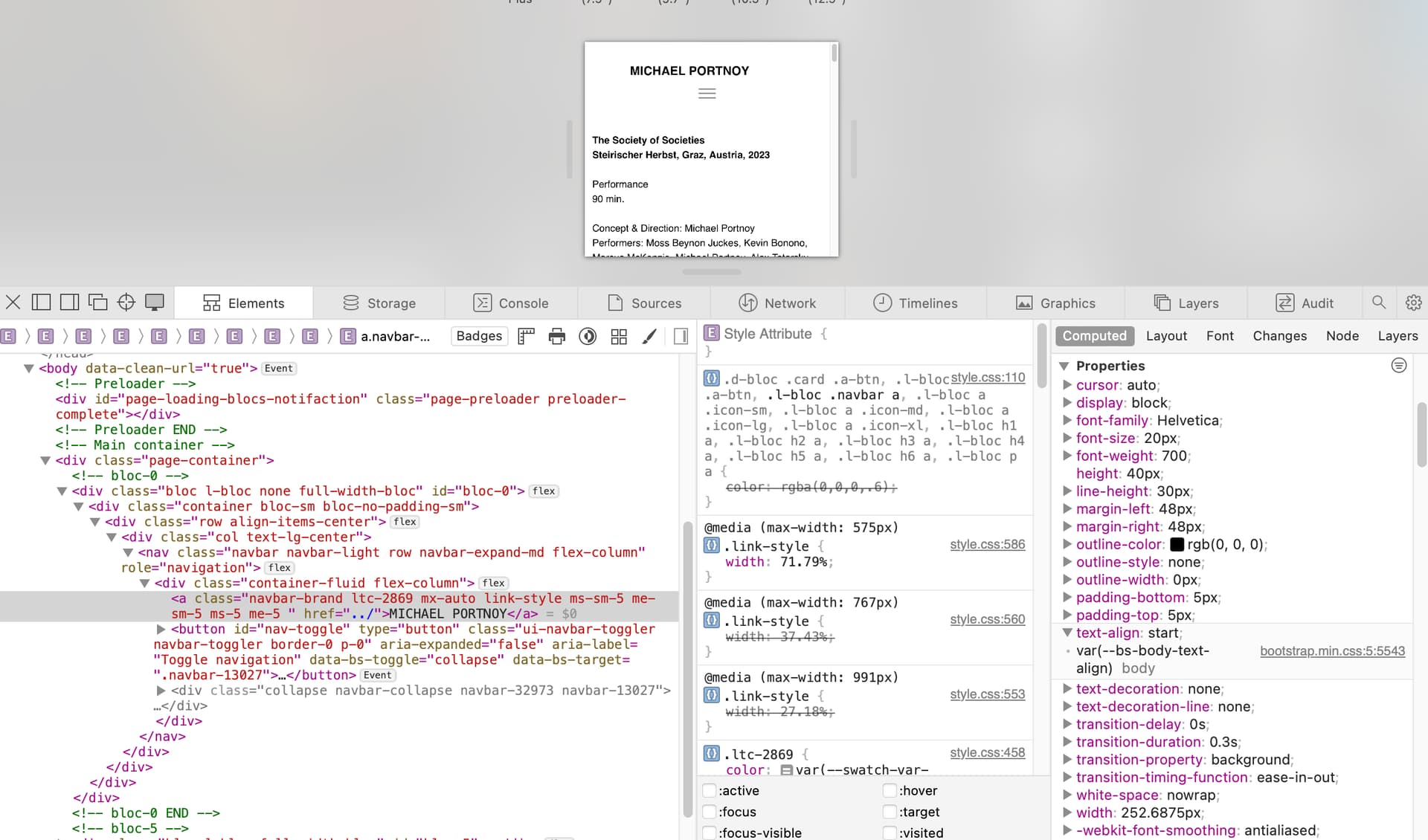
Yes, I am. They’re all selected. And then I double check and go to the SM view and it still looks fine there and in preview mode, but when published there are no margins at all. Is there a more reliable way to space images other than what I’m doing?
Hi Jerry, sorry I don’t know what a “live link” is? (I’m a beginner werbdesigner myself, I’ve only ever made a site for myself). The site I’m referring to is strangergames.com, and all of the WORKS pages (those linked in the homepage) when seen on my iphone have the same non-spaced images.
Thanks, Jerry! Just to make sure, in Blocs there’s no way to set margins universally on images is there? I have to go on XS and click on each one, and then on MD and click and adjust each?
Solved! Much appreciated, Jerry! Just one more question for you, if you don’t mind.
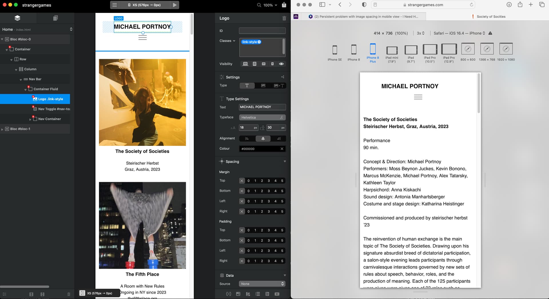
One very odd thing is the centering of my name in the header on mobile. Here you can see it’s centered in XS but then on the live link it is always off center.
I’d probably just go through your classes applied to this item and make sure that any paddings/margins/ alignments are all set correctly to start with at this breakpoint.
I’ve done it myself - very easy to miss something.
Hmm, I really can’t make sense of why it isn’t centered in sm view…