Hello,
I have designed my website with a double navigation bar, one designed for desktop view and another for tablet and phone.
I have the following issue that I cannot solve.
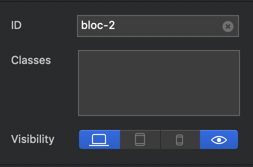
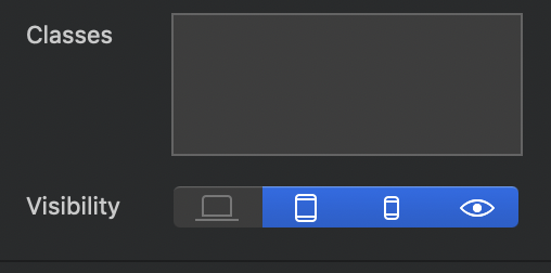
I have properly toggled the visibility of each of the two navigations bar. In the first one I have left active only desktop, in the second one just tablet and phone.
The issue is that my iPad (quote old Ipad air 1) keeps on showing me the desktop version also on iPad and I cannot find a solution.
This may be the answer but without knowing the link for your site I can’t test it.
Part of recent versions of iOS is a setting in Safari to “force” the desktop version of a website. If you are using iOS13 the there is an AA (Big A / Little A) on the left of the url bar at the top. If you press this you can toggle between desktop and iPad default views.
It may be that your iPad is forcing the desktop view and therefore showing the wrong version of your menu.
Thanks, clear.
My problem is overlapping in the navigation bar of the site name (written instead of the logo) with the menu items, when viewing from iPad.
Yes, In the class manager (I think it’s called, I’m not in front of the computer at the moment), you can set logo type sizes and Nav bar link sizes for each breakpoint.
Hi, just to clarify what I said yesterday. It’s in the project settings (under File), go to the T symbol, choose Object and scroll down to find the Navigation Links and Logo Text, where they can be changed for all different breakpoints.
Hope that helps.