I may miss something, or missfit with blocs (?), then if not as feat suggestion :
To make bestly responsive,
% is best for containers (brics…)
REM unit measure is best for fonts
REM (ROOT Em) are in reference to the main font as root, right ?
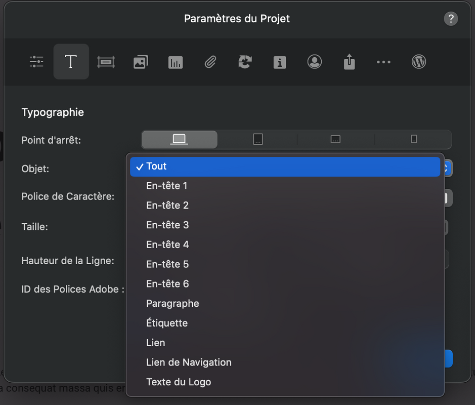
I then tested in Project Prefs with :
ALL (font) in 21px and 12px
Hn in Xrem
And when changing the ALL (that is suposely and logically the “root” font reference), Hn don’t change.
Maybe it is wanted as it is, thus this feat suggestion :
to get the ALL as Root (why not also renaming it “Root” ?)
and the Rem relative to the Root font
Benefit ?
Properly responsive, no ?
Huge time saver for Blocs hardusers (with mockups “capitalisation” etc…) : by just changing the Root px size, the whole others fonts (btw not only Hn : p, lists, etc.) to adapt to different projects (some design need huge fonts, others classic 12-15 fonts…)
Or may I omited a way or something (I’m not developer)… ?
Short tiny wishlist btw : adding <li> in preferences also (then all type of font are present)…
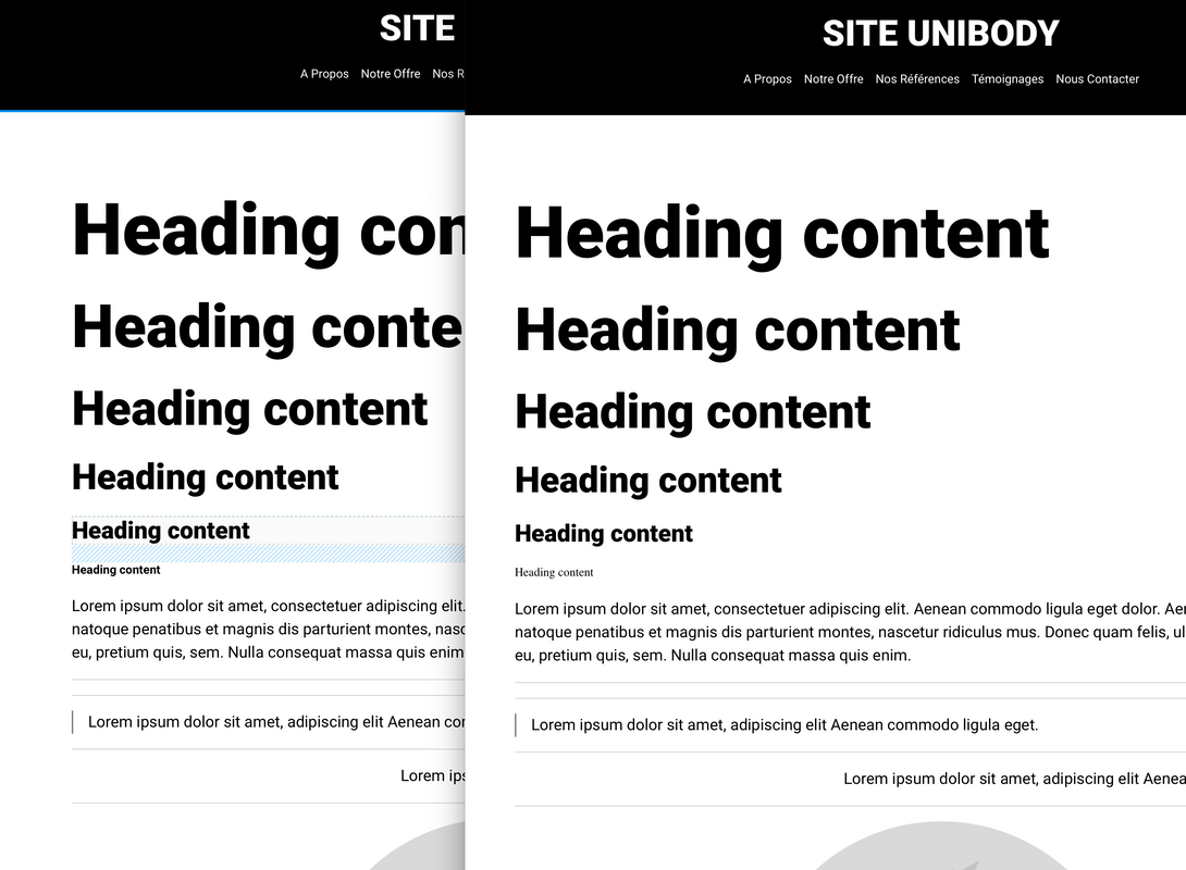
(tiny bug with the H6 not in Roboto-Bold as put in Project Pref and visible in right frame off course)
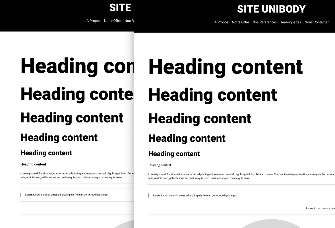
…And a simple change of the size of the root font for each resolution for responsive (thus 4 changes) and absolutely all fonts (Hn, list, p, etc) keep the proportion reference… Big time saver.
When using those options, you are defining a font size in a typography tag that overrides or is relative to the root font size. You are not actually setting the root here but assigning a custom class.
The (basic) cascade of CSS is
Root / Bootstrap / Custom classes
I wouldn’t change the root font size, it’s bad practise. It will likely mess the site up for people who enlarge or decrease their screen fonts for accessibility.
1 REM is usually 16px, and it should remain user scalable.
So in summary, well done for thinking, but it’s not good practice. Don’t do it.
Ok didn’t know, but it doesn’t change the point (it is devs stuff to find how-to (…) )
I agree, personnaly i dislike smaller fonts on mobiles, it must be “natively adapted” (better 18px for me, even 21px more and more with next gen displays - as I done with my site), but sometimes for design bit originals (as eg huge H1, vertical H1…), it could be a good options also.
Still and always in “two” clicks…
(…) And as end-user, for noobs non-coder with “two” clicks as hard-users for capitalising responsive and easy customisable mockups in “two” clicks also, it’d be a great option (personnaly would love, evemn if, i know, I also can prepare good css stuff ready for copy/paste… )
Ed : And even better than that, considering all edits are REM relative to ALL (or 'Root" or even why not for non coder “Reference”), imagine your whole (p, list, Hn, etc etc) editorial content can be changed in ONE!!! change of this “root” font. Flexible & Powerfull
Btw good night all (in europe :))
: …Or a checkbox beside the ALL field as “Reference” (with tooltip : "Make it as refence for all others fonts is selected. It is usefull only with REM fonts units) something like that…
no change as it is for users if not selcted
big value in design customisation as for eventual responsive need on-demand
I can’t follow the rest of what you are saying, it doesn’t make sense. But at a guess here, I don’t think you fully understand the way responsive websites work. (Your website has some responsive issues to resolve)
There is seldom a reason to adjust the root font size. Best practise standards exist for a reason. Accessibility is one.
Yes also, told as root/reference with my upper purpose. (my site now has fonts in px, would have known earlier REM as I was learning with this spontaneous feat sugg…)
( My site, I know, progressively… (now I know much better Blocs I would have done things differently from start, btw i do with…). )
 : …Or a checkbox beside the ALL field as “Reference” (with tooltip : "Make it as refence for all others fonts is selected. It is usefull only with REM fonts units) something like that…