On the Desktop view. I have navigation bar well lined up, but once I resize the desktop window, Navigation bar changes to 4 lines. Please refer to the attached pic. Any solution?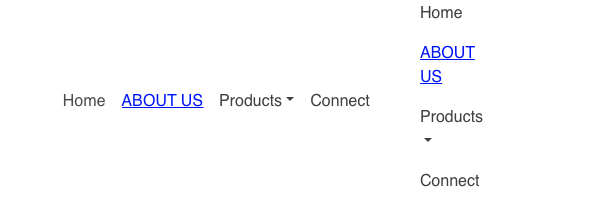
This will typically happen if you changed the navigation type for narrower width devices. Normally, the navigation will switch to a hamburger navigation at the two smaller breakpoints. Delete the navigation bloc and add it again. Leave everything at its default settings and try previewing again.
Thanks for the update hendon52.
Deleted the bloc, reinserted the Navbar.
Now instead of 4 lines, I have 2 lines, attached pic.
Then little more shrink and it changes to Hamburger layout.
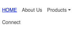
What is important is that the menu displays correctly at each of the viewport sizes. It should be a full text menu in desktop and tablet layouts, and should revert to a hamburger menu on the smartphone layouts.
Resizing a browser window isn’t the best way to preview the device variants. When published, the site will deliver the most appropriate version of the site depending upon the device being used. In smartphones and tablets, there is no option to resize browser windows so the chances of seeing menu wrapping caused by having an odd in-between screen size is virtually zero. On desktops and laptops, users do have the option of resizing browser windows but it is often expected by such users to see distortions in the pages they visit. How the page displays can be affected by factors such as screen resolution, window size, zoom levels etc.
The best way to see how the site behaves is to preview in Safari and then select “Responsive Design Mode” from the Develop menu. This will allow you to preview in various devices and orientations.


2 Likes