Not sure I get the idea behind your thinking. If you mean you want to create a full width carousel on your desktop site, this can be done. However, its ability to fill the screen will depend on the aspect ratio of the images in the carousel.
In your second example, I don’t actually see a carousel, so not entirely sure what you want to do.
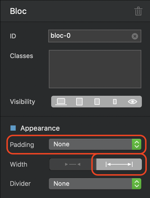
For general guidance, if you place a carousel on your desktop version of the site, it can be made to fit the full width of the browser with no space above or below by simply removing the padding of the bloc containing the carousel and setting the width option in the properties panel:
This will make the carousel fully responsive across all device sizes. However, as the width gets smaller, the height will also reduce proportionately to the aspect ratio of the images contained in the carousel.
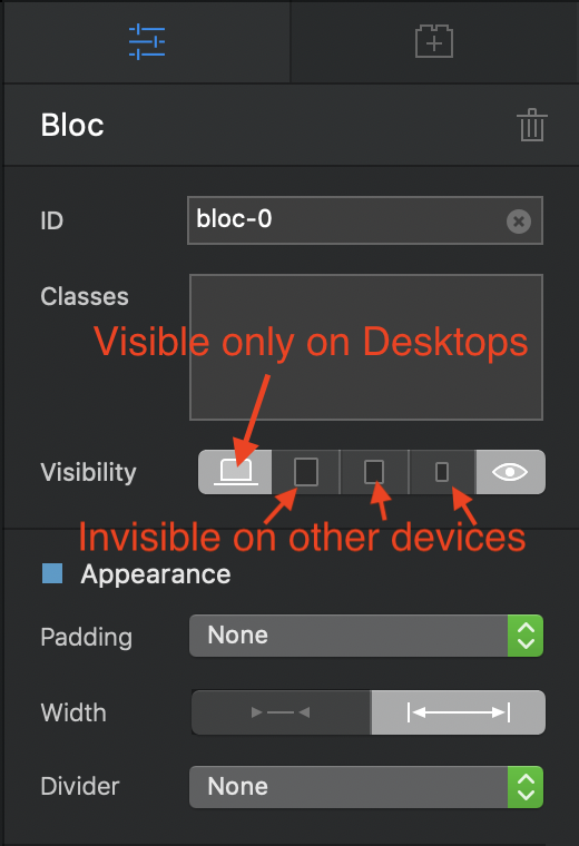
To overcome this issue, you would have to create different carousels for each device breakpoint and change the aspect ratio of the images used to better suit the device screen you’re designing for, Each carousel can then be made visible or invisible at various breakpoints, simply add all the carousels to the desktop version in their own blocs. You would then hide the ones you don’t want displayed on each device by using the visibility options.
Hi @PeteSharp, I read it as:
The carousel pictures are generated to fit full screen desktop, and using the same pictures for mobile devices, a bit of code added to crop them left and right (for portrait views) or top and bottom (for landscape views.
So the carousel holder is always full screen, but images within are cropped to fill the space rather than left with space around.