Is this possible adding a Responsive Carousel or Gallery with a working website?
I think some of Blocs / Web Designer like @Pealco , @PeteSharp , @Flashman , @Eldar @Whittfield … etc. maybe helpful with this question.
Hey @KBConcepts ,
Do you mean adding one to an existing website?
Then the answer is yes. Even easier if the website uses Bootstrap already.
1 Like
Thanks for reply @PeteSharp
You know when you have a gallery and you can insert images/pictures or videos. I want to know if live/working website in the same areas.
@KBConcepts ,
So instead of an image or video, you want an embedded website(s) in the gallery?
Yes, Gallery of websites, as if each area is a browser.
Well you could with iframe’s I guess. It would probably load terribly slow if you had a lot of them.
Someone else may have a solution.
nelo
October 30, 2019, 10:44pm
7
I guess you want to do something like this?
Aqui
1 Like
@nelo you rock! These are Word Press themes with Plug-ins.
Here is what I came up with playing with CodePen. Not to mention it’s free. I have not yet brought it into Blocs though.
HTML - (Why is the code not being revealed in the Forum? )
CSS
.iframe-container iframe {
// Demo styleshttp://GalliesAlley.com/img/.jpg ’);
h1,
h1 {
a {#31c1ef ;
.wrapper {
CSS
.iframe-container iframe {
nelo
October 31, 2019, 4:02am
9
use a zoom image for a site, I have an idea how to do it, with images let me try it and if it works I will send you the example.
Interesting idea. I haven’t seen it before.
Pealco
November 1, 2019, 1:24am
11
Hello @KBConcepts ,
Regarding what you send and I see that you like what @nelo show you, so I could create what you need, and for that there are the instructions:
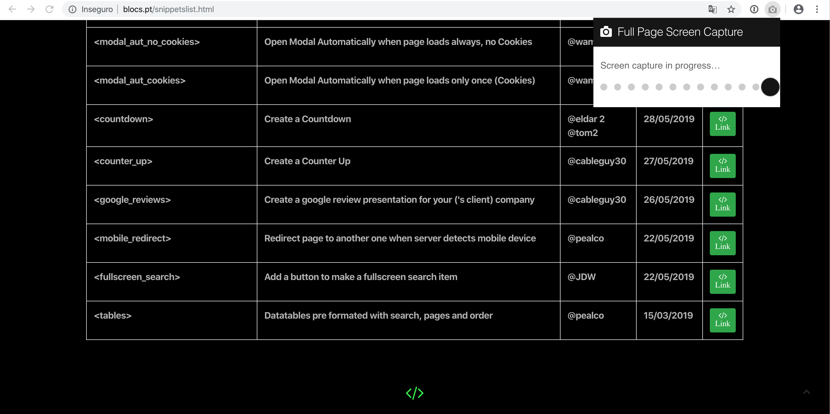
So first step: Use chrome browser and install the following extension: https://chrome.google.com/webstore/detail/full-page-screen-capture/fdpohaocaechififmbbbbbknoalclacl
Open the website you want to copy:
After you press the camera icon it will appear the capture animation of the page:
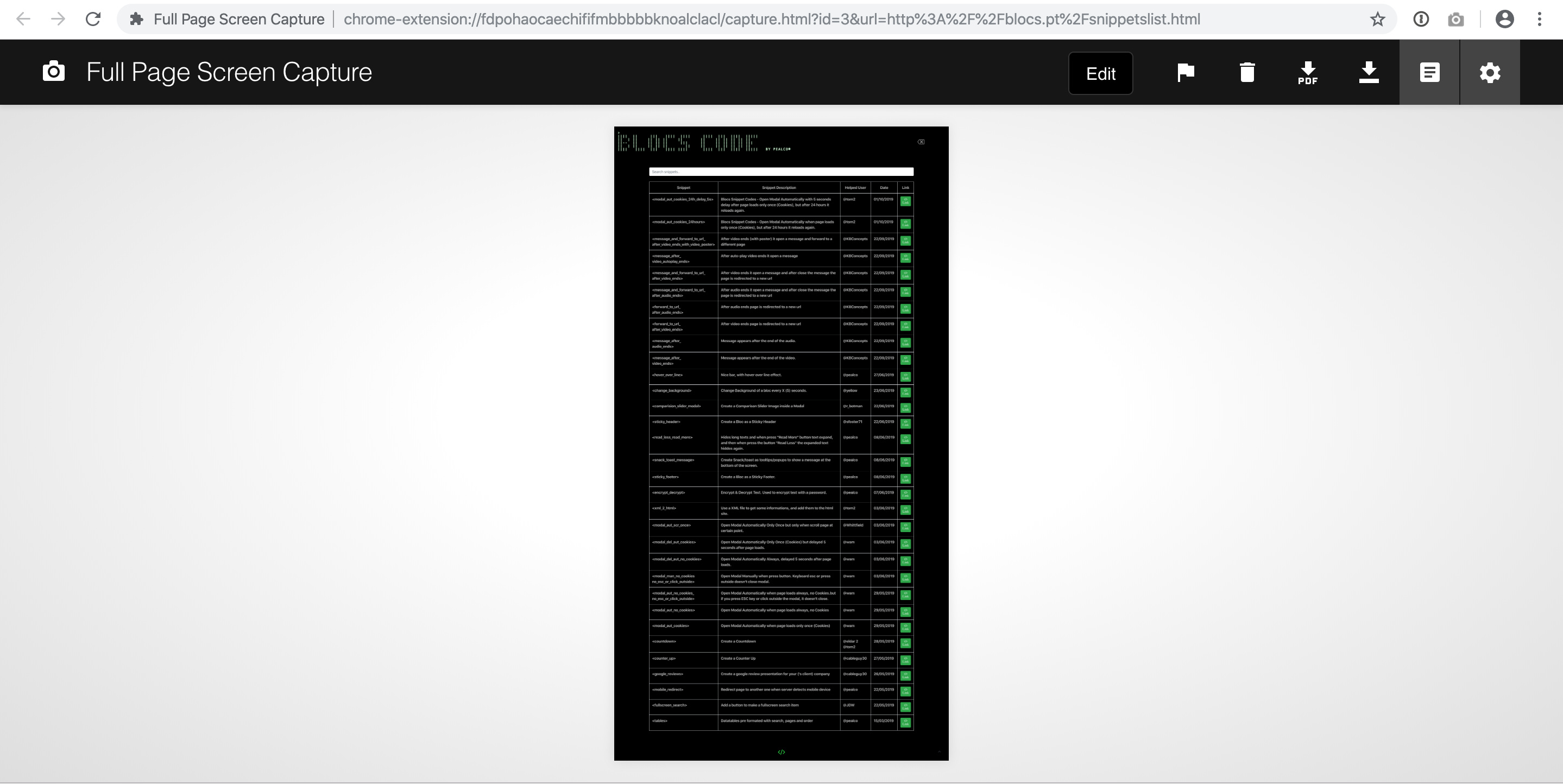
Then you have a nice picture of the website
And just press the button “Download to PNG”
Second step:
Add a page with all the images you will use and just keep it there with nothing except the images and don’t make any changes as this page is just to have the files, or you will have to add the images manually to img folder, but probably one time you will forget and the page not work.
Now in the page that you want to appear the website “iframe”, add a “code widget” and add the following code: (turn off preview before paste this code)
<div class="preview-item hover1"> <a href="website1.html"><img src="img/website1.jpg" width="1600" height="13058" alt="" class=""> </a>
<h3>WEBSITE 1</h3>
</div>
Change the ref= to the website url
Go to the definitions of that page and in the code editor add the following one:
<style>

.preview-item{
display: inline-block;
    margin: 30px 30px 0;
    vertical-align: top;
    width: 237px;
}

.preview-item a{
   border: 5px solid #444444;
    display: block;
    height: 300px;
    margin-bottom: 20px;
    overflow: hidden;
    width: 237px;
		-webkit-transition: all .3s ease-out;
	-moz-transition: all .3s ease-out;
	-ms-transition: all .3s ease-out;
	-o-transition: all .3s ease-out;
	transition: all .3s ease-out;
}


.preview-item:hover a{
	border-color:#ffc908 ;
}


.hover1:hover  img {
	margin-top:-1560px;

}

.preview-item img{
	width:100%;
	height:auto;
	position:relative;
		-webkit-transition: all 4.3s ease-out;
	-moz-transition: all 4.3s ease-out;
	-ms-transition: all 4.3s ease-out;
	-o-transition: all 4.3s ease-out;
	transition: all 4.3s ease-out
}

.preview-item h3{
	border-bottom: 1px solid #444444;
    color: #fff;
    font-family: "oswaldbook";
    font-size: 16px;
    margin-bottom: 20px;
    padding-bottom: 15px;
    position: relative;
    text-transform: uppercase;
}
</style>
There you have an example working for you test:LINK
2 Likes
Wow @Pealco you went through a lot of work to make this happen.
1 Like
 They are really cool though.
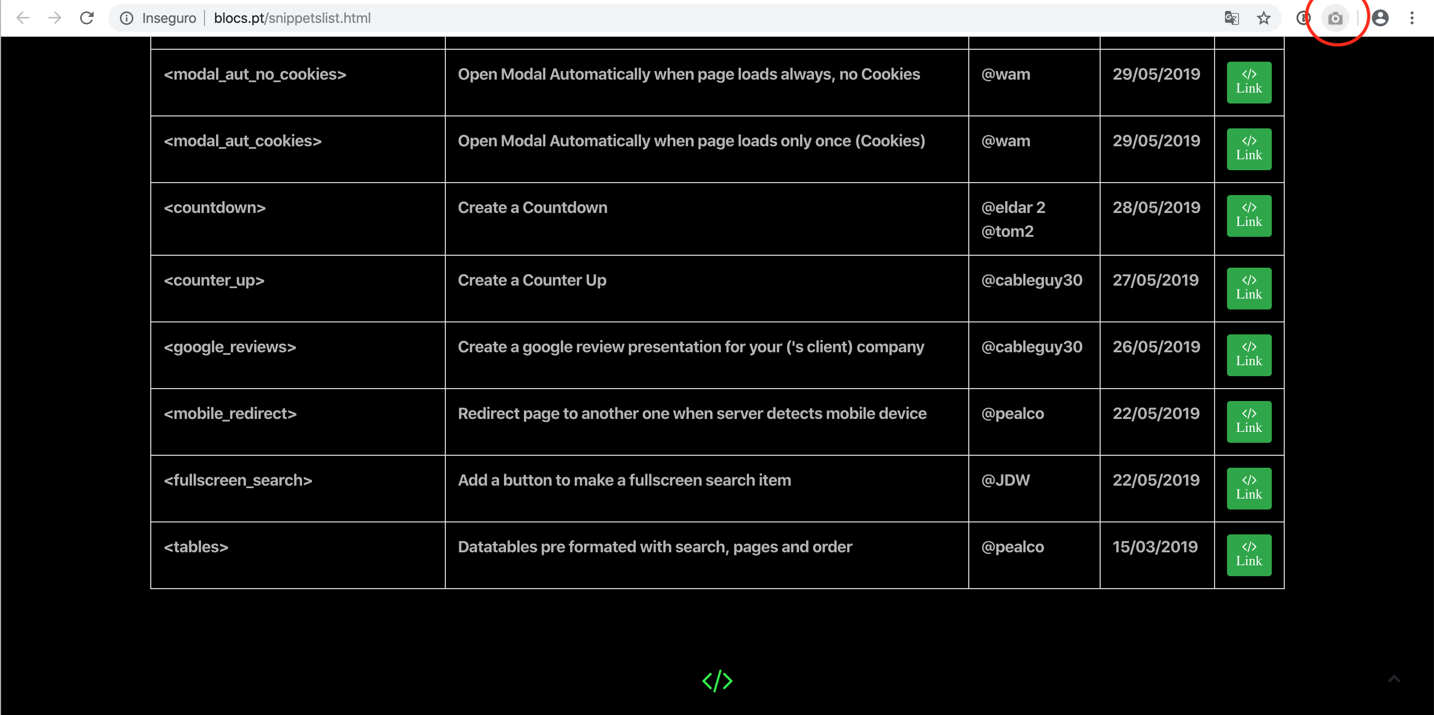
