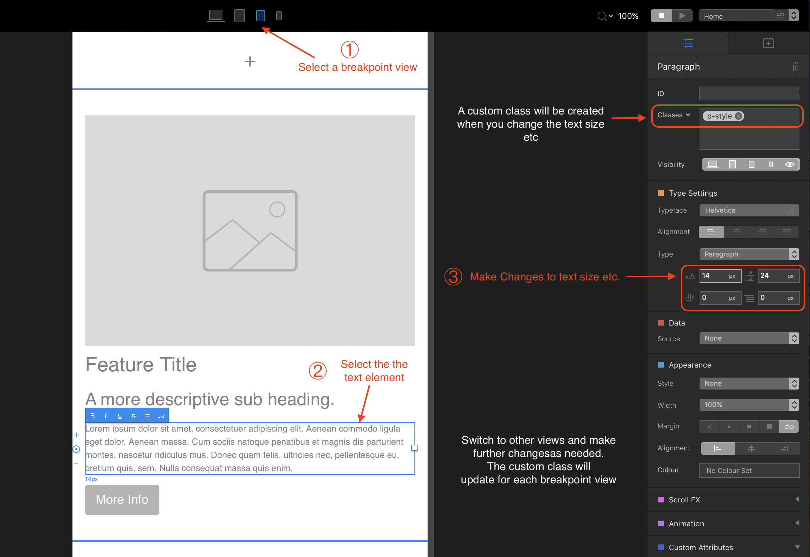
Text will wrap at different break points as a default option. However, you can manually adjust text size at different break points. Just switch to the breakpoint views and adjust the text and spacing size to whatever you need. You will notice that a custom class will be created automatically when you do this.
I guess the best way then is to create a custom class that looks good on every device and then reuse it as often as possible… Just thought that there would be a smarter solution for this
No need to actually create a custom class - Blocs does it automatically. See below. Automatically resizing text is often a bad option. I have a couple of apps that do this, but it becomes a real pain adjusting text and layouts afterwards. This is because if automatic resizing is used. a 12pt text size on a desktop breakpoint suddenly gets reduced to about 5pt on a small mobile screen - making it difficult to read. It’s much better to have a system that maintains the text size and wraps the text to suit the screen width. You are then free to tweak the sizes if it looks too large on other breakpoints.
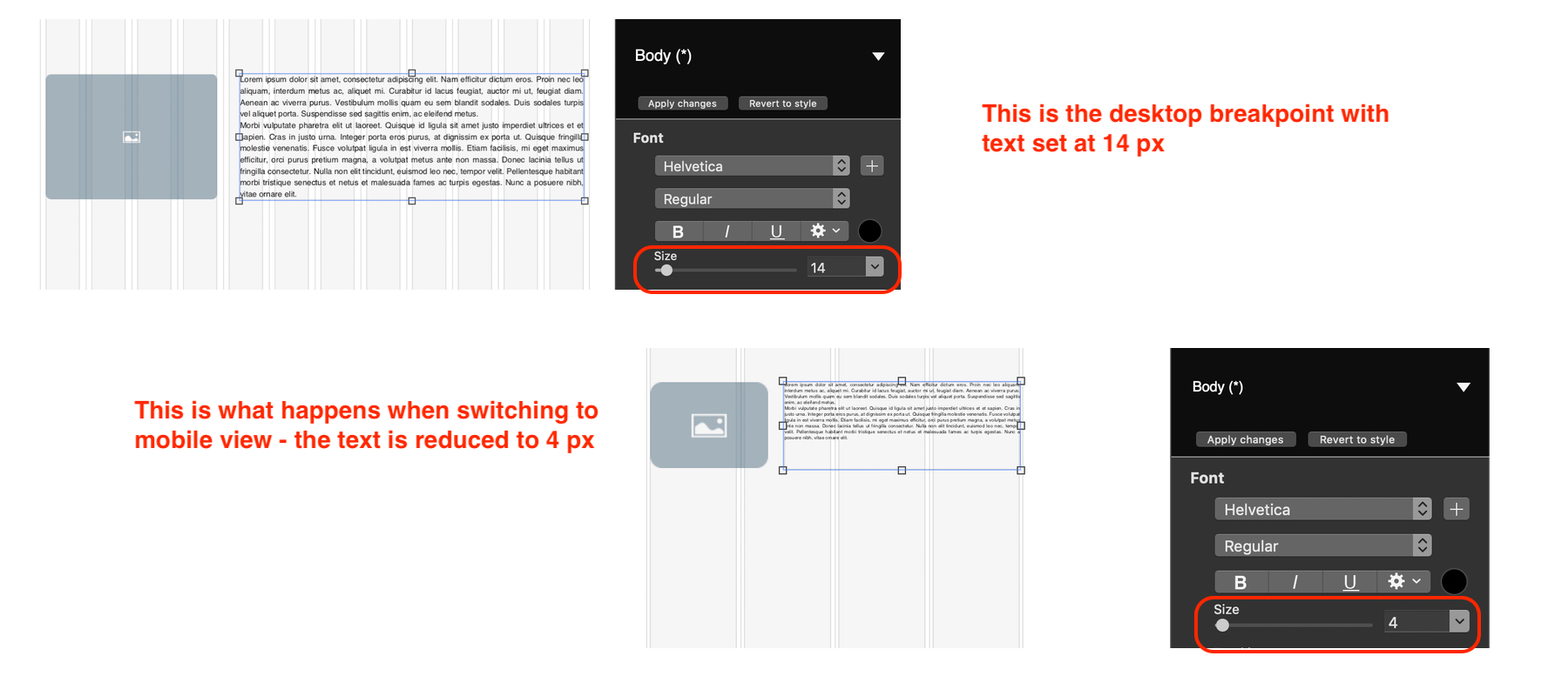
By way of example, the illustration below shows what happens in an app that automatically resizes text. In this case, it was created in Sparkle. You will note, if the text size is changed in the mobile breakpoint, the layout of the page will also have to be changed to reflect the larger text box size. This is where it becomes a bit of a pain, particularly if you have a lot of page elements. Basically, everything below the adjusted text would have to be manually moved down the page to accommodate the changes. This doesn’t happen in Blocs. The text box can expand when changes are made and everything below it will be pushed down the page automatically.
It is the best solution, I think it’s better to have control on your design for different breakpoints. I tend to draft it out in desktop and then work mobile up for asset placement and font sizes. You don’t want the site to just flow to small screen sizes, you want the design to look great too. For a lot of people they only ever see the mobile breakpoint of your site.
You’re absolutely right @PeteSharp. It’s always best to have full control of your site. It should certainly be made to look good on all breakpoints as a priority. This is one of the reasons why I’m not a big fan of auto-size functions when it comes to fonts. Although it’s always possible to resize manually, it best to start with something that does work - even if it’s a little bit bigger than you like. The problem, however, with adaptive design products (as opposed to responsive) is that it takes quite a lot of fiddling laying out the page elements for every breakpoint. At least with Blocs, we don’t have to do that.
Blocs has speed up my design time. I still do a lot of code in the end (I use OctoberCMS) but the initial design, and flow for breakpoints is all done in Blocs.