Hi there,
Something that seems to be “nothing” to code with a value for Responsive (more and more in future with increasing use of Code Widget especially with some awesome new 3D solutions as Spline… (as it may be a good point Vs some other concurrence known to be used with Spline, and I don’t think they have this function… )
Observation/need :
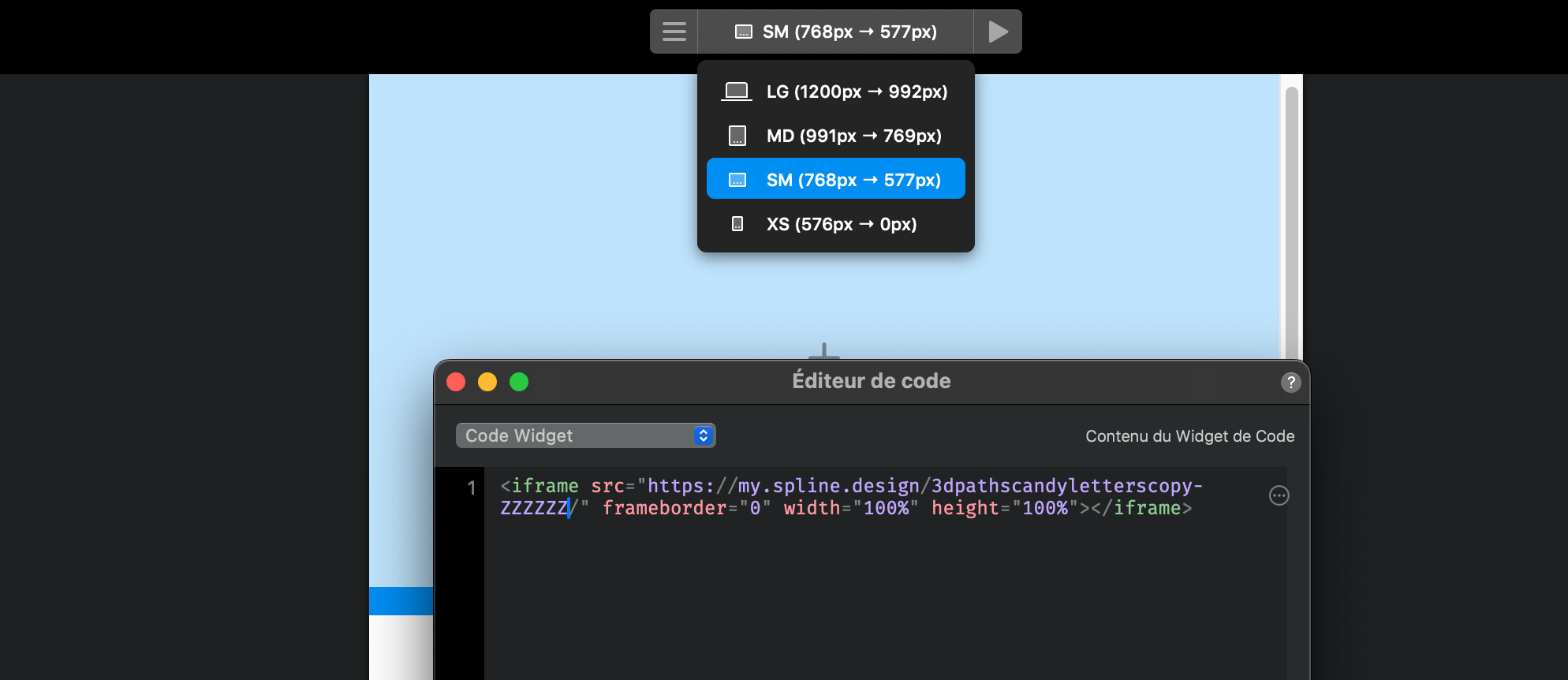
Impossible to make responsive those 3D solutions export code widget (it is as eg 1280x900, and it only keeps this proportion with small devices, then we get a ridiculous 3d iFrame (or bg).
Feat Wish/suggestion :
Th possibility to put different code widget respectively to screen resolution, and that’s it !
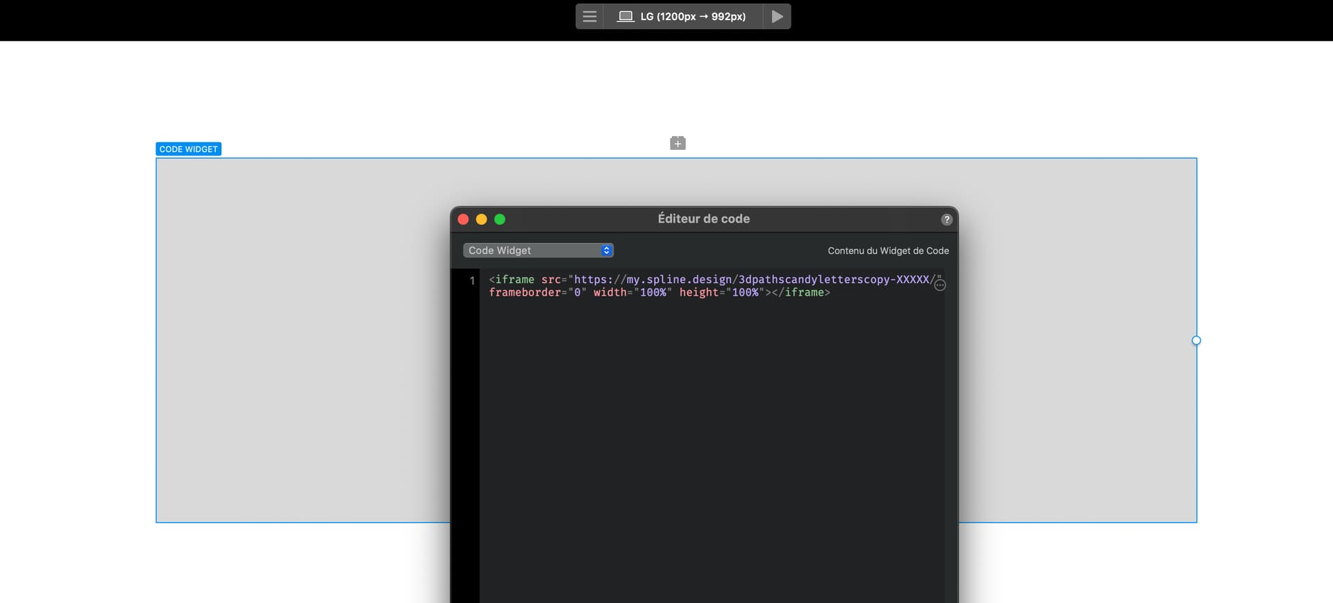
Exemple
With my case somehow very basic and universal :
Resolution more than the 1200px gap :
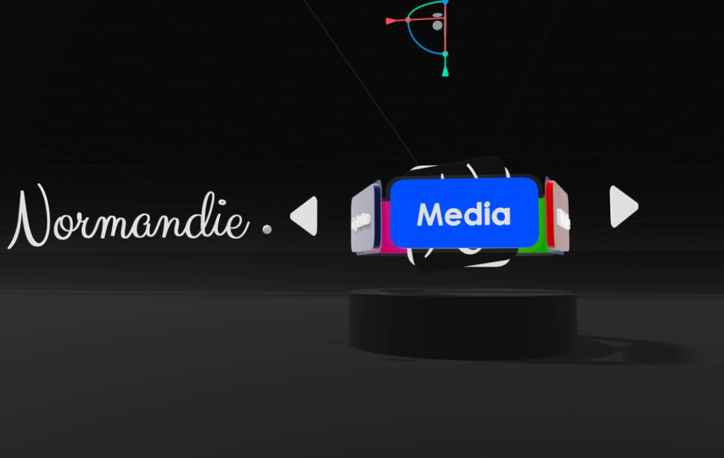
Then with below resolution, I just have to make in Spline a duplicate scene > “Normandie” upper the 3D caroussel, then with a ~square code widget optimised for small devices.
And why not another one for XS and SM resolution with a simple “N” and caroussel bit differently presented to the camera, with arrows below side by side,
Etc.
Maybe less to be coded, and it has lot of sense.
If the idea is good and retained, to thanks me, I beg you to do it quickly (for my proj) 

