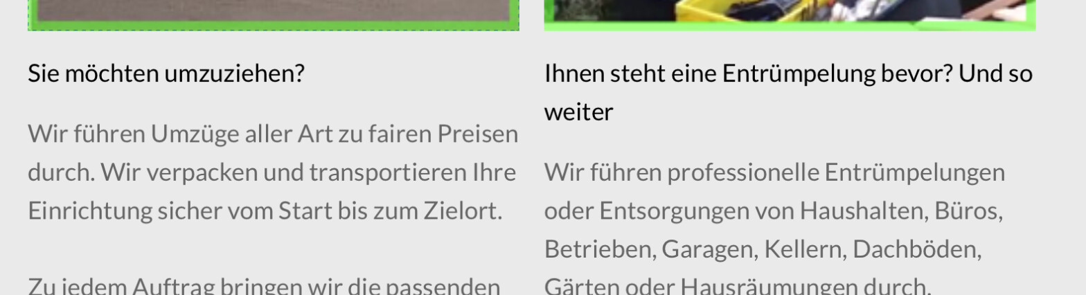
when I use several colums, I need some kind of equalize to make the e. g. the headers the same height, so the text of the paragraphs start at the same height as well:
Hi Fuellemann, you’re an ex-Foundry user also, we used to have the Equalize tool where we could create a label for a few objects and then anything that had that label assigned would set the height to be the same as the one that was the largest. Is that what you are trying to do?
Setting the pixel height isn’t best as content can be dynamic and needs to change to the largest height for a group of elements such as titles on a card or body text area on a card. I can’t see how this is done in Blocs unless using a grid layout, but then can be awkward for adding some components.
@Norm do you know if it is possible in Blocs with the native controls of Blocs to be able to set the height of a number of objects to match the largest one of the group?
But, in any case, I am not sure it is going to look good to have the first column have a huge margin, and then the second one a much smaller one. Maybe a total rethink of this section might be the best option.
I totally get what you are saying, and agree with that, and that would be a poor aesthetic design decision if there was a noticable imbalance, but you get instances where a line of text for 2 out of 4 cards maybe hits a third line where the other 2 fit two lines, so there is a slight difference in height making the overall cards different heights. The imbalnce of four cards not being the same size I feel would be greater than a bit of space with the text lines. An instance where minimum height won’t work is if the content is Volt generated and the user pushes it slightly over the threshold or using REM settings on text and the browser for some viewers is set different for the base font size. If there was a ‘wraper’ with a class that could be applied to the text content where all objects with that class adjust the height to meet the largest one it would elimante that issue, essentially the largest one sets the minimum height. This was something that was implemented in Foundry to address this as a default option with a ‘wrapper’ div, Blocs’ equivalent process I imagine would be a class. If Blocs could do this it would be a valuable option. It’s worth looking in to and also gleaning ideas from the way other systems enable practice.
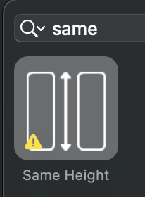
@Bill Hi Bill, yes I did try that, but it wouldn’t work for me, I can’t remember what the problem was if was the Bootstap version incompatible or Blocs version, but it had the yellow exclamation indicating an issue. See screenshot, Same Height is exactly the thing I’d love to use.
Thanks KBC. That’s the one I’m having trouble getting to work (I have the latest from the store). I tried following Bill’s instructions here but all they do is give me an extra column so I have four blocks on a row and one beneath them – or they do nothing at all.
Clean Native Flexbox Solution for Equal Height Layouts: Cards, Divs & Columns (No Brics or JS required)
Hi everyone! You don’t need any third-party Brics or custom JavaScript to achieve perfectly aligned, equal-height layouts in Blocs. Whether you are using standard Cards, custom Div containers, or plain Columns, native Flexbox handles this smoothly out of the box.
Here is a simple step-by-step guide on how to set it up (demonstrated here with Cards, but the exact same logic applies to Divs and Columns):
Step 1: Set up the basic layout structure
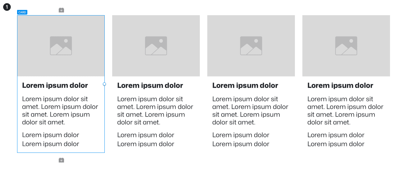
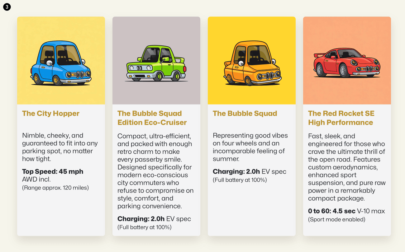
Create 4 cards (or any Column / Div container layout). In this example, we use 4 cards with an Image placed at the top and a Card Body below it. Inside the body, add two Div containers: one for the top content (headline + description) and one for the bottom content (price or specs).
Step 2: Add content and styling
Style your elements to your liking and fill them with your content. At this stage, containers with less text will naturally appear shorter than those with more text.
Select each of the 4 Columns (or parent containers) and set Alignment to Stretch (Sidebar → Settings → Alignment: Stretch). This forces all columns in the row to match the height of the tallest item.
Give your headlines a custom class (e.g., .card-title) and set a min-height (in this example, 56px to cleanly accommodate up to 2 lines of text).
Step 4: Configure Flexbox classes & apply margin-top: auto
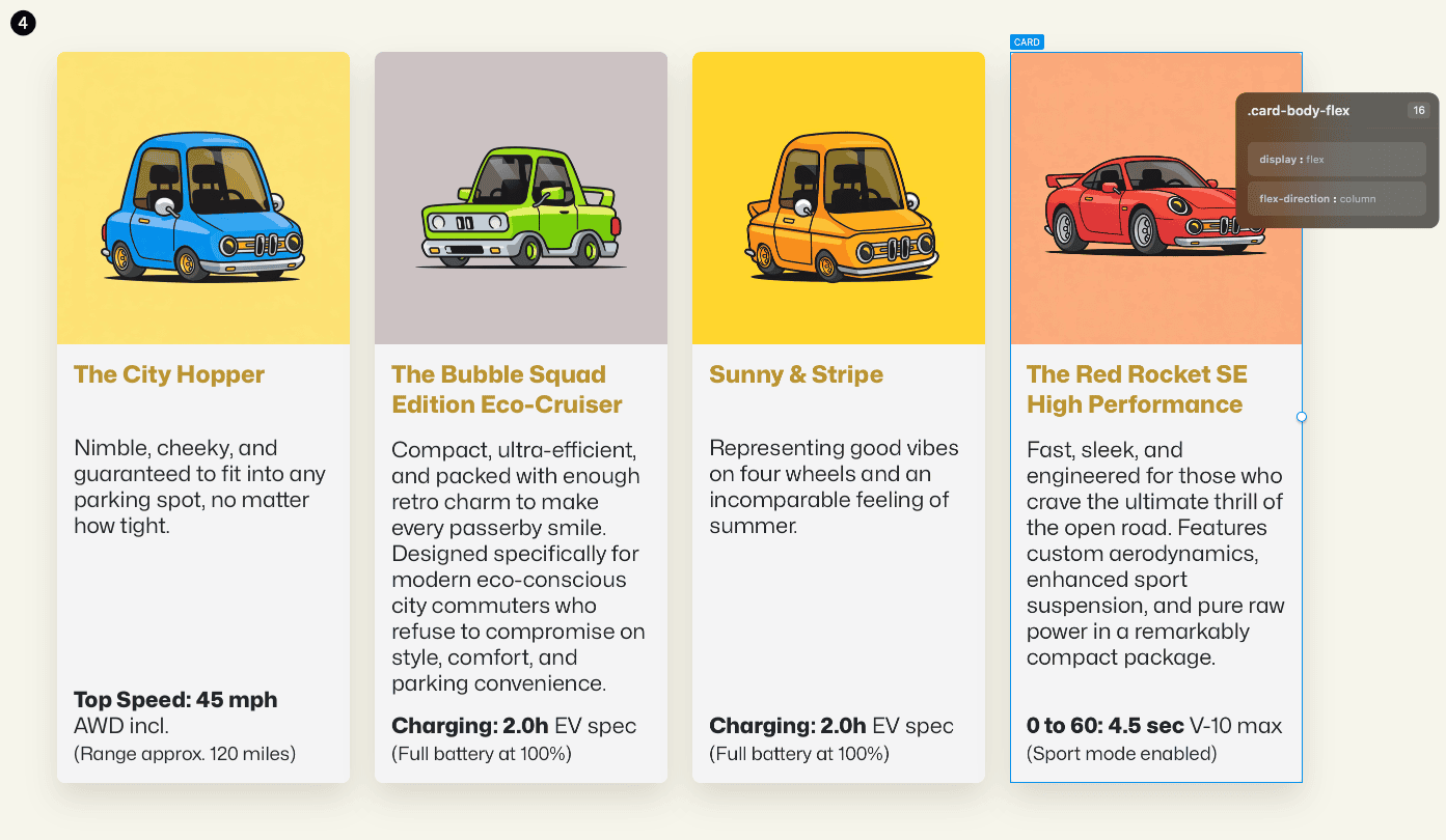
Assign a custom class (e.g., .card-body-flex) to both your Card (or Div wrapper) and the Card Body, and set them to display: flex and flex-direction: column in the Class Editor under Flex Container. (This ensures the flex height passes down all the way to the inner containers).
Give the two inner Divs their own classes: .card-text-wrapper for the headline/description Div, and .card-price-wrapper for the bottom Div. Set both of these to display: flex and flex-direction: column as well.
The Magic Trick: Select your bottom class (.card-price-wrapper) and in Class Editor → Margin & Padding, type auto into Margin Top.
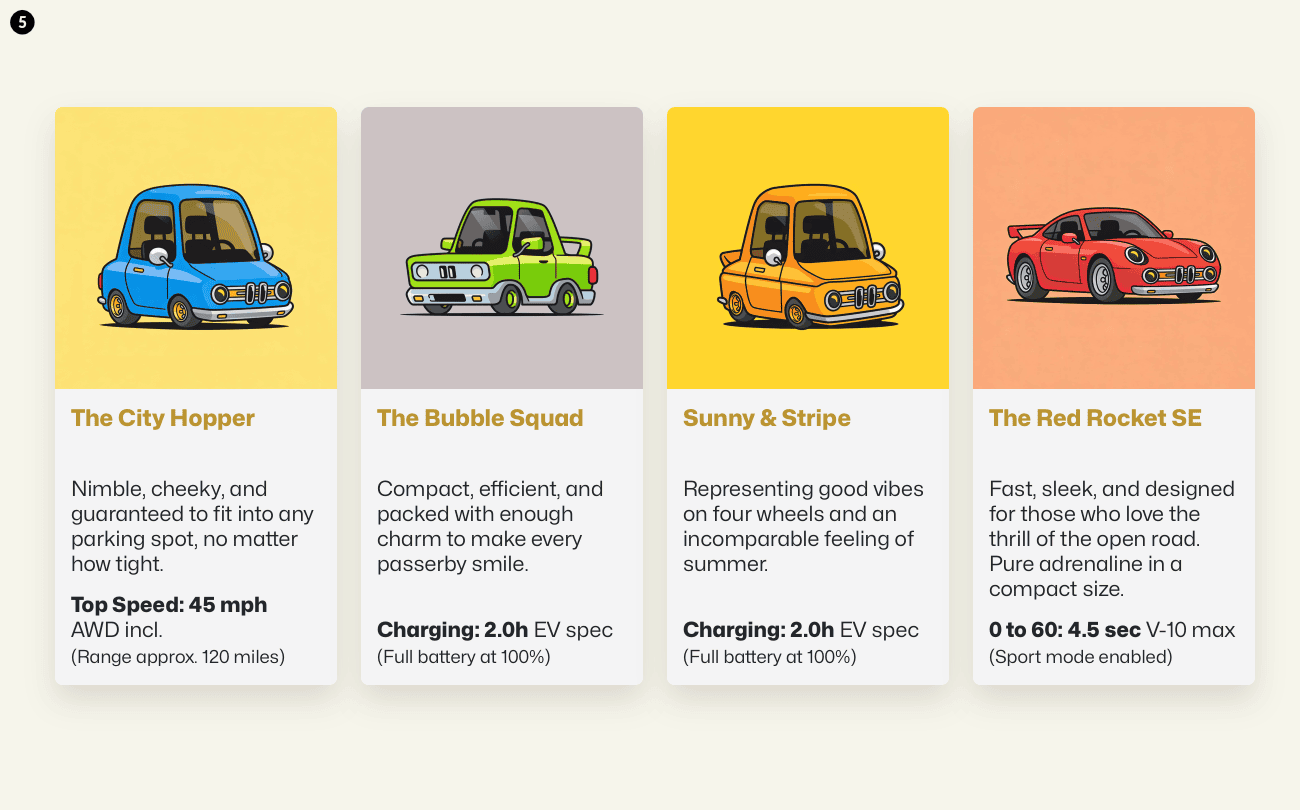
Step 5: The final result
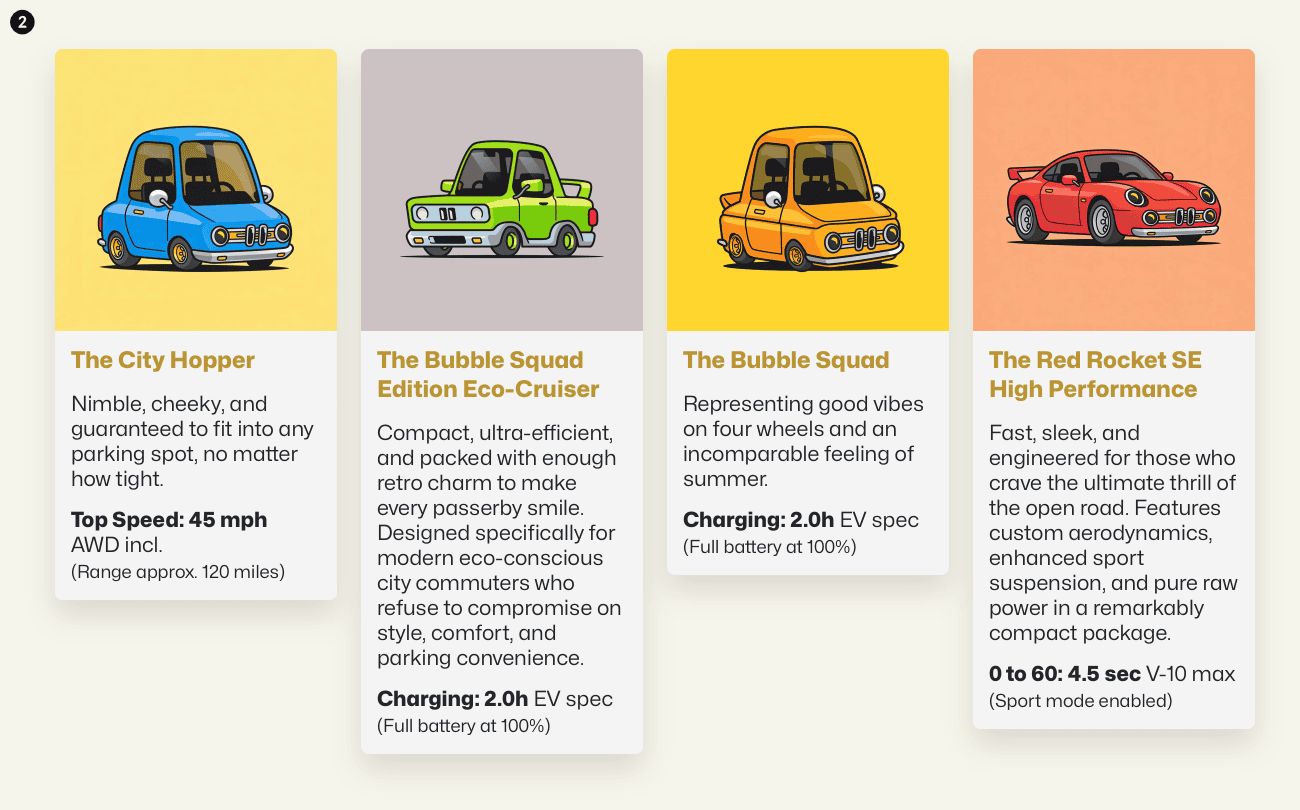
Finally, we adjusted and refined the text content for each card to show how varying text lengths behave in a real-world scenario.
With margin-top: auto absorbing all vertical empty space inside the flex container, the bottom elements push down seamlessly to the baseline. Regardless of whether you build this with Cards, Divs, or Columns—and no matter how long or short your text is—you get a clean, perfectly aligned layout every time!
Wow that explanation took some time and it was so cool of you to take the time to do that for us to help us understand how this works. Thank you, @Ghost
Wouldn’t it be great if someone would actually develop a bric that would take care of this need.