Hello! Is there any way to change the appearance of the tabbed content into a hamburger menu in mobile version of your website?
Hey @Stewie_Griffin,
I have an idea how you could do this, give me some time to see if I can get it working.
great!!! Thanks a lot!!
I’ve been searching this forum for some examples of tabbed content but can’t find any. I too want to know how to make tabbed content work in the XS breakpoint. You’d think that Blocs would have addressed this for us, but all it does is make XS look awful like this:
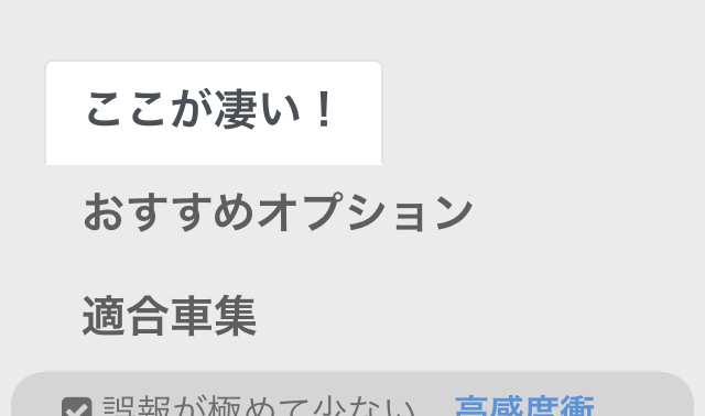
(The 3 tabs are vertically stacked! What the…!!!)
However, I disagree with using a hamburger in XS because you already have a navigation hamburger (at least I do) at the top right of the web page. It would be a confusing UI to have multiple hamburgers.
At first, I thought the best way to approach tabs in space-constrained XS would be to have the main (leftmost) tab showing, then have a some mini-tabs to the right of the main tab. Then when you hover over those mini tabs their full name would suddenly display. But that doesn’t work on a real mobile device because there is no “hover” when it comes to your finger. And so, if we don’t have a hamburger, what do we do?
Again, I’d love to seem some examples of what other people have done in the XS breakpoint. For now, there are some non-Blocs examples such as the one below. It basically converts the tabs into an Accordion at small screen sizes.
https://www.cssscript.com/demo/animated-tabs-component-pure-css-tabsy-css/
I like the following one better, but how do we implement such in Blocs?
https://www.cssscript.com/demo/responsive-css-accordion-tabs-component/
That was basically my suggestions to @Stewie_Griffin, There are tons of examples of this with Bootstrap 3, but not a lot around with Bootstrap 4.
I did find one possible solution, but I’m getting a javascript error with it lol.