Hi guys,
I have a 4-way special feature on my site and it’s all perfect apart from one small thing.
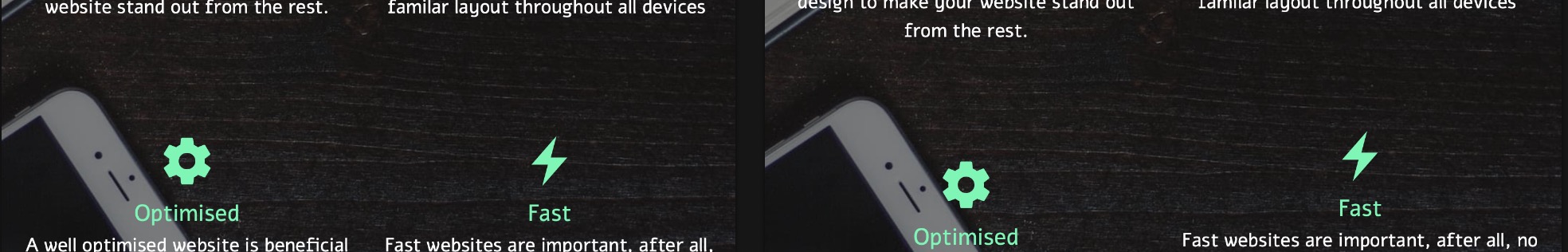
When viewed on a iPad Portrait and iPad Pro 10.5", I’m unable to get them aligned properly. I’ve tried adjusting padding and margins on a lot of the brics/colums/rows etc which make it better, but then the iPad view gets messed up, it seems I have to have one or the other looking wrong?
The answer is staring you in the face. The third element has more text at the top, going on to a second line, which is forcing the icon lower. Either reduce the length of that sentence or use a freehand custom class to extend the others.
1 Like
Managed to sort it. The problem was if I added more text onto the fourth element, it would push the element below down further, thus aligning the fourth elements properly but then the second element would be out of alignment due to going onto a new line as they are both tablet views but different resolutions.
Hence why if I used a freehand custom class it applies to both since they are both tablet views…
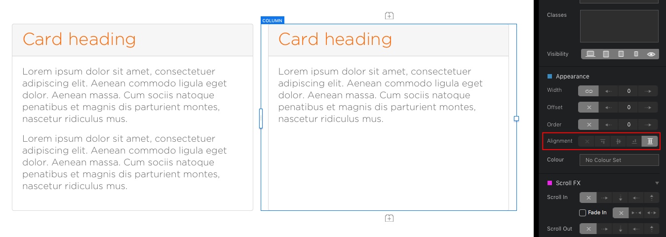
In situations like these full column alignment can often make life easier. All columns then extend to match the one with the most content.
3 Likes
Learn something new everyday! I’ll check it out. Thanks @Flashman