Apologies if this has been answered or its a daft question. i am not too familiar with Columns, and so cannot find a way around this!
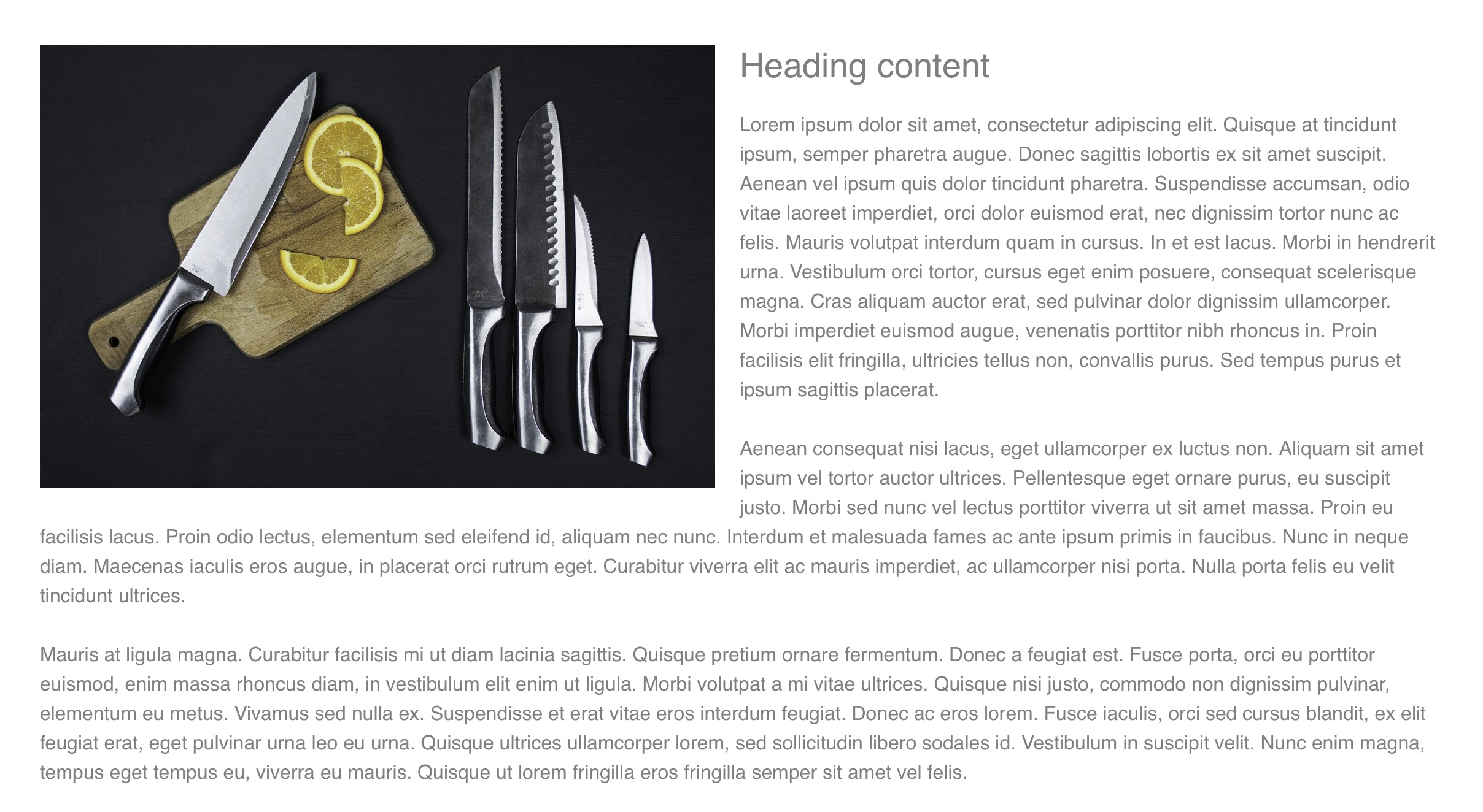
The shot below is how i would like the ‘main site to look’ the text wrapped around the picture. I achieved this by using 2 columns, one with a picture, the other with ‘paragraph’, then another full length paragraph below it, and all looks ok.
However, when i scale down to check responsiveness at the different points it looks terrible and i have no idea how to achieve the same, but then have the text below the picture in the smaller views.
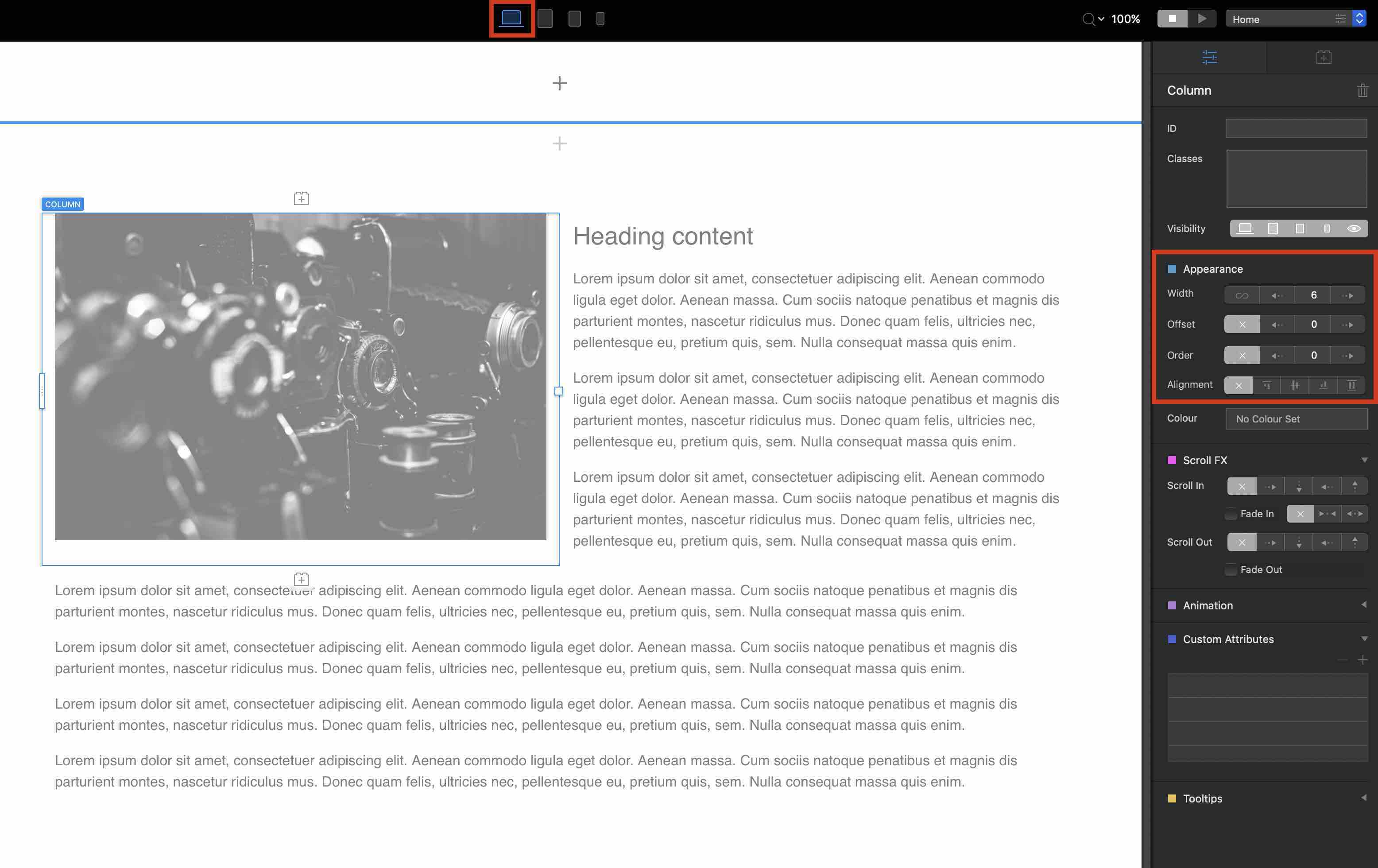
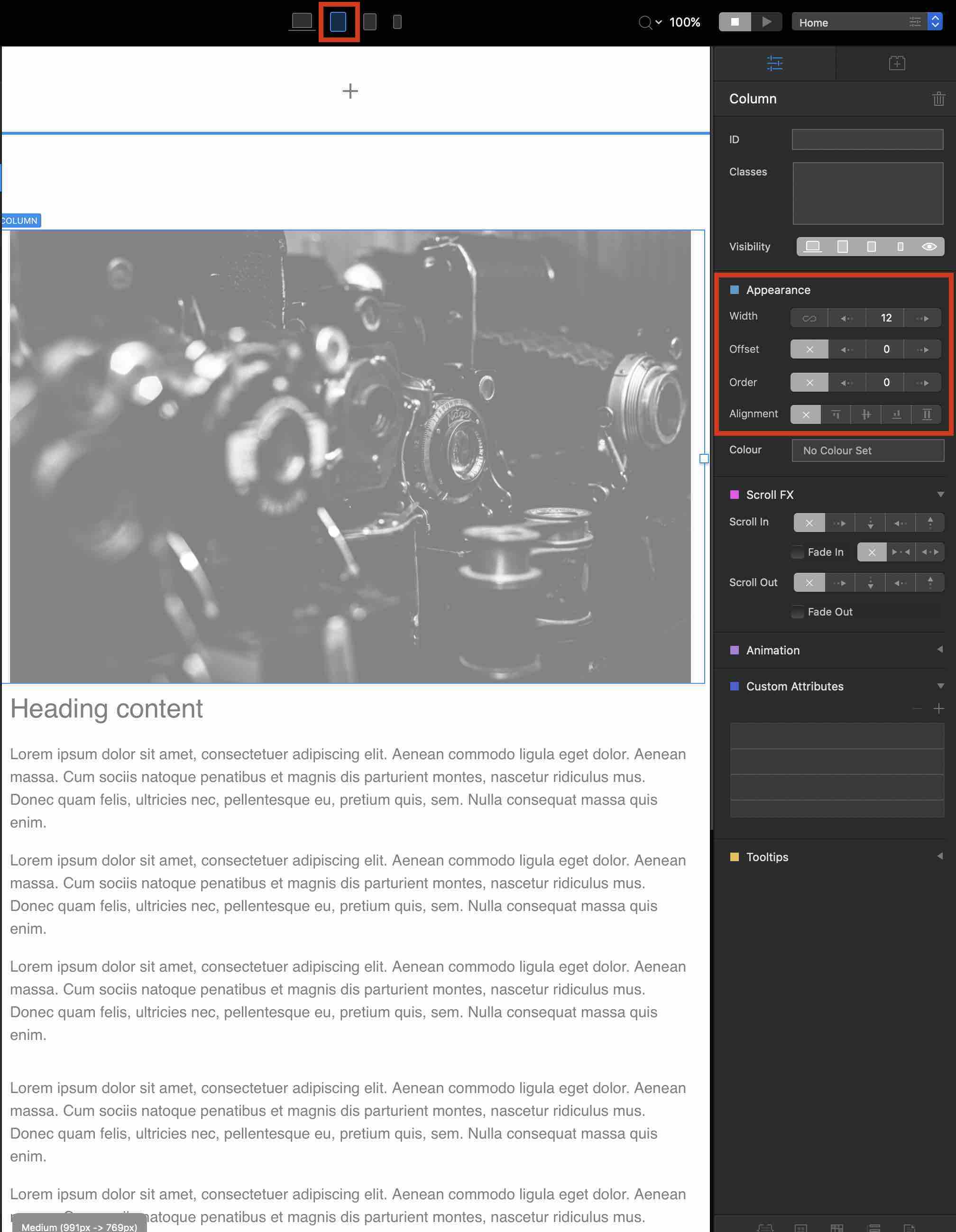
You can easily do this by using three columns and then design it the way you want with the “Appearance” settings in the sidebar using different break points (in the menu above the canvas).
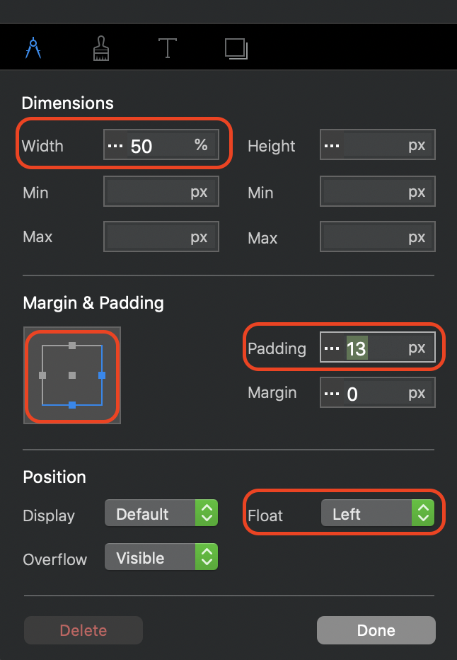
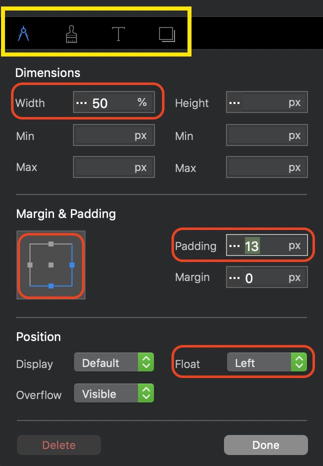
Add a div bric. Inside the div add your image bric (full width) and immediately under the image add your paragraph text. Select the image and create a custom class (call it something like text-wrap). In the class editor window set the width you want for your image and select Float left in the position area. Select the bottom and right margins and adjust the padding to create some space between the image and the surrounding text.
For mobile devices, you only have to set the width of the image to 100% in the class editor. This will place your text underneath the image. Of course, if you still want to use the wrap text feature, you’ll have to scale your images to whatever sizes you want. But, the text will still wrap.
Indeed. So essentially I followed @Ghost suggestion of using a 3 columned approach. Works well, need to make sure the other breakpoints are sorted too and check a second time to make sure but it worked well
Personally, I prefer the div method because it doesn’t require the use of multiple columns and the div is responsive - it will scale everything to suit the various breakpoints. But, just like everything else in Blocs, it may require a little tweaking of the custom class to make it look better on different device screens. Ultimately, if one solution works for a particular user, that’s the one they will always use.
Well, there are usually always different solutions to different problems, and that’s a good thing. Everyone can choose the approach that suits them best for their problem.
Hi @LumerianMedia, Malachiman means the little menu icons in the CSS style you’ve created. All the options are there in the current blocs, they’re just found by clicking different icons along the top of the style interface.
To recap for someone, like myself, totally new to blocs…
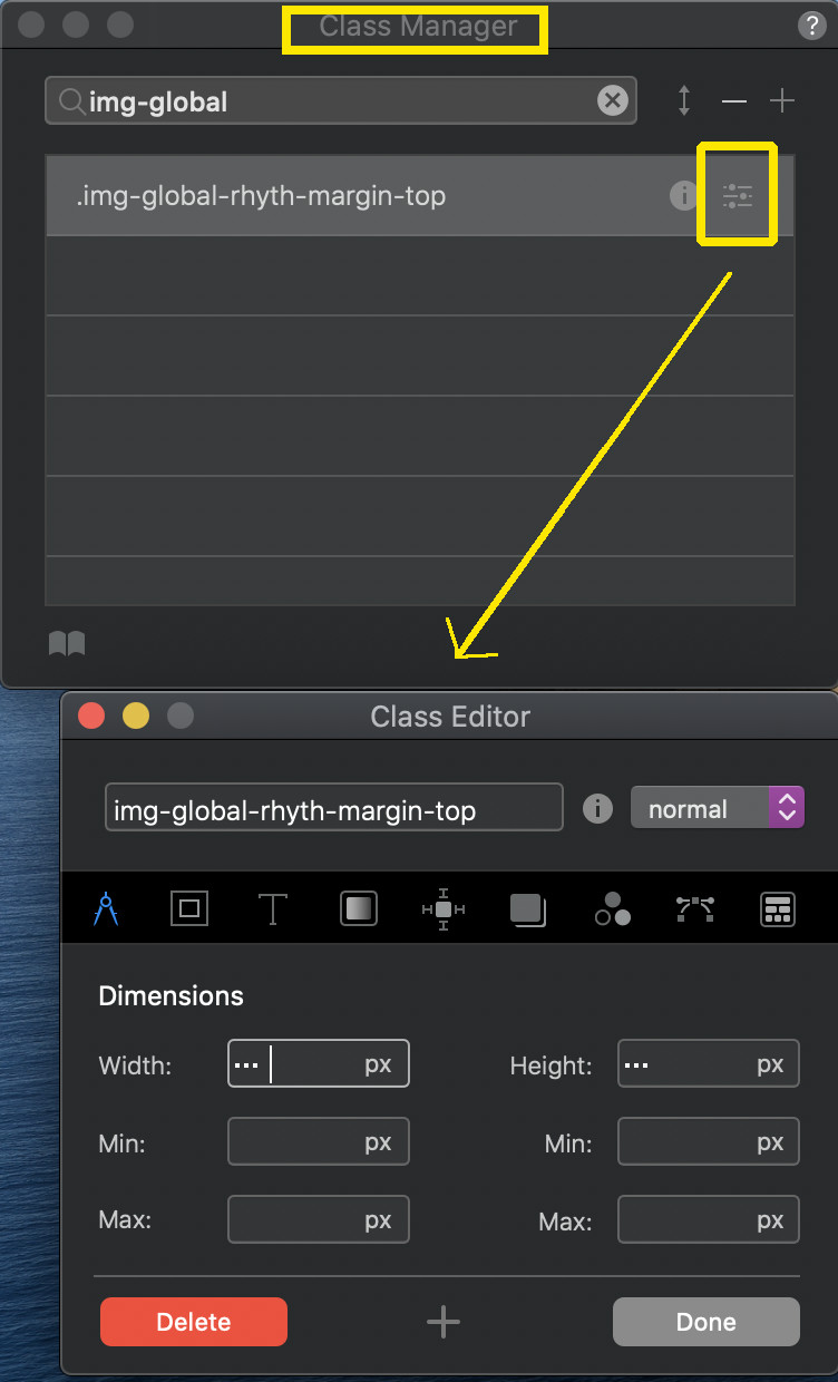
If you don’t see the Class Editor under the Window menu,
You can click on Class Manager, then to the side of the selected class you want to modify click on the little ‘Settings’ icon to the right in that specific row…THAT will open the Class Editor.
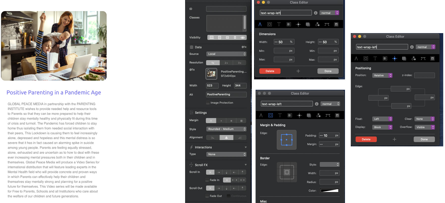
Well one step closer…
I selected the image and tried to duplicate what I saw in hendon52 image…
I’m showing 3 views of the same Class Editor in the attached image.
But still…the text does not wrap. What am I missing?!
ARG!