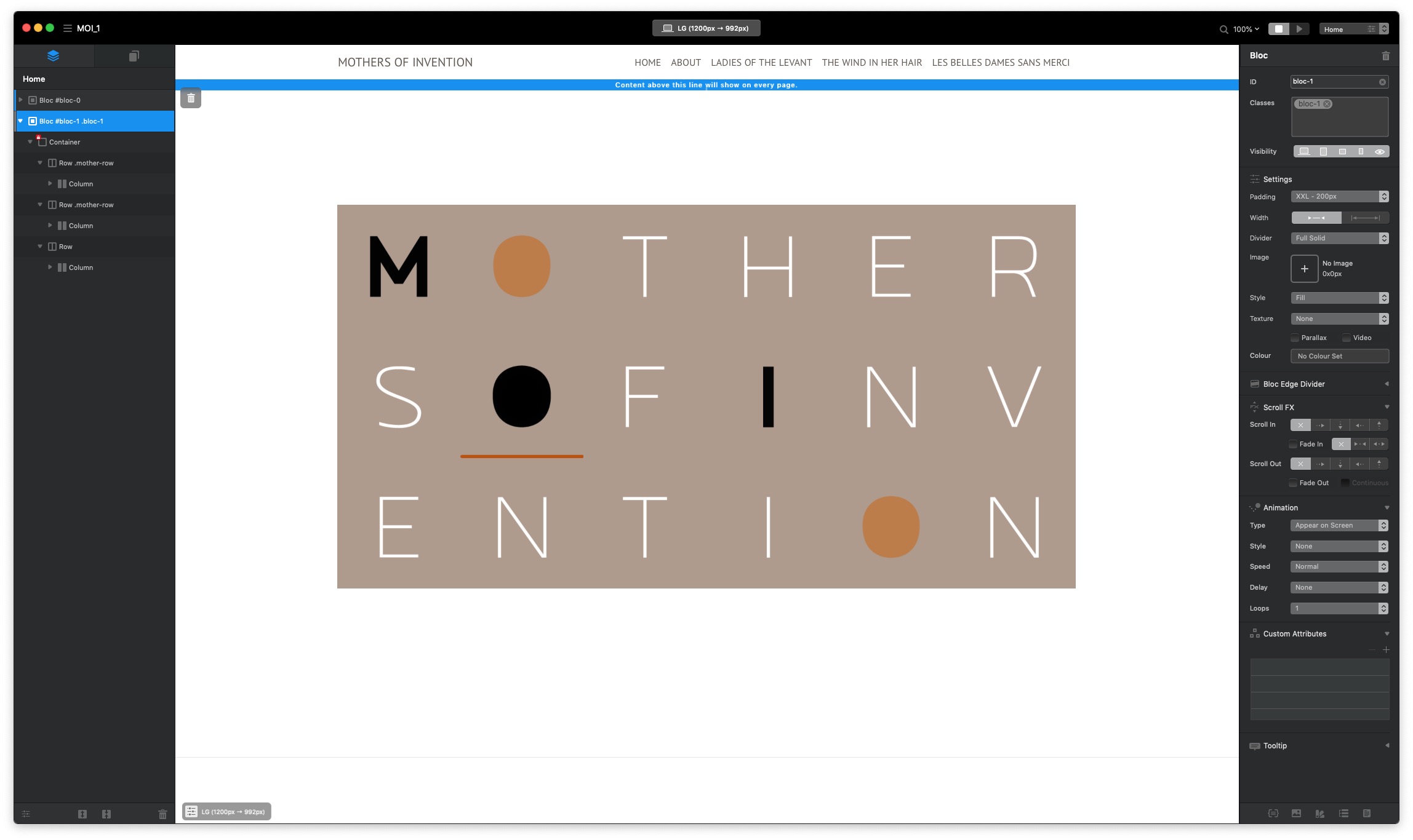
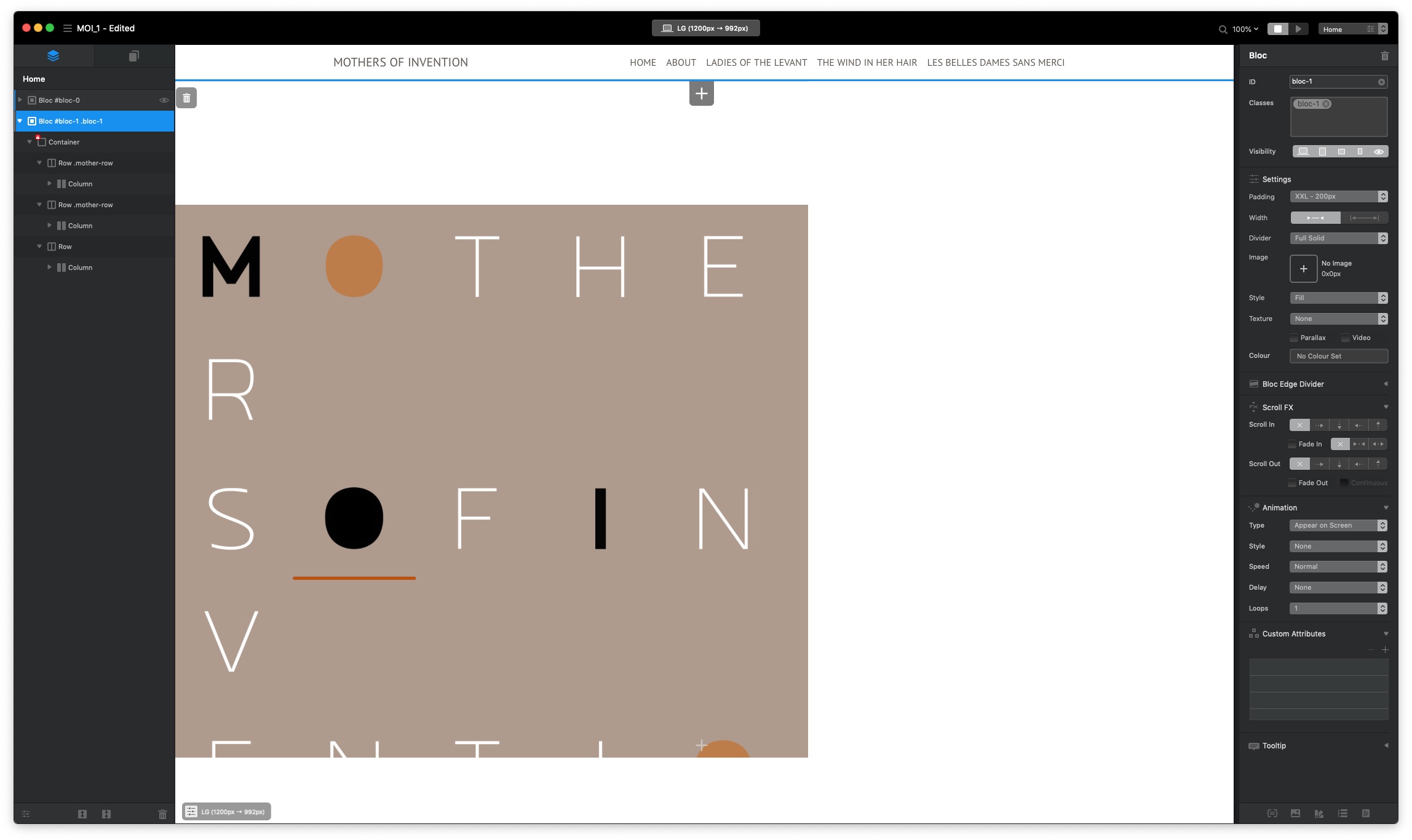
How do I decrease the overall size of the splash page image, which consists of 18 separate images in 3 rows?
Do I address the bloc? I tried adjusting the width at various percentage points for the class blocs-1, and all it did was slice the image and move it over to the side.
Do I address the container instead?
Or do I have to adjust each and every font element separately?
That worked absolutely perfectly. Thank you SO much.
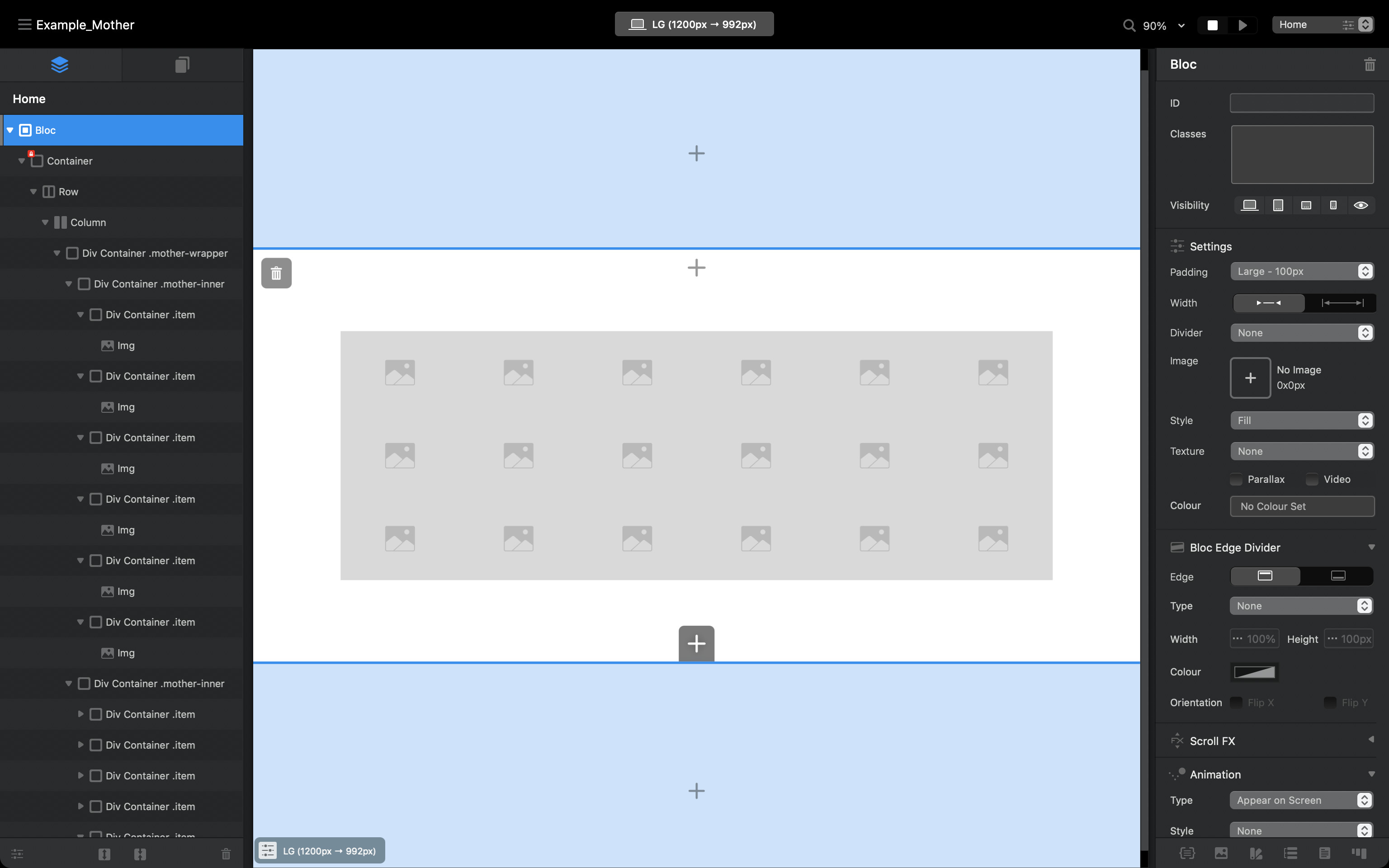
But the logic completely eludes me. Why, for instance, would a div work when a regular container appeared not to. And, if you have a moment and would be so kind:
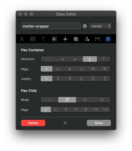
What are the wrap options in the flex category, and what do they actually mean?
Why is the direction of the flex container pointed down?
The flex direction down is for the 3 rows. They are vertical. Flex effects child elements. Then each div row has a horizontal direction with wrapping turned off for each div inside it. Each of those item div holds an image. The image will fit the div.
If that’s as clear as mud, watch the video @Jerry posted above. Flex is very handy, just takes a little bit to get your head around. I use it all the time, it’s very useful.