I need help to prevent portrait oriented images from expanding outside of the browser view.
I have series of horizontal and vertical photographs all with the same 2/3 or 3/2 aspect ratio (pixel size - 1465x1025 or 1025x1465. These are on on a sequence of individual pages with individual text captions, etc.
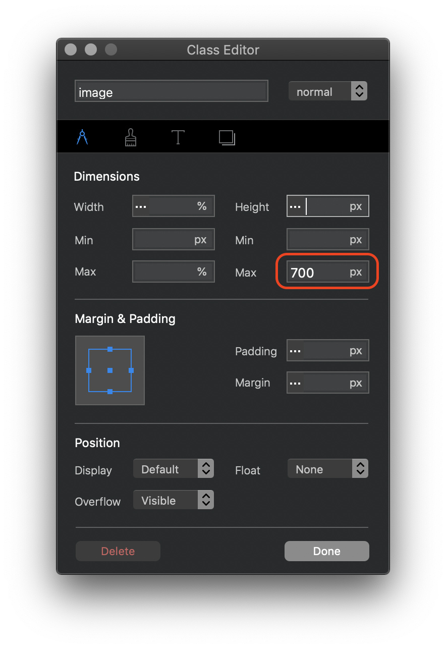
The horizontals expand into the space allocated for them in the browser and respond properly and responsively to changes in the browser size. The verticals (portrait) fill the entire browser with the image extending out of the browser space. They are responsive but the whole image can only be seen at the mobile phone size.
How do I limit the sizing of vertical images so they remain visible at all browser sizes?