I’ll try to explain as best I can, and offer one method I can think of (there may be other methods, that someone more experienced than me can offer…)
It appears you have the image successfully placed as you desire in your screen capture, so the next step is really what you will be adding to what you’ve already achieved –
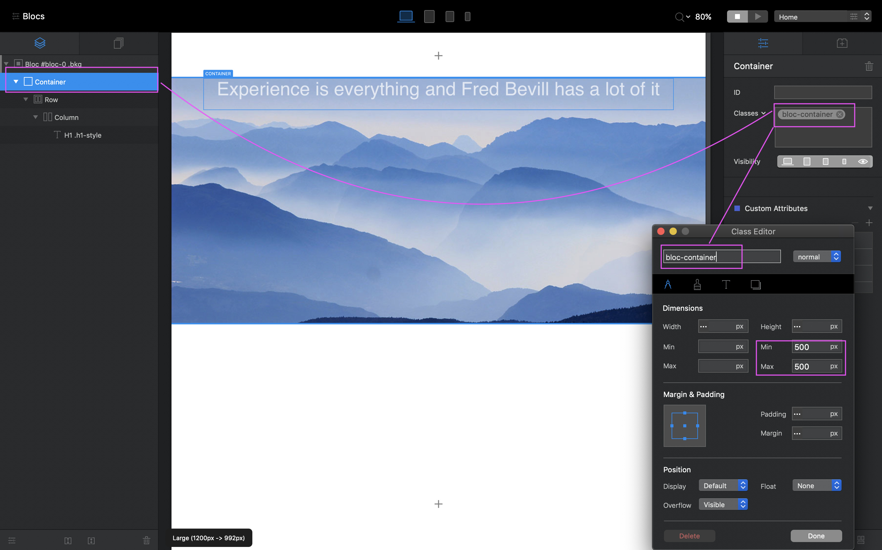
Create a Custom Class for the Container seen in the Layer Tree, so that you can constrain the size of the Container, as the Container will enlarge according to any elements placed in it, including any padding adjustments you make for the elements within the container, such as trying to position the h1 with padding.
So, using my example, make changes to the Container max/min settings to constrain the container to the size you want the picture to be.
Then create a Custom Class for the H1, and adjust the top margin to place it lower within in the Container and to where you wish it, and because the Container is constrained by it’s Custom Class, the H1 margin should not impact the Container size, which results in not stretching the background picture.
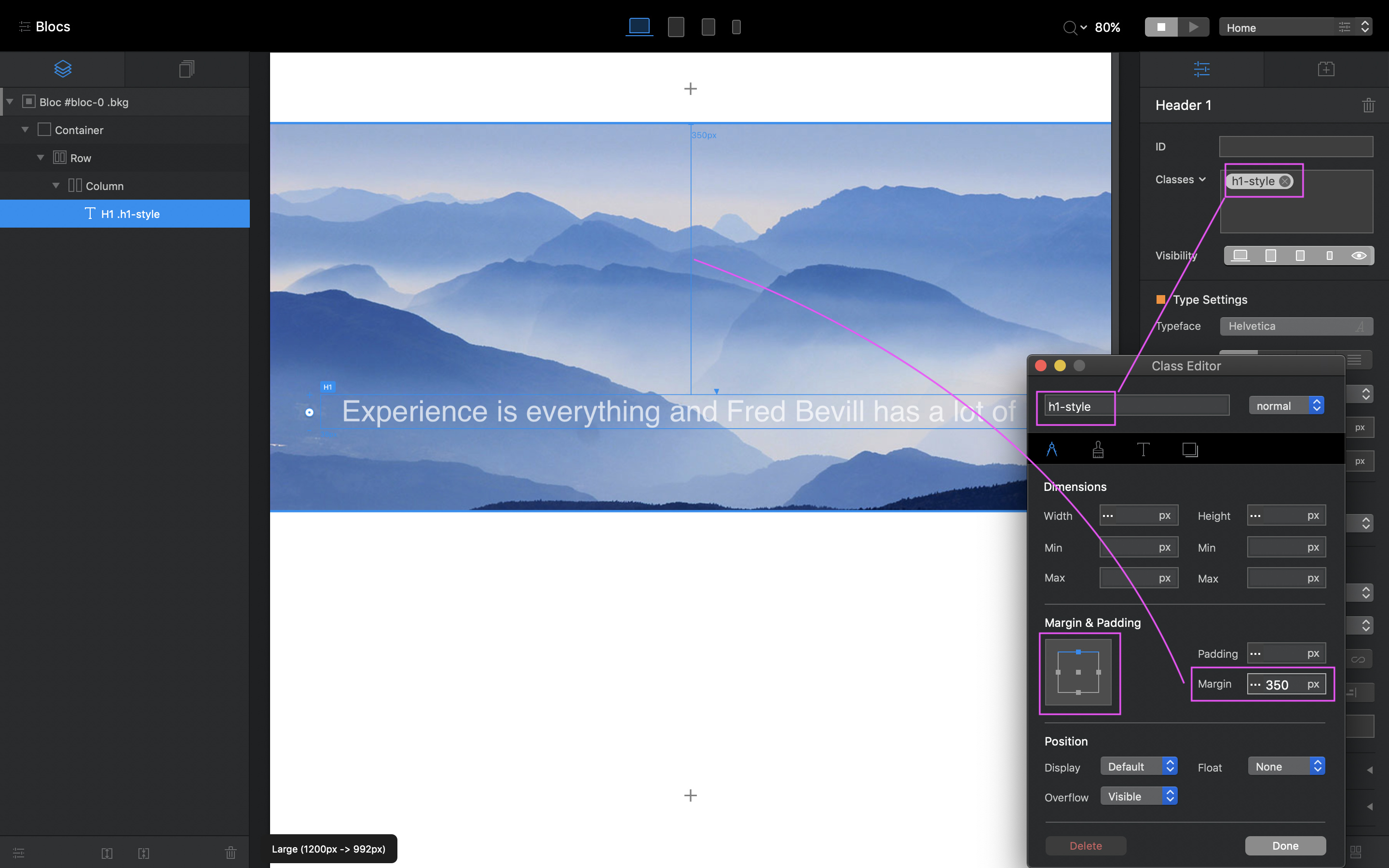
As you can see, the picture doesn’t change when adding the Margin change for the H1.
Hope that makes sense.
That said, I’m not sure how this will affect the responsiveness of the image itself at smaller breakpoints, which is why I suggest you view the video link above. However, because you have the two Custom Classes (Container + H1) you can adjust those per Breakpoint.