I’m loving Blocs but I’m having a hard time figuring out how I can adjust the text placement in a block without making the background photo grow or shrink in size.
In Webflow I had the option to position text “relative” to the “section” or in this case a “Bloc.” All I can figure out at the moment is the ability to move text around using padding or margins. Unfortunately if I want to put text at the bottom of my background photo it will only go to a certain point and then start making the background image larger. So the bigger the padding, the bigger the image.
Is there a way to place text within a background image without adjusting the size of the image??
Can you take a screen capture and post, that shows where the picture is placed, ie. as a bloc background, or as a column background, or an image in a column? What structure did you use? And what settings in the property panel do you have?
I’ll try to explain as best I can, and offer one method I can think of (there may be other methods, that someone more experienced than me can offer…)
It appears you have the image successfully placed as you desire in your screen capture, so the next step is really what you will be adding to what you’ve already achieved –
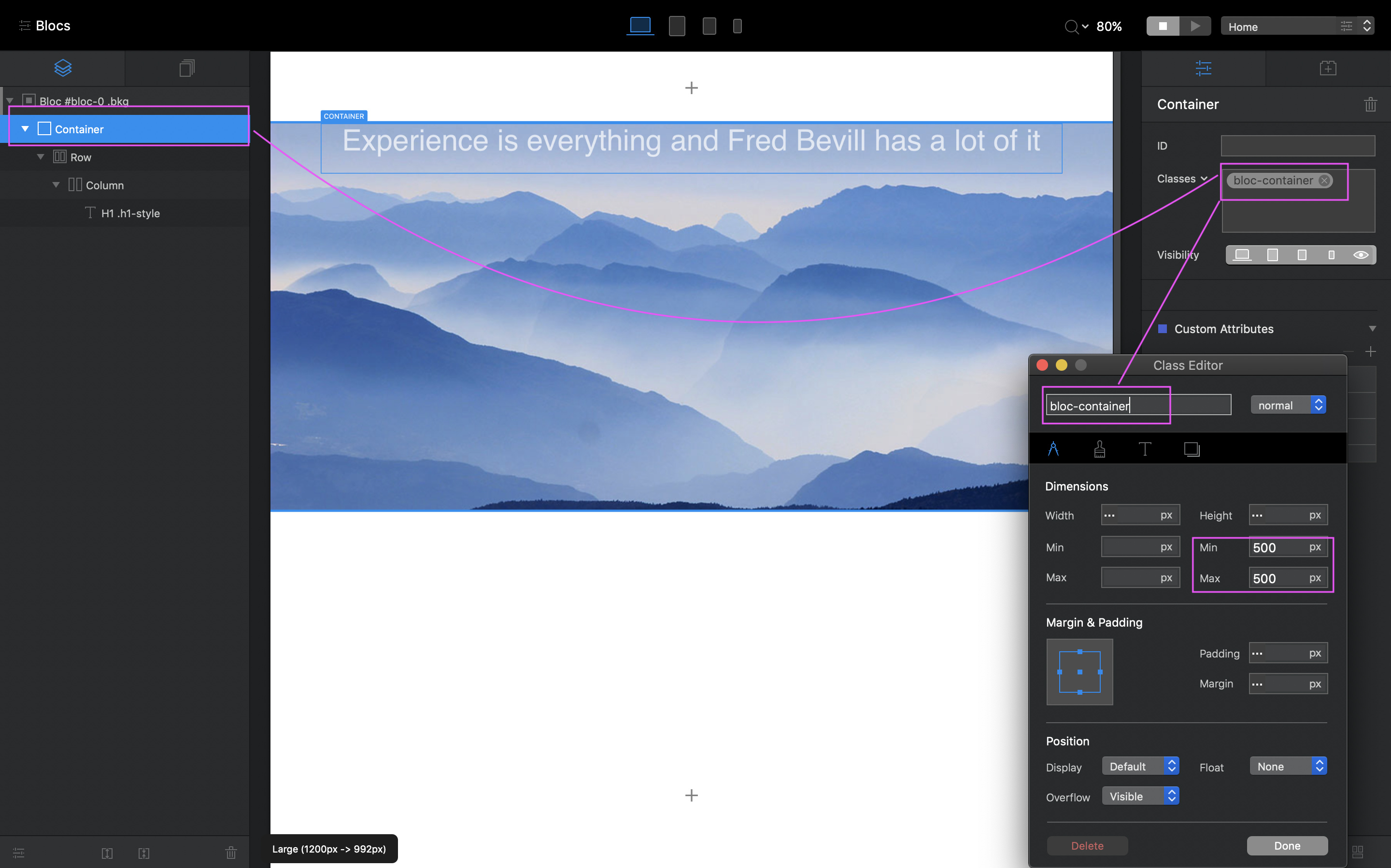
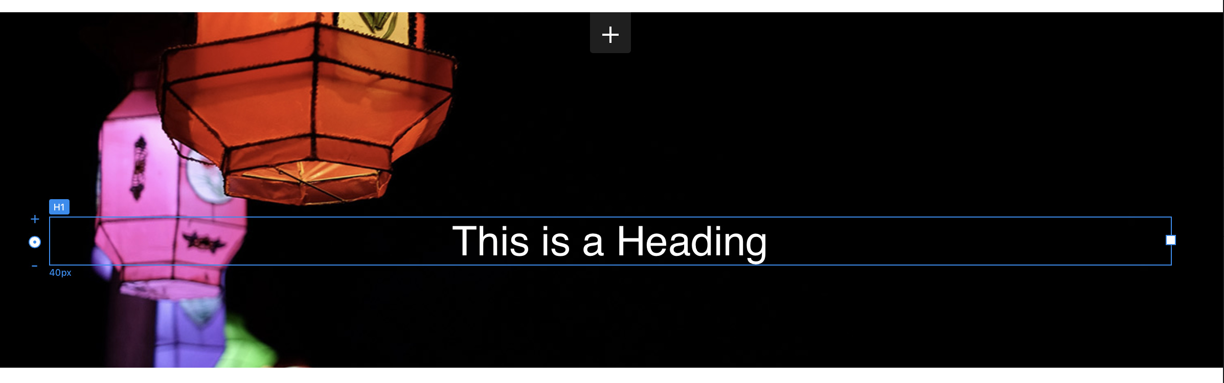
Create a Custom Class for the Container seen in the Layer Tree, so that you can constrain the size of the Container, as the Container will enlarge according to any elements placed in it, including any padding adjustments you make for the elements within the container, such as trying to position the h1 with padding.
So, using my example, make changes to the Container max/min settings to constrain the container to the size you want the picture to be.
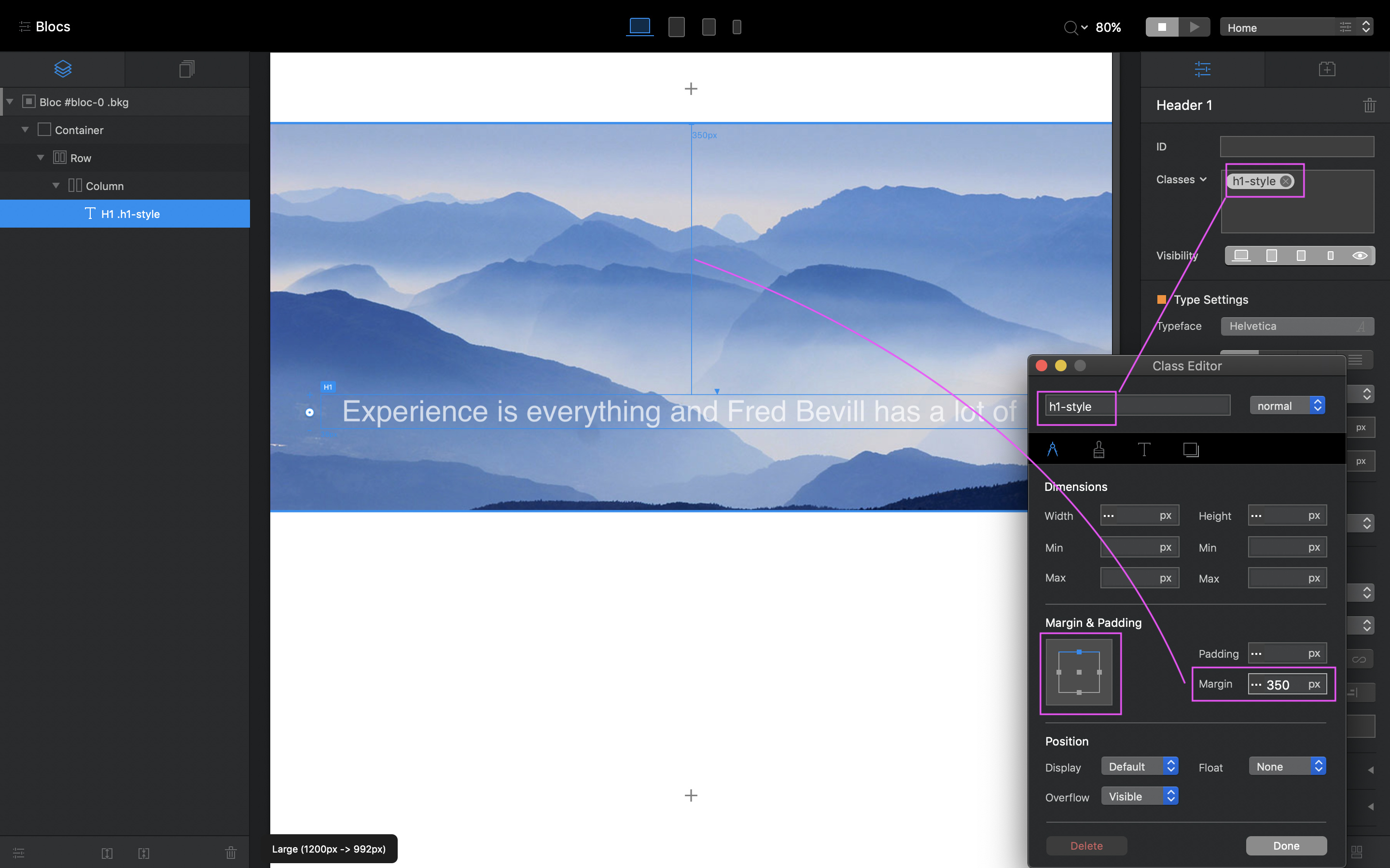
Then create a Custom Class for the H1, and adjust the topmargin to place it lower within in the Container and to where you wish it, and because the Container is constrained by it’s Custom Class, the H1 margin should not impact the Container size, which results in not stretching the background picture.
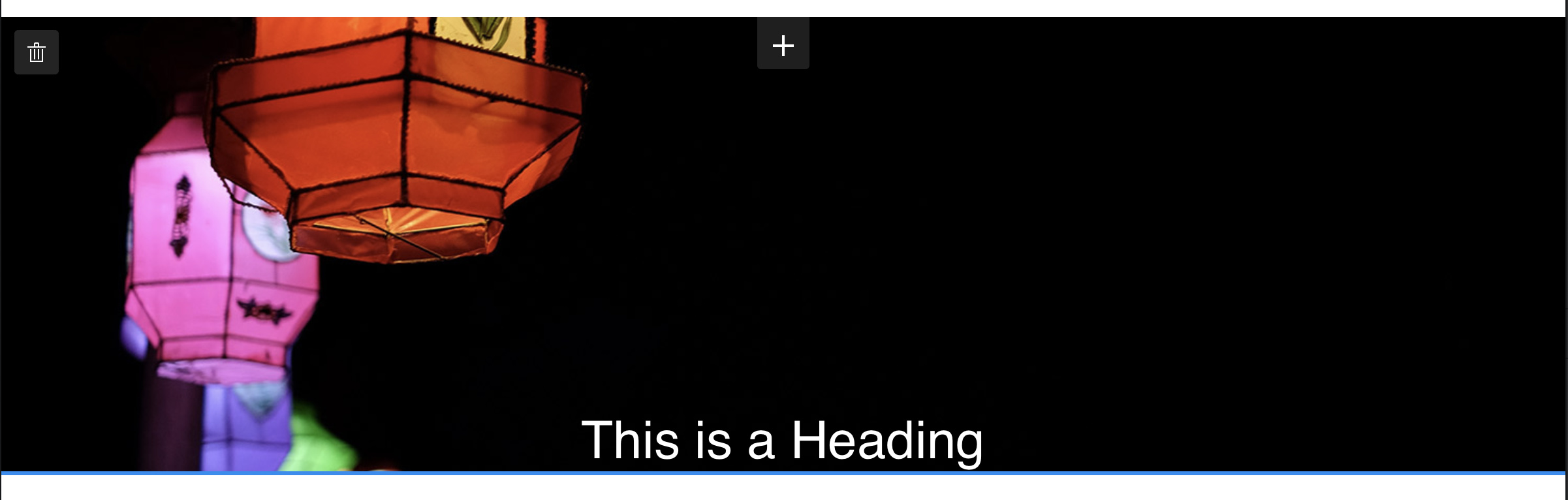
As you can see, the picture doesn’t change when adding the Margin change for the H1.
Hope that makes sense.
That said, I’m not sure how this will affect the responsiveness of the image itself at smaller breakpoints, which is why I suggest you view the video link above. However, because you have the two Custom Classes (Container + H1) you can adjust those per Breakpoint.
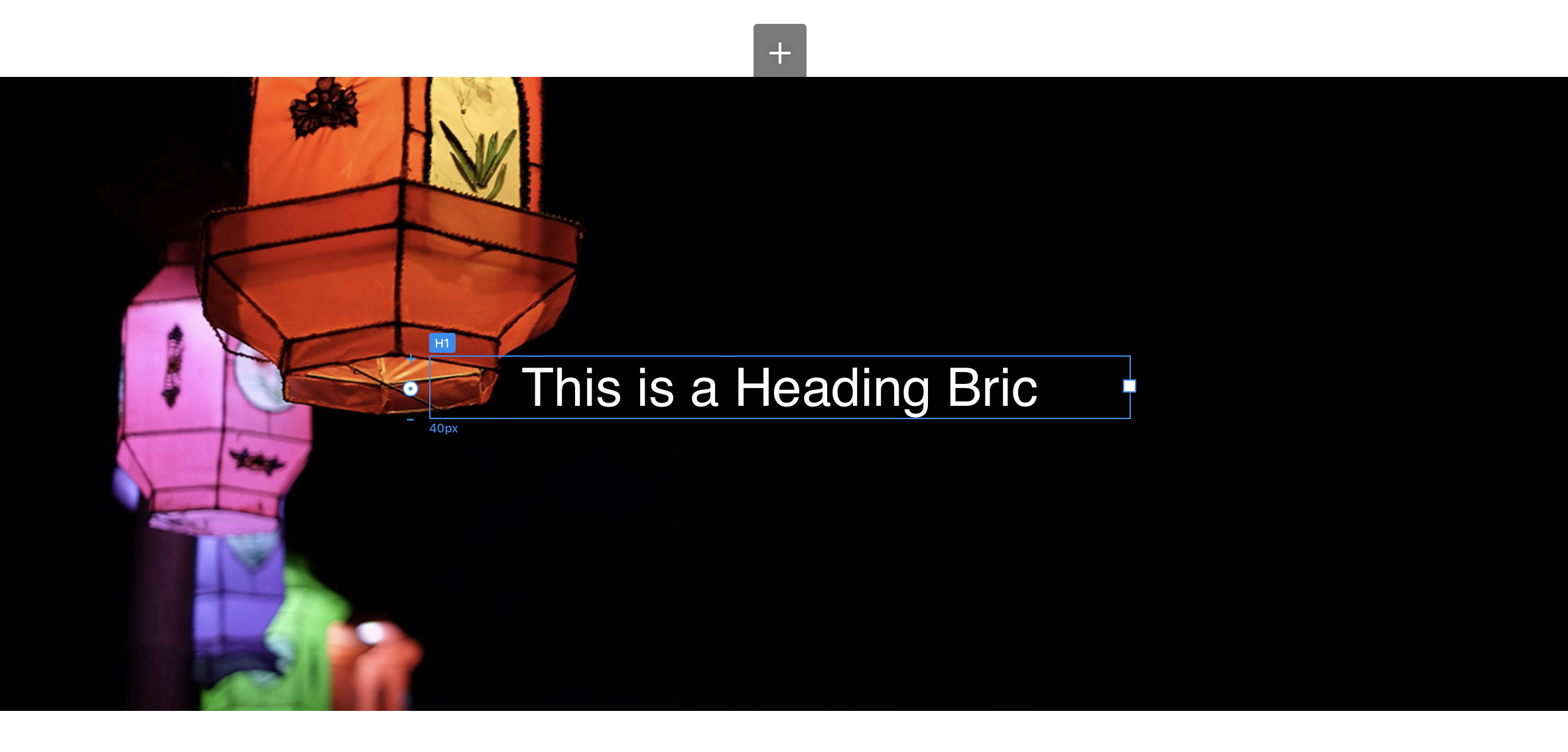
Background images take on the dimensions of the bloc they are placed in. The size of the block is determined by the content PLUS the padding of the bloc. In this situation, one line of text placed in the centre of the bloc will create this sort of result.
This is because the standard padding option in the properties panel applies equal padding to the top and the bottom of the bloc so as to keep the visual appearance of content being placed in the middle of the bloc.
If you add top margin to the heading bric through a custom class. it will extend the size of the bloc because it’s trying to keep the bottom padding of the bloc. To solve the issue, remove the block padding in the properties panel (set it to none). You end up with something like this:
Now select the paragraph bric and create a custom class. Apply top heading and adjust the slider to move the text down. This will keep the text at the bottom of the image, whilst extending the height of the bloc, and its image, to any dimension you want.
You can then switch to other breakpoints and adjust the same custom class to create the image height you want for other devices - the text will remain pinned to the bottom of the image.
hey @hendon52 – What if you don’t want the text to be at the very bottom, but perhaps .25% from the bottom, yet you want the picture to be a certain dimension? His picture is a map which has a particular dimension, which I understand he wants visible, but have the text lower than the middle of the screen, but not necessarily directly at the bottom.
okay, but by adding bottom margin to the text’s custom class, this too changes the size of the container, and so the height of the bloc, and thus the appearance of the bloc’s background picture.
This is what happens when I try it out.
It seems to me that you have to constrain the container that the text is in to the desired image height, using the same min/max height values (i.e 500px) in a custom class for the container, and then move the text down with top margin. And at each breakpoint, adjust the container min/max height setting, and the text margin, to maintain a consistent visible image result across breakpoints.
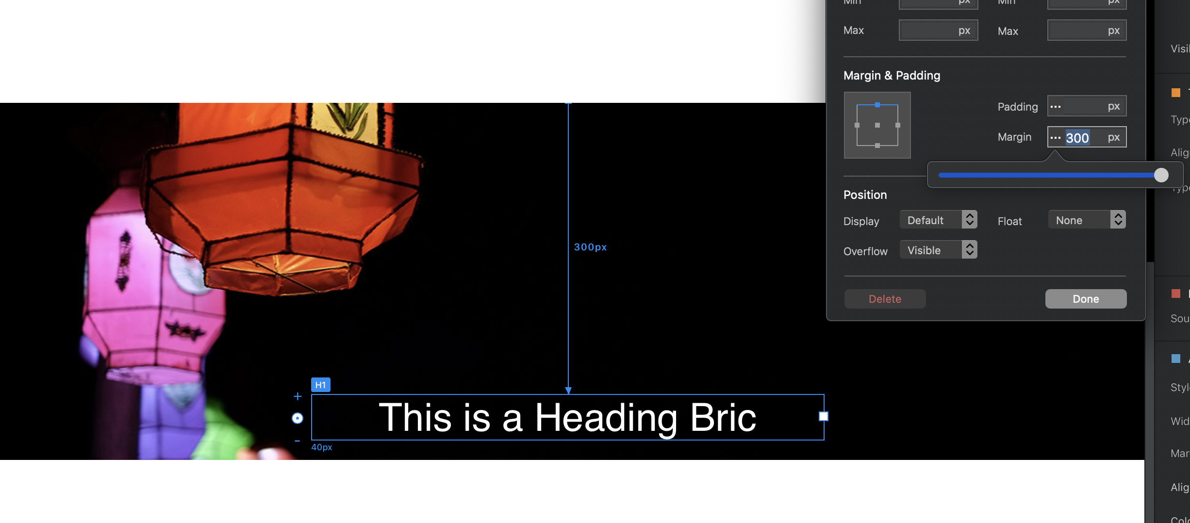
Yes, that’s it exactly. The container (the bloc) expands to accommodate any positive margin applied to the content whether it’s the top or the bottom. So, removing the bloc padding basically ensures that the padding isn’t being figured into the calculation. If you set the top margin to say 300 and the bottom margin to 0, the text will sit at the bottom of the bloc, like so.
ah, so you reduce the top margin when adding the bottom margin to even out the container size – this bit was not clear in your otherwise clear description.
And so, the same result is achieved in managing the Container size with min/max, but using a different method.
I wonder if there is any advantage / or disadvantage to either method – perhaps in responsiveness?