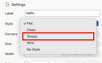
Basically I have a glossy button with a custom style. I NEVER set it to ‘grey’ anywhere in the UI.
However, after clicking it and the modal disappearing, it’s no longer glossy but flat and it’s grey - which as I said, isn’t even in the colour swatch of the site.
If I click on the background of the page and then scroll, the formatting style of the button returns to what it should be.
No where in the custom style ‘btn-style’ is there a setting to change the Style to or from ‘Glossy’… so I have no idea how it’s losing and gaining that.
Set the button style to flat and inside the class you create change the :focus and :visited colors so when the modal launches and closes it shows the color you want
Yes, I know - that’s how I chose Glossy in the first place… but that doesn’t explain why it’s changing on it’s own and in the custom class for the button there is no way to choose any of those options!
Also, it should be easy to test. Create a glossy button, add a custom class to give it a non-grey colour and then make it show a modal. When you dismiss the modal you’ll see how it glitches back to flat.
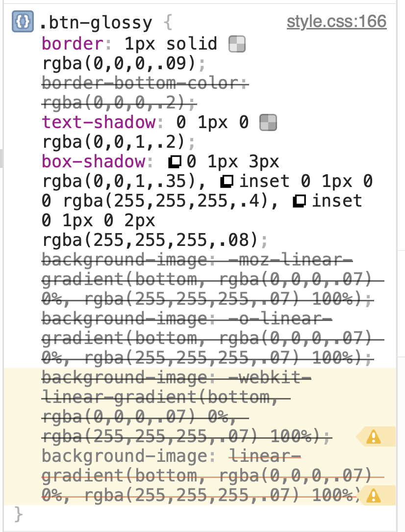
I can replicate it. I have tried using the class btn-glossy to override the bootstrap defaults, I have tried subclassing btn-glossy, all the same. Seems like when the modal is dismissed it leaved the viewport in a focused state, as clicking outside the viewport restores the glossy button. Something about the state the viewport is left in when the modal is dismissed removes the gloss from the button, even though the glossy class remains intact in the dom.
This is whats suppose to happen, its standard accessibility and not a bug.
When a modal closes, the element that triggered the modal becomes set to focus. Selecting outside of that element removes its focus, which is why it goes back to a normal state.
So people who use the keyboard for navigation, do not get lost, it returns them back to where they were when they interacted with the page.
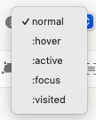
You can style it with the state :focus as @BLOCS-Freak mentions above.
Ideally Blocs should include an option for including the focus state with the hover style. But I suspect it’s an old part of Blocs where accessibility wasn’t really considered in terms of simplicity for user design.
Yes, just spotted live in the inspector, when the modal closes the linear gradient overlay is removed along with the inset box shadow. Bit not sure you could stop that happening with the Blocs class inspector. Even with the focus state selected If you can you’d need an exact match by inspecting the CSS for the normal state, and replicate it in focus state in class inspector. A chore at best.
Best workaround so it looks purposeful for a glassy button is the the class btn-primary, glassy selected. set your button background colours for focused, active, hover etc (in this case I set focused to green) When the modal is dismissed the focused state is applied and we get a meaningful focus ring on teh calling button
I vehemently disagree that this is correct behaviour. A Glassy button should never appear or be set to FLAT regardless of what else is going on, on the page.
This is clearly a bug and the fact that it’s ignoring the Glossy state, and that Glossy/Flat et al are missed from the Class Manager options is also clearly a bug.
I have set the background colours for all the associated states. But it still looks stupid, turning flat and being the odd button out on screen until you click on the background and scroll. It looks like what it is - an ugly bug.
The glossy button styling just gets over-ridden by the Bootstrap CSS. More an oversight in the styling Blocs applies not being setup for the active state. Pretty sure it’s been like this forever.
IMO Semantics. I don’t see it as broken, just an oversight (easy to happen). It never bothered me, because I always styled from flat or none, and applied states.
Either way, it’s not expected behaviour, regarding the styling, based on the goals Blocs tries to achieve as a visual page builder.
But the functionality you mentioned, that I explained, is correct.
 If you can you’d need an exact match by inspecting the CSS for the normal state, and replicate it in focus state in class inspector. A chore at best.