I may be old school but it’s 3 for me. Feels more controlled and more consistent cross platform.
Andy
1 Like
What I like:
Version 3 
Your choice of visuals
Your text styling and placement
What I don’t like:
Way too much Bewegung , Parallax … 
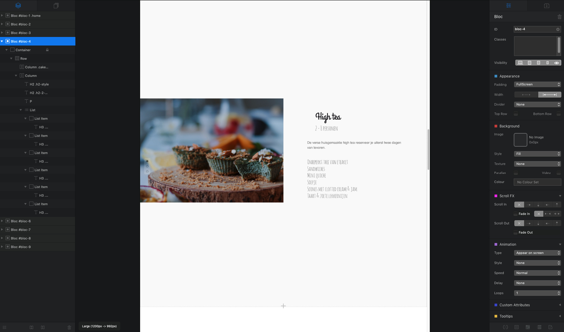
Hi @Nyokhix
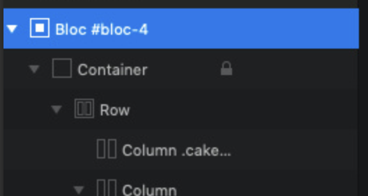
The reason is that you have set the image in a column (column.cake) whereas you are to set the image to the background of Bloc 4.
Left hand side:
Right hand side where you are to set the image:
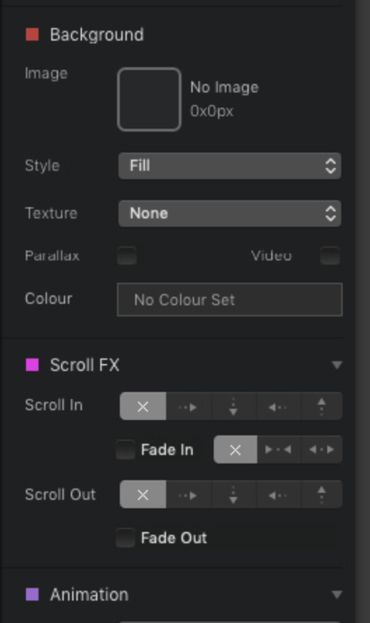
To add the image to the background simply click pithing the image well under Background on the right hand side. Make sure that Bloc 4 is selected (in blue) on the left hand side.
MDS
1 Like
thank you this worked perfectly!
You’re welcome.
MDS
Can you edit the dots background with any class? if you set a dark alpha background it will contrast with the white dots and you will always read it clearly . I think its the best option. White margins make the page look like they have a programming flaw and they are not responsive enough, if you switch this to another color it will look like a design decision.
1 Like
Version 1 hands down. The snap scroll frames the content site really well while the others take away from how well you’ve designed the various sections. Really nice job BTW.
1 Like
@RME I know a lot have replied but I was wondering if you set it for a full screen but give it a left-hand margin? Fills the screen, but keeps the white space on the left-side for snap-scroll.
casey
Hey @casey1823 I did it, because it is not as at all other pages. After the different feedbacks i did change it to fullscreen. I ll show you the pages later.
1 Like
Nice work! I vote for version 3.
1 Like
Version 4: Snapscroll, no border.
good work !
What I like . Version 1.
Hi,
I also think that Version no 1 without border is the best there are two Short Lines Right and left donˋt See Any Use
Thank you for the many opinions. I think the Snap Scroll effect is very cool. But there are some problems.
I think the scroll effect is good for one-pagers with less content. Here you can use large pictures and little text. If you have more content, it will be difficult to create a perfect website. The content must fit on different screen sizes.
For multipage websites, navigation is complicated for many visitors. I tested it. Many have not found their way around the two menus. At the top of the page is the normal menu and on the left is the menu to scroll.
Easy navigation is very important on a perfect website. For these many reasons, I decided to design my new website without scroll effect.
4 Likes
Hey guys, I want to share my new project with you. This is the result www.trippen.rmemedia.de
Any recommendations or feedback? Thanks ![]()
Hi @RME
I like the header icons with modal info, I’ll be noting that.
On smaller viewports the hamburger menu background is transparent.
This makes it very hard to read. Maybe a mid to high opacity would be better.
Andy
1 Like
Hey @apswoodwork oh i see. I forgot the background image. Thanks.
Very nice @RME. Don’t you just love how Blocs just keeps getting better? With your skill, and eye for design it really shows what Blocs can do. I love the modals.
casey
Thank you @casey1823 I used many modals for contact, forms and feedbacks. I appreciate your feedback 
1 Like