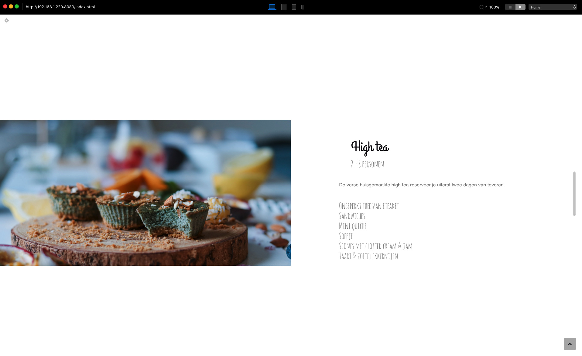
Hey guys, im working on a new website. i have 3 versions for desktop of the site. i would like to replace my existing page. my question is, what site do you like the most.
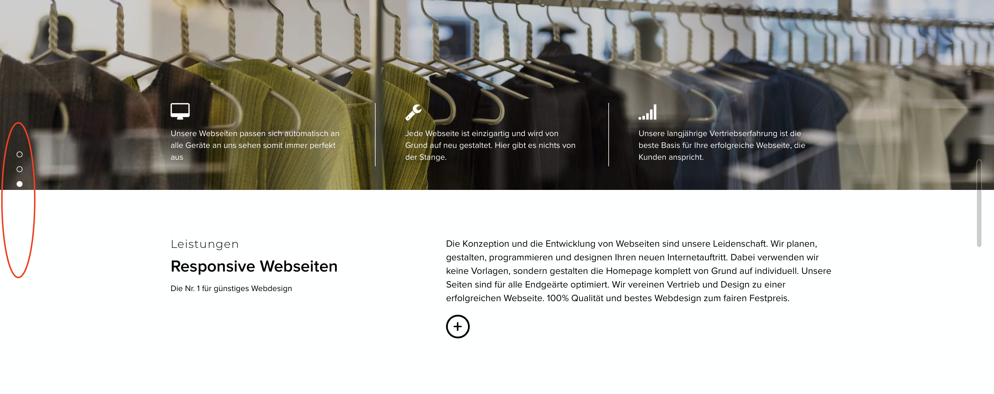
how did you manage to get the boss at full height and responsive to height in version 1.
and how did you get the images to full width like in version 3
im struggling with a similar issue at the moment
I tried snapscroll on a recent project, but it’s impossible to eliminate bloc names from the side that you don’t want, which rather damages the overall appearance. To avoid that you have to do a lot of messing around to avoid seeing bloc 7 or footer appear in the list. Is there a way to colour the text to something other than dark or light?
Another vote for version one with a slight caveat that snapscroll can feel a bit laggy on older computers. That almost feels like a magazine when you are flicking through.
im not sure with the fullscreen version because the dots disappear on the white background. black dots disappear on the dark background. it is not a 100% solution for me
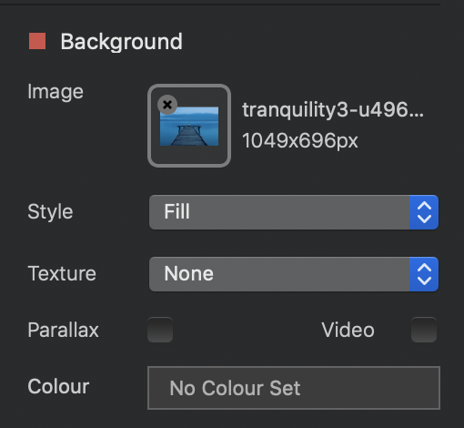
…just to confirm, the image is set for the Bloc background setting, not within an element in the Bloc, like a column?
So, if you have indeed selected the Bloc itself, and set the Bloc background in the right side bar with the Style to ‘Fill’ (and for good quality, be sure the picture is about 2400px wide in an image editor) then this is a strange behavior…
I personally am not such a fan of the snap scroll. So I went firstly for example 3.
However, I do like the version 1 and I especially like the page circle indicators on the left stripe. I just would change the stripe colour to fit it less contrasty or pronounced to the other pages. I don’t like the white right stripe.