Hi all, I’m able to replace the classic toggle button with an icon (see below). However, I’m struggling to place the icon nicely centered within the button itself. Does anyone have an idea/direction?
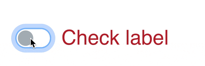
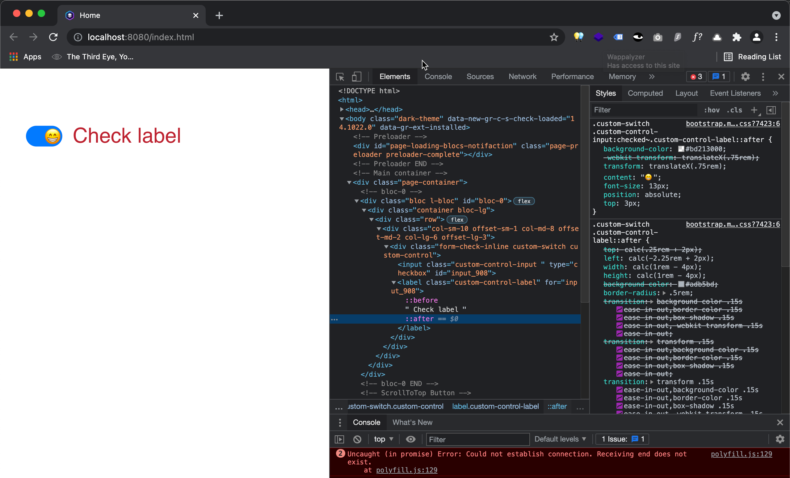
Hi @Pealco. I’m trying to add an icon centered in the toggle button (probably I’m using the wrong name as someone else was confused as well  ). I’ve set the opacity to 0% of the toggle and added an icon to the .custom-control-label::after class. When aligned the actual toggle has moved (obviously) outside the switch box. Am I able to center an Icon on top of the actual toggle?
I hope this clarifies.
I think I can’t fully understand what is going on, but hopefully this will help you:
For a Dark/light toggle check this one:
2 Likes
Hi @Pealco. Indeed this will be the best way forward. Amending the toggle baked into Blocs is a real mission. Replacing it will be easier and a time saver. Thanks for the pen’s proposed.
1 Like
Hello @Jerry, just in case you want one of them implemented in Blocs, add a Code Widget, and inside paste the following code:
<div class="emoji-toggle emoji-happy">
  <input type="checkbox" id="toggle1" class="toggle">
  <div class="emoji"></div>
  <label for="toggle1" class="well"></label>
</div>

<style>
@charset "UTF-8";
.emoji-toggle {
  position: relative;
  width: 60px;
  margin: 40px auto;
}
.emoji-toggle .well {
  display: block;
  background: #eee;
  height: 20px;
  border-radius: 10px;
  cursor: pointer;
}
.emoji-toggle .toggle {
  opacity: 0;
  border: 0;
  outline: none;
  height: 100%;
  width: 100%;
  background: transparent;
  position: absolute;
  cursor: pointer;
  z-index: 100;
}
.emoji-toggle .toggle ~ .emoji:before {
  content: "🐱";
  position: absolute;
  left: 0;
  top: -20px;
  font-size: 40px;
  transition: 0.2s;
}
.emoji-toggle .toggle:checked ~ .emoji:before {
  left: 100%;
  margin-left: -1em;
}
.emoji-toggle .toggle ~ label {
  white-space: nowrap;
}
.emoji-toggle .toggle ~ label:before {
  position: absolute;
  right: 100%;
  margin-right: 5px;
  top: 0;
}
.emoji-toggle .toggle ~ label:after {
  position: absolute;
  left: 100%;
  margin-left: 5px;
  top: 0;
}

.emoji-happy .toggle ~ .emoji:before {
  content: "😠";
}
.emoji-happy .toggle:checked ~ .emoji:before {
  content: "😄";
}
.emoji-happy .toggle ~ label:before {
  content: "Mad";
}
.emoji-happy .toggle ~ label:after {
  content: "Happy";
}
</style>
Hope it helps you…
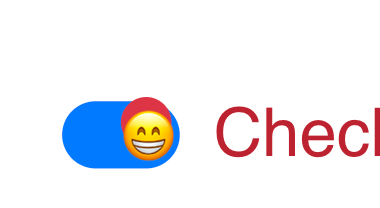
And for something “closer” for what you have there is the code:
<div class="emoji-toggle emoji-happy">
  <input type="checkbox" id="toggle1" class="toggle">
  <div class="emoji"></div>
  <label for="toggle1" class="well"></label>
</div>

<style>
@charset "UTF-8";
.emoji-toggle {
  position: relative;
  width: 100px;
  margin: 40px auto;
}
.emoji-toggle .well {
  display: block;
  background: #eee;
  height: 45px;
  border-radius: 35px;
  cursor: pointer;
}
.emoji-toggle .toggle {
  opacity: 0;
  border: 0;
  outline: none;
  height: 100%;
  width: 100%;
  background: transparent;
  position: absolute;
  cursor: pointer;
  z-index: 100;
}
.emoji-toggle .toggle ~ .emoji:before {
  content: "🐱";
  position: absolute;
  left: 0px;
  top: -8px;
  font-size: 40px;
  transition: 0.2s;

}
.emoji-toggle .toggle:checked ~ .emoji:before {
  left: 95%;
  margin-left: -1em;
}
.emoji-toggle .toggle ~ label {
  white-space: nowrap;
  background: blue;
}
.emoji-toggle .toggle ~ label:before {
  position: absolute;
  right: 100%;
  margin-right: 5px;
  top: 10px;
}
.emoji-toggle .toggle ~ label:after {
  position: absolute;
  left: 100%;
  margin-left: 5px;
  top: 10px;
}

.emoji-happy .toggle ~ .emoji:before {
  content: "⚪️";
}
.emoji-happy .toggle:checked ~ .emoji:before {
  content: "😄";
}
.emoji-happy .toggle ~ label:before {
  content: "";
}
.emoji-happy .toggle ~ label:after {
  content: "Check Label";
}
</style>
1 Like
