Any chance we could see Multicol in Blocs as described in the link below?
The magic is that “You do not need to add Media Queries and change the number of columns for various breakpoints, instead we specify an optimal width and the browser will work it out.”
The custom “masonry gallery bric” provided as part of the developer api uses “columns” if I recall correctly. With that, in the appearance sidebar you can add/remove images so the basic integration of using and interacting with columns has already been proven in app and the UI.
So I would think it would be possible to have a generic column bric and allow the column settings to be set via the sidebar. Allowing users to drop in various content visually and adjust settings. But only @norm could conclude how that fits in the scope of the app at its present state.
After 20mins I realize the only way to do this in a bric and make it generic so that any elements can be used is a bad hacking of the Bootstrap .container .row .col layout. Really bad and not worth it IMHO. It just isn’t possible in the current api to get exactly what you’d want.
That’s why I mentioned only @norm knows the scope of the present state.
Unless nativity implemented and not via the API, it would be messy with so many things. Before you even factor in features like row controls, freehand controls, and how content relates with everything.
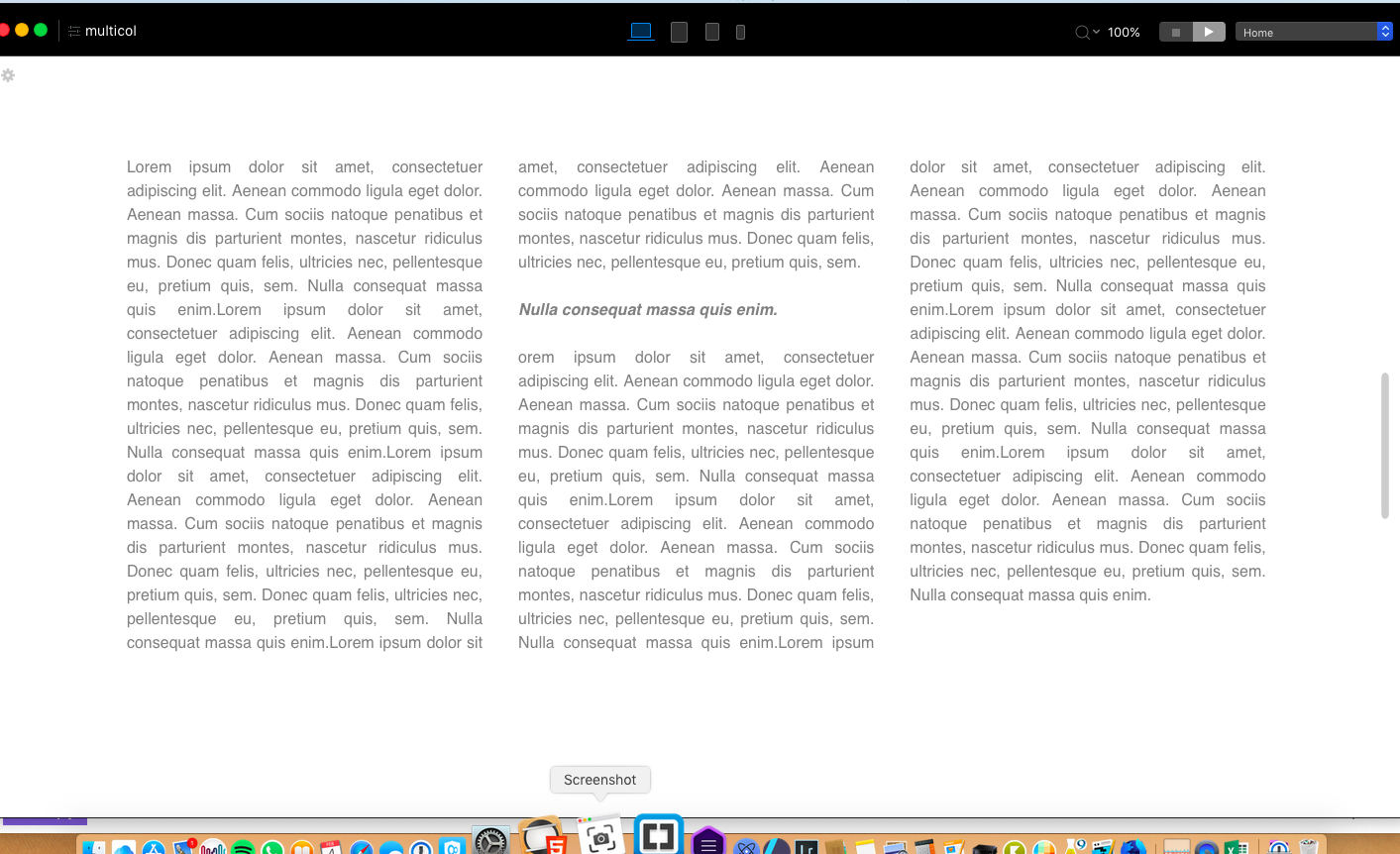
I have made the width to 1170px with a col-width at 20em. Then you can play with these to get what you desire. That said obviously worth for LG and MD breakpoints, while SM and XS especially would not make sense.
Would though be great to have this available directly in Blocs settings.
Thank you @MDS what you have done here is quite clever and it’s interesting how the column width can be edited via the em values under page settings. You are correct that this isn’t entirely sensible for smaller devices, but could in theory be adapted by adding a second bloc with different em settings using visibility options.
There is no obvious way to do this, at least from the testing I did just now. I even tried changing the page width and image size, hoping to squeeze more in but that simply adds larger spaces between them.
I think the idea is to have the images expand, shrink and change layout as required. If you look at that web link and change the width of your browser it’s pretty flexible.
On a 32" display I can see anything from one image to five across the screen. It dynamically reformats as required. Having a large display is great for web design, not least because it forces you to think beyond average desktop sizes when building a site.
I agree that would be nice but if you look at the stats very few users go beyond the 1920 resolution. I’m not sure what is so special about the masonry gallery, I changed my res to 1900 and can now see three. But any masonry gallery should flow with the screen size that you configure with the breakpoints. I could be made with the additional XL breakpoint.
Norm doesn’t seem too enthusiastic about adding an XL breakpoint. This is more about physical screen area than resolution. A 32" display could be 2K, 4K or 5K resolution with the same physical viewing area. This is just about how many images will fit into an area and the overall layout. In terms of resolution, even my 6" smartphone is higher than 1920 resolution at 1080 x 2160.
I get the resolution and how big your screen size is. The extra break point would be handy for things like, my point is just how many people have 32 inch monitors that surf the web using a full screen browser? I totally agree with having the bigger monitor for designing would be nice, I ve been toying around with getting a 27 inch UBC-C one myself just for my photography and webdesign.
Here’s one with 6 images at the first two breakpoints, three images and sm and two images at xs.