Hi all, first published website from in blocs!!! i am quite pleases with it if im honest, but i would very much appreciate some thoughts.
Style wise as i’m sure you can appreciate, i cannot change too much as the brand (colour/style) etc is dictated. so what do you think?
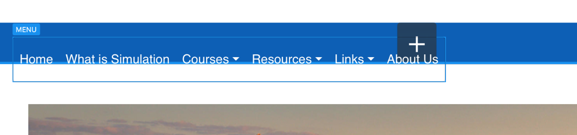
Advice - the only thing i’m not overly happy about is the drop down menus, the long ones go over onto two lines which i don’t particularly want, i wanted the entire name on one lin in the drop downs. but i cannot for the life of me find how to do that. the Class i have on the menu is ‘menu’ but what am i missing?
Hey @Recce43, congrats on publishing your first Blocs site. Very consistent across the site to match the branding.
To fix the width of the drop downs, you can override the Bootstrap class by adding ‘dropdown-menu’ to the class manager and changing min-width to 15rem or something, you will have to play around for the right width.
You might want to optimise your images, on one page there is an image over 1mb. A great site for easily optimising your images is… https://squoosh.app Drag and drop your image on that webpage, its free.
Nice clean looking site. I like the colors and the content is well organized.
A couple of suggestions.
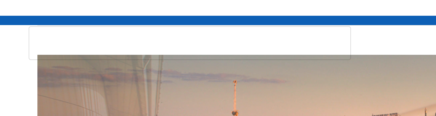
Your top carousel images should all be the same size. I one that is larger causes the page to jump around a little because it’s bigger. Maybe even look at removing the padding and making the carousel edge to edge.
With the three main columns with images, two of them have a color cast in the background that is not solid white. The would look much better if they were white.
You need to do a little work on the smaller breakpoints. On mobile, each main column needs to be 12 wide to fill the screen. It currently looks to be only six.
I would also change the Hamburg menu icon to light. A dark icon on dark blue is harder to see.
The p text on the smallest breakpoint is a little hard to read (for me). Maybe add just one point or even try adding a little more line-height, sometimes this can really make a difference in readability.
@PeteSharp gave you some nice advice with the help links, and I feel Eldars tutorials are essential if you really want to learn how to get the most out of Blocs.
I want to stress that overall you did a really nice job. I wish my first effort was a good as this one.
As the images on the upper part of the home page cycle, the variation in image height makes the entire page jump up & down. Making the images a consistent height should solve the issue.
Pictures done
Carousel done
I need to understand breakpoints more clearly!! I have @eldars videos, they are awesome so will take a look when back at home
So sorry I’m not sure how the menu thing works. I did add what you suggested but could work out how toaster the width of the drop down menus. I can only select the primary menu on the page, but not the drop downs, and anything with Width on that class doesn’t seem to have an effect. So sorry for being a newbie
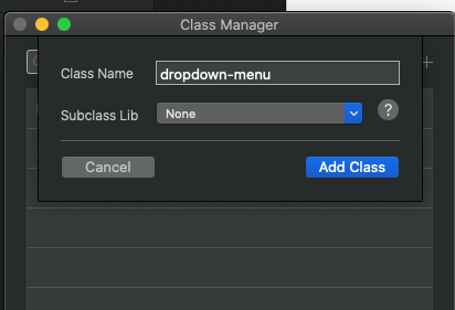
No problems, we all start somewhere. Open the class manager and click on the + symbol to create a new class. Call this class ‘dropdown-menu’
Click Add Class.
You should now find that class available in the class manager. Select the class to edit it and change the min-width to something like 200px, you might have to play around to find the right size.
so this is the issue im having, i can apply the class, but as soon as i do, it loses its position and when previewing is completely out (screen shots) adding width as per your very kind screen shots just doesn’t seem to do anything
The top one is when in building mode and you can see the menu but now hlaf way below the blue ribbon, the second is running in preview where the ribbon is even smaller and the menu cannot be seen (probably because of white writing on a white background.
But it should be on the blue background. ive tried playing with padding etc
I changed the value in my browser on your live website and it does work.
Are you just creating the class in the class manager and changing the min-width?
You do not need to add the class to anything on the website. As the one you are making in the class manager is over-ridding an existing default class.
Someone may have an easier solution, but with Bootstrap 4 you need to edit the CSS like the following code. (I have edited it, so the hamburger will display white on your webpage. We can show you how to modify it if you want to change colours.
You can add this to the header section of the page.
You can add the class “navbar-toggle-icon” to the class manager, but you won’t be able to change the colour of the burger, just the background and border etc.
Thank you all for your comments and assistance, i think ive made the changes needed. HOWEVER, i am now looking at the ‘breakpoints’, being aware of the smaller device views.
the ISSUE i now have, and ive read the links on this and watched the videos, but whenever i do try and change the columns in the individual breakpoints (device size) they change in the other views too, including the larger views where i dont want it too!!