How strange, I wonder if it’s being caused by Dropbox.
Yes same as mine, what I’m saying is it doesn’t render as text and shadow but as text plus offset text plus shadow. If you get my drift!
Hi, I deleted the Dropbox folder after you unlinked yesterday, the ‘fixed’ version of Blocs continued to work correctly, the problem only started this afternoon. But, I’m reloading all the images and crossing my fingers! Pouring a stiff one now!!!
1 Like
Well… that is just a CSS3 property “text-shadow:0px 3px 3px rgba(0,0,0,0.3);”, so if it is not rendering correctly I would blame the renderer.
Scotton, I’ve had some of the same problems with viewing on the pad between both views. One easy solution on the two troubled areas where its running off the screen is to use the verticle alignment on the tablet mode. I see you have it set up that way for a phone size.
If you look any the top menu it also just about runs off the screen. I set the tablet to Hamburg also. This way it shows the full menu on landscape and switches to the Hamburg menu in portrait. Yes we need more break points.
Casey
I blame the renderer.
Or Apple could quit building mobile devices with screwy, non-standard resolutions. (c;
1 Like
Yup - Casey’s right - we need more breakpoints!
Unfortunately, the first breakpoint is set to 768 pixels wide which works great if the table is in portrait mode but if it’s in landscape mode (which is generally at least 1024 pixels wide) then the page will ALWAYS be rendered using the desktop layout - and this includes the menu! Blocs would be perfect if it had two more breakpoints one for tablet landscape and one for phone landscape in addition to the tablet and phone portrait breakpoints that already exist.
Over to you Norm…
OR… perhaps an easier solution would be to make the tablet and phone breakpoints user definable?
macrod… I come at this from a position of ignorance, but I feel sure that devices can be identified by browsers.
And by Google Analytics…
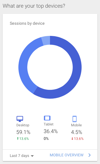
The image above shows “devices”.
Specifically, “Desktop” does not include ‘tablets held landscape mode’.
As stated above (I think) Apple’s own website can distinguish between an iPad held landscape and a desktop.
That’s all I’ve been asking for… I have desktop content I don’t want to appear on a landscape tablet.
If your content looks good on the desktop why wouldn’t you want it on a landscape tablet view?
Casey
Yes, I understand, but the Blocs page determines which layout version to use by querying the “device width” that the page is being rendered on not by determining which device is being used… that list would very big and ever expanding!
If the Apple website does differentiate between portrait and landscape iPads then the site will most probably have separate breakpoints for each device width. This isn’t difficult to do when you custom create your website but when using a web creation app like Blocs then we can only use the tools, and their set values, that are available.
If you read my original post you’ll see…
If it can be done… it can be done.
I’d like it done!
@Ian It can be done but you will have to do it yourself by writing your own media queries. The good news is that this is not too difficult, but you will have to put the effort in yourself.
In CSS code you can make decisions on what to show or not show when a device has a width of an iPad in landscape and also the height of an iPad in landscape. You may then ask which iPad. Good question and you would need to create a scenario for the different sized iPads. What about future iPads and also iPhone that can make the possible combinations grow. You would need to update your code to cater for future versions. What about similar but not exact Android iPad clones. Also you would need to debug this mess using the actual devices because emulators are not always good enough to prove that a drive size will work the way you want it.
Blocs is based on the Bootstrap framework which does not introduce this massive and unnecessary complication.
So the best solution for so many reasons, is to design your layout with what device breakpoints are available. Treat iPad as a desktop width which it is, and design accordingly.
Also, don’t forget that tablet and mobile users are incredibly adept at rotating their device if the web page information display is not the way they want it.
2 Likes
Yes @webdeersign sums it up perfectly. There are so many scenarios to consider you will end up doing more harm trying to target specific devices.
Also consider you have some tablets that run desktop OS, and tablets like iPad Pro that have desktop size widths. It’s a bottomless pit of potential edge cases.
I checked the style sheets for Blocs and the parallax effect is switched off if the screen size is 1024x768 so you shouldn’t get the effect.
Also if you do want to fine tune layouts for each device, you can easily attach these once you have written them to each page via the page settings.
1 Like
You couldn’t have a 1024 breakpoint as it would effect 13" MacBooks. When Blocs adds support for bootstrap 4 you’ll get another breakpoint between Tablet and Mobile.
1 Like
Hi Norm, sorry for the delay in getting back to you on this…
To answer your questions:
iPad mini 1024 x 768
www.poulson.info/test/ is a previous version published to show the issue
www.poulson.info is my compromise design which works on iPads (except for the way the large text renders with two offset images)
The problem is I’ve got several groups of three adjacent parallax images, which provide the ‘3D’ shadow effect. I spent a lot of time working out how to achieve it, and I like it, but can’t use it as I can’t prevent landscape iPads from seeing it.
(Not a problem on the iPhone 6 Plus at 1920 x 1080 as I can hide the parallax images.)
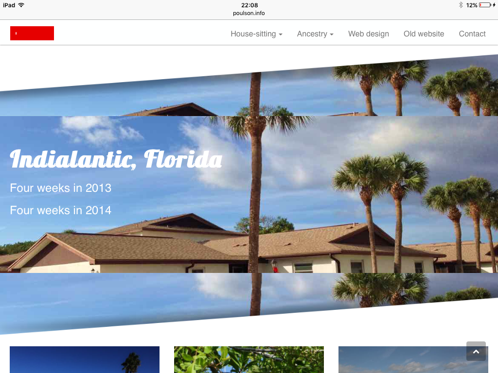
So this is the mangled images I get on the iPad:
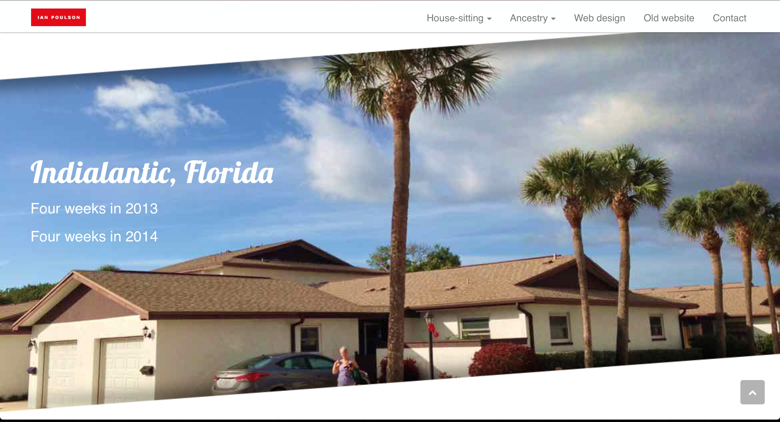
And this is what it should look like:
I can handle the iPad portrait mode, no issue there, as I can hide the parallax images.
Hope that makes it clearer!
1 Like
I’ll take a look
Hi Norm
I’m slightly confused by your 13" MacBook comment. To the best of my knowledge all 13" MacBooks had a native resolution of 1280 x 800 and the last of those was produced in 2010. So why can’t we have 1024 breakpoint?
Roddy