Not everyone runs the OS at the native res or uses the browser frame at full screen, by time you take into consideration the macOS dock which some have set at the side of the screen. The available area get smaller and smaller, I know because I had to make the main Blocs application support under 1000px wide, as some laptop users couldn’t use it.
If you need a 1024 breakpoint just write one and attach it to the page.
BTW… I got the screen captures back from my associate with the iPad pro 9.7" and the only thing out of sorts are in landscape with several parallax bricks on one page with the same graphic not showing parallax but three repeats of the graphic in each of the three blocks.
A shame as I love the way it looks on desktop, and given how many iPad users out there that are viewing this page other than designed/intended.
Not sure what I am gonna do about it just yet but am thinking a redirect to another page based on userAgent. Not ideal but it should work.
Ok… a redirect on user-agent works on iPad as Apple is kind enough to put the string ‘iPad’ in there.
@Norm I’m confused though. The iPad Pro 9.7" is 1536 x 2048 pixels and is displaying the desktop layout in landscape. My Android tablet is 1200 x 1920 pixels and it is showing the tablet layout. And my phone is 1440 x 2560 pixels and is showing either the tablet or phone layout.
1536 x 2048 = Desktop in landscape
1440 x 2560 = Tablet/Phone in landscape
Obviously there is something else going on here other than just pixel dimensions (of which I have no clue). But would love an explanation.
The screen dimensions are different to the actual viewport css size. This site is a decent reference to give you an idea of what I mean. https://mydevice.io/devices/
Why your tablet doesn’t render the same as an iPad Pro will have a lot todo with the pixel ratio or the graphics card powering the displaying.
So basically the breakpoints in Bootstrap 3 target 3 main sizes (if I remeber correctly: below 768 (mobile), 768 to 992(tablet) and above 992 (desktop. There are a few extra breakpoints added to Blocs sites to switch off parallax effect on the iPad device.
Thanks @Norm. What a mess. So do you know how the CSS Widths and Heights are arrived at… is it some calculation based on screen size, screen rez, and pixel density? Or is this simply arrived at and embedded into the device by the OEM?
Seems it would have to be embedded by the OEM as Bootstrap can’t have any idea what the actual device is, nor would it make sense to try and keep up with all of them.
It would seem this all renders multi-Bloc parallax useless for any of us wishing to support both desktop & tablets (at least until the point when OEMs decide their tablets have enough horsepower and battery to support it). And considering the iPad is in play… I certainly wouldn’t consider this to be an “edge case”.
I’ve just updated the template, on which I showed how to make sliced borders using the parallax in Blocs. Obviously, parallax doesn’t work on iOS, so the background image becomes static, which causes the issue you have on your screenshots.
Fortunately, I think I have found a solution for this issue. Parallax still doesn’t work, but sliced borders (and gradient effect, which also didn’t work) look perfectly fine on iOS devices.
I’d load a version of what I was trying to achieve, but I’ve deleted them all and ‘moved on’ as nobody could suggest a solution!
Effectively I did what you did in your video, the only difference was I added a soft shadow to suggest 3D.
I thought the only solution was going to be preventing mobile devices from seeing the parallax effects at all - easy on a phone but impossible on a pad.
So if you’ve got a solution I’d be really grateful. (I did notice that the parallaxes you have on http://blocstemplates.com/demo/designer/s/index.html are very large on my phone, I don’t know if that’s part of the solution?)
Yeah, I noticed that you have just deleted all of the borders from your website. It looks nice too.
I like to have more padding in my websites, so it’s not the part of the solution. As always, you can adjust the amount of padding you have on mobile to whatever you like.
Anyway, the solution is actually nothing difficult. I will record the video and share it here in coming days.
Here is the video for you. It is kind of long because I try to explain what was the issue in the first place. I also show how to archive the gradient faded effect on iOS.
I wanted to put a simple video tutorial, but ended up recording almost 15 mins educational video on Blocs
Hope it helps somebody.
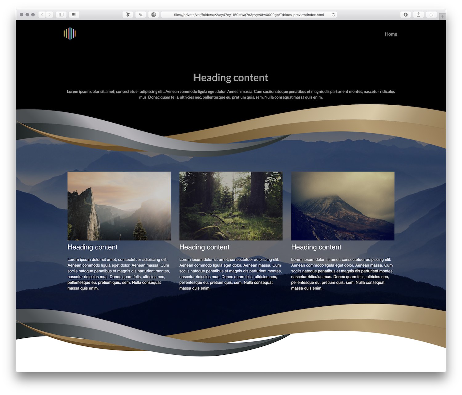
Followed Eldar’s tutorial and got some great results. Don’t have to stick with basic shapes either. In the example below, I created some Swooshes and exported them as SVG graphics. The file size is smaller than a PNG when using multi-coloured graphics.
Thanks Eldar - I can now take Blocs to a new level.


 Great work!