Hello,
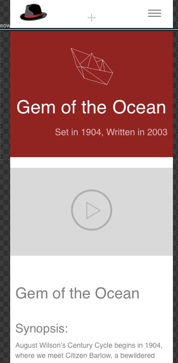
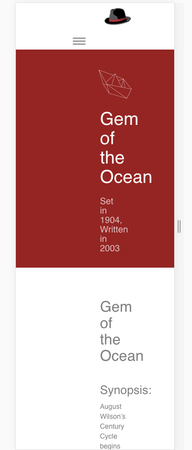
I’m getting discrepancies between how the preview in Blocs says my page will look in mobile and how it looks in Chrome developer view (or any narrow browser window). Please see screenshots below (the first is how it looks in preview; the second how it looks in developer view. Many thanks!
A follow-up: I’ve been working with the code in dreamweaver. The problem seems to go away if I remove the div <div class="container bloc-lg"> . So another question would be: is there a quick way to remove or change all the bloc-lg’s? Thanks!
Ah, I think I’ve figured out the problem, but I don’t know how to fix it. When I change the appearance to padding large 100px in desktop, I can’t get it to go to small in mobile (without changing mobile back to small.) Custom class?
I fixed it, but I don’t know why: Just changed all the widths to | <—> | instead of > — < . Maybe it was a conflict with one of my custom classes?
I’m glad you got this sorted. Your post was like a stream of consciousness with you the only person in the room.