Ok, I see the issue in your project file. The problem is that your images are not sized in proportion to each other. so, let’s start by understanding the grid structure of the blocs page.
You have set the width of your page to 1400 px. This is divided into 12 GRID columns. When you place content on the page you create STRUCTURAL columns that span a specific number of GRID columns. For example. If you add a two column STRUCTURE block, each of those STRUCTURAL columns will span six GRID columns. You can view the grid columns by holding down the shift key while you are viewing your blocs page.
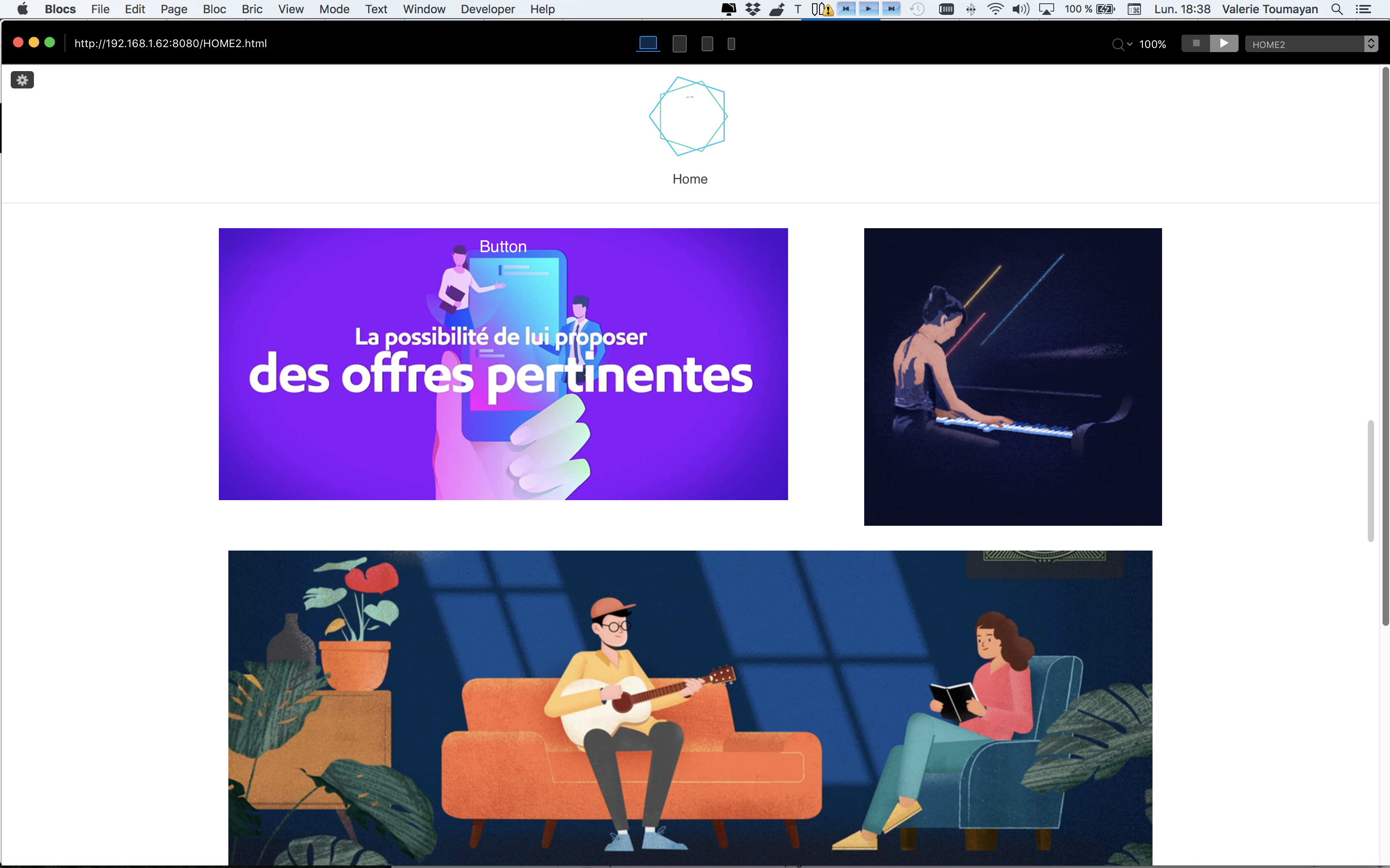
When it comes to laying out a grid of mixed size images, you have to ensure that your image sizes fit the width of the STRUCTURAL columns you place them in. If you don’t, the images will not fit if they are smaller than the structural column width. So, if you place a 1200 px width image into a full width STRUCTURAL column, the image will not stretch to fit the space, it simply places it in the centre of the structural column - leaving white space on either side.
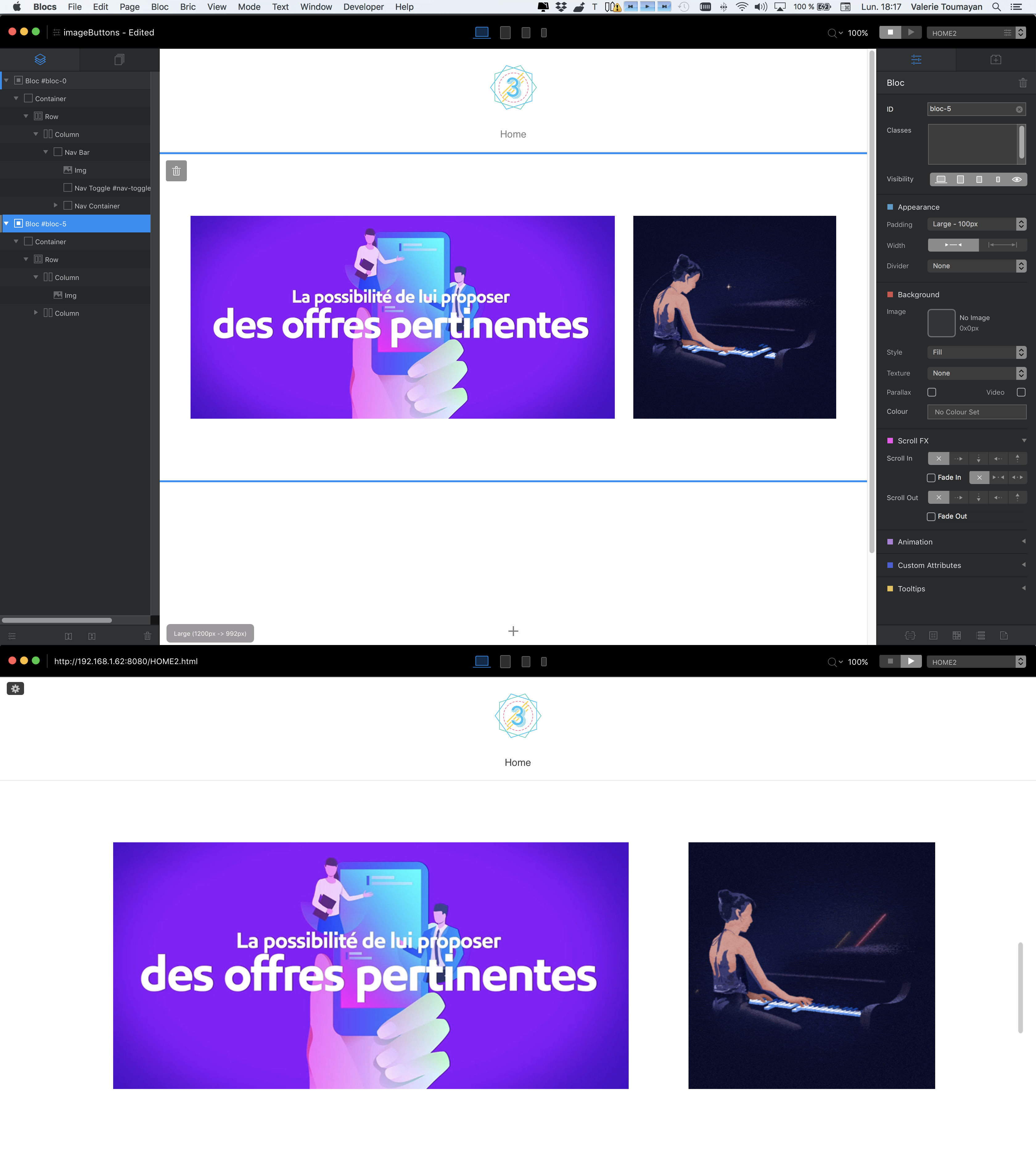
In you particular project, you have a common feature which really dictates all the sizes of the other elements. That feature is your SQUARE images. Your square Images (the GIFS) are 400 x 400 px The nearest number of grid columns that you can place this image in is 4 (one third of the page width). This will reduce the size of the displayed image to 378 x 378 px. It also sets the benchmark height for all other images on the page. All you then have to do is ensure that your wider images will fit the width of the remaining space adjacent to the square image.
Given that the square image is occupying 4 GRID columns, this leaves 8 GRID columns for the adjacent image. The remaining content width (on your page) of 8 GRID columns is 785 px. Therefore, your adjacent image must be 785 x 378 px. When this image is placed next to your square image, it will be perfectly aligned with a standard gutter space between the images.
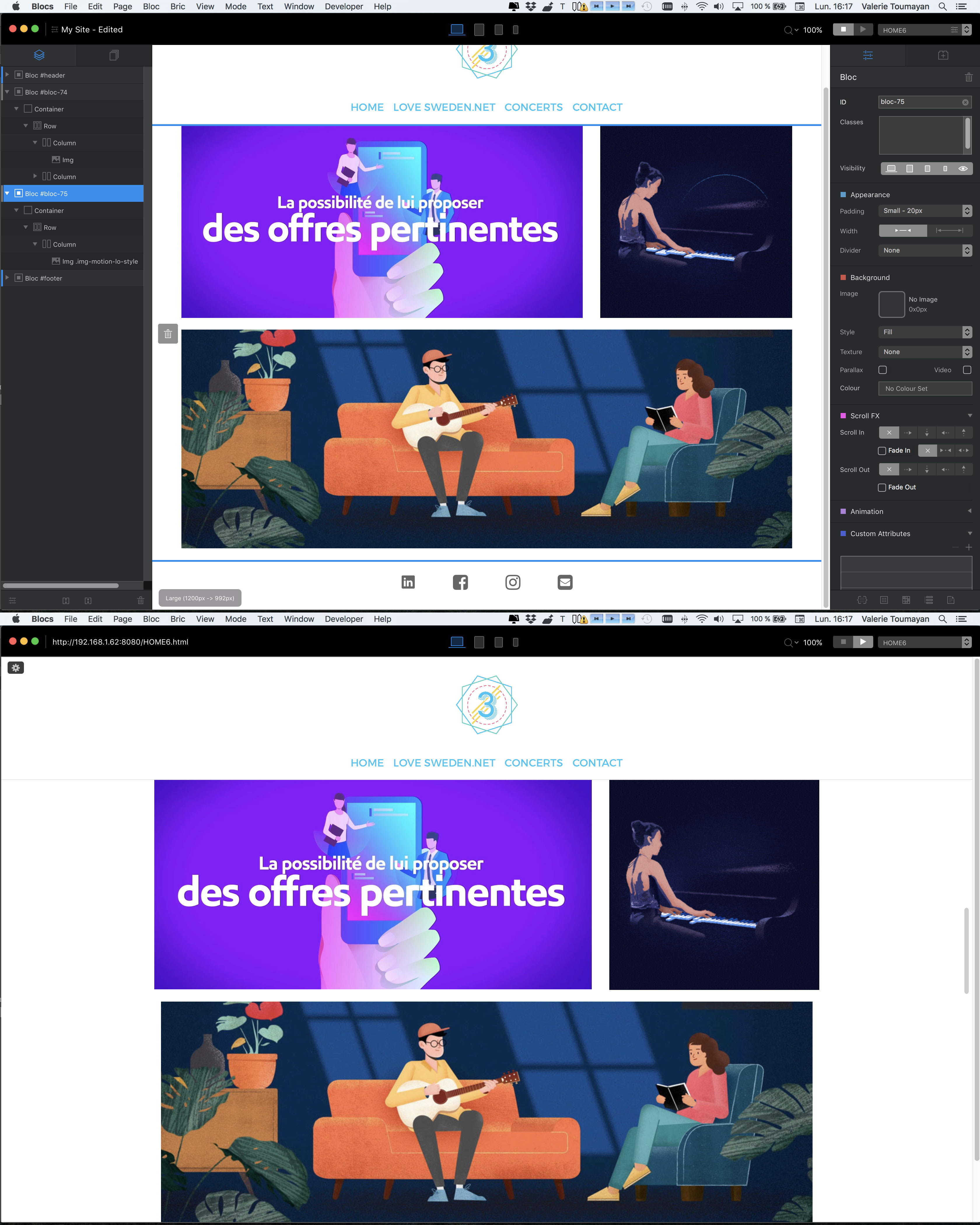
So, the best starting point is to lay out some STRUCTURE blocs on your page. The first bloc can be a two column bloc, the second bloc a single column bloc, the third, another 2 column bloc and so on.
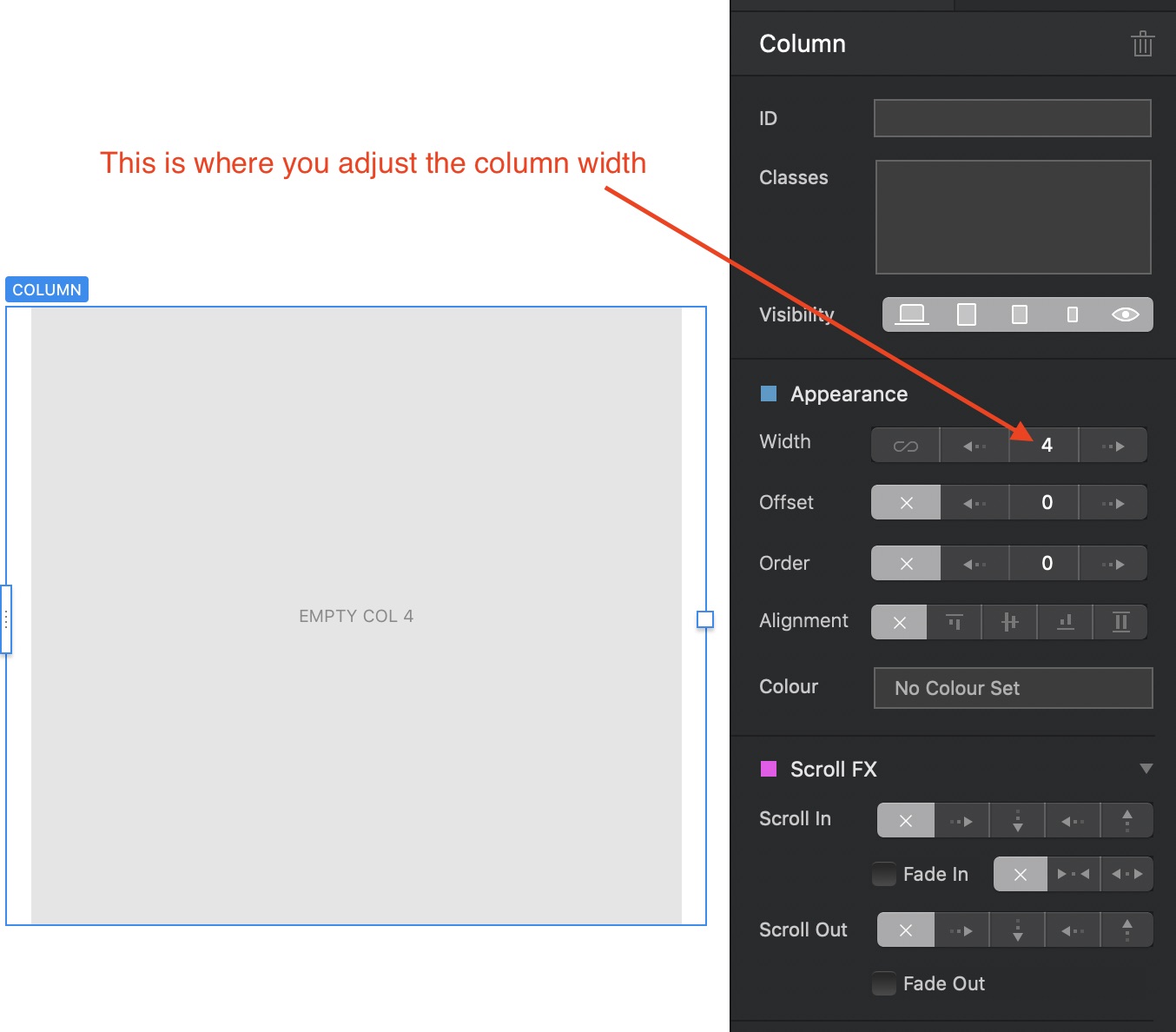
On your 2 column structure blocs, select either the left or right column from the tree structure at the left side of the screen and adjust the width to 4 grid columns. Then select the other column and set its width to 8 columns. These adjustments are made in the appearance section of the properties panel on the right of your screen See Image below:
In your image editor, create some images that will fit into these columns. For the 8 column width columns, your images need to be 785 x 378 px, Your square images will need to be 378 x 378 px and your full width images will need to be 1183 x 378 px. It doesn’t matter if your images are to be displayed in an image bric, or used as normal and over images in full width buttons. If you size them correctly, they will all align perfectly in your grid structure.
Although I’ve given you the exact CSS dimension of the image, they can be larger, but the width and height must be in proportion. The best way to do this is to simply double the width and height of the images so they appear crisper on high resolution displays, you could even triple the dimensions if you wanted to. The thing is that Blocs will reduce the display size accordingly based on the width of the columns you place everything in.
As a final point, if the horizontal gutters are not to your liking, just use the margin options to adjust the amount of white space between the blocs.