@hendon52, I would probably wrap everything into one column (nested columns) rather than Blocs, when it comes to breakpoints you won’t get padding issues to sort.
I didn’t do anything with the project file, as I went to bed instead, @hendon52 has you covered with good advice though.
Good advice @PeteSharp, as always.
yes thanks for all your help!
how do you make the grid of images non-visible for mobile?
and what do you mean by creating a separate block?
for mobile, i’d just like to have each linked thumbnail, same size one under another…simple look
Use the visibility options in Blocs to hide or show specific blocs. The visibility options are shown below. This is the default state that shows the selected bloc on all device variants.
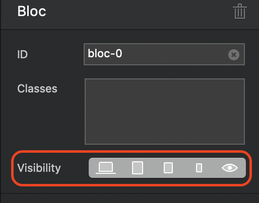
If you select one of the devices, you will see that the bloc dims to illustrate that it’s hidden on a specific device. Check it by making the desktop version of the blocs non-visible on all devices except the desktop version. Switch to one of the other breakpoints and then preview. You will see that they don’t display. Switch back to your desktop viewport, and you will see they are visible.
You would then create additional blocks, in each of the other viewports which you can lay out as appropriate. These blocks should be made non-visible on the desktop version. Although all blocs will be displayed in your page, they will only display in the website in accordance with your visibility settings.
ok so for the mobile, i hide everyone, and make a whole new grid, that i only show for mobile?
Ok, i think i’m all good now, everything is set up, it was really not easy to make, this will probably the only website i’ll do with that program…even if it’s easy to build, it’s too messy to adjust
another thing, is it possible to adjust the space between each link of the nav bar? would love to ad a dot or something to show the separation, but it doesn’t seem possible to ad
Don’t be disheartened about using blocs. The product has been designed for simplicity and you can make great looking websites with minimum customisation just by using standard blocs. Of course, there will always be situations where the site designer wants to step out of the box and create something that requires a little more work and pre-planning. Such projects are not really the best place when starting out using blocs - this is something you build up to once you are more familiar with the basics. So, keep going and practice building a site with the built in pre-made blocs - it really is very simple once you get used to it.
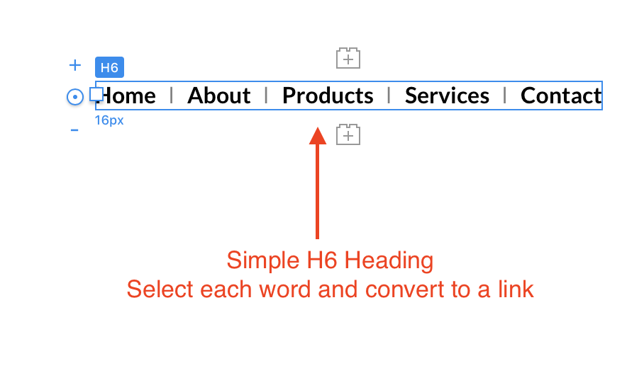
With reference to the menu, to do what you want will require that you make a custom nav bar for use on your site. Given that all you want is to put a character between each menu link, the easiest option is to creat a text bric, such as an H6 bric. Simply type out the links you want displayed and place any character you want between the words of your link. In my example below, I used a vertical line with a double space before and after it.
Select each word in your nabber and convert them to links (you will see the link option above the text box when you’ve highlighted each word). Once the links have been created, you can create a custom class to style your links how you wish. In my example, I styled the normal state with the colour Black, and the over state with the colour Red. Now select each link in turn and apply the class. The end result looks like this in a browser.
Clearly, you will want a normal navigation bar for the smaller device variants. This is because you will want your menu to change to a hamburger drop down on mobiles. To achieve this, place a normal navigation bar on the page also, but make it only visible on the mobile breakpoints. Likewise, make your custom navigation bar only visible on desktop and tablets. Place each navigation bar, one above the other in the main content area of your page (not in the global top area) You can copy your navigation bars to other pages of your site.
perfect thanks!
i have another question about this part. when i change the padding to none for another device, it’s get none for everyone…is there a way to dissociate this setup ?
Yes, Set the padding in a custom class for whatever element you are applying the padding to. If it’s a complete bloc, select the bloc apply the custom class, You can then change the custom class for each breakpoint without it affecting the setting for other breakpoints.
well for me it changes for all breakpoints
when in computer mode i have “small”, and want to put none on the tablette, then the computer gets the “none”
Hi Val3rie, as @hendon52 said, set a class for the Bloc padding. Set the ‘built in’ setting to none, then set a single class (ie: bloc-padding) with a padding of 0 for the mobile viewpoint.
I sometimes find it easier working small to large because the smaller sizes will sometimes inherit settings from the larger ones.
so, mobile-0, small pad-0, small screen-20 and monitor-20 (or whatever settings you’d like).
Best of luck.
1 Like
Hey! Everything is finished, the website works!
I do have few weird things, but it’s probably not Blocs related…
in firefox when i charge my website, i have for a fraction of a second thiss
showing up
And i checked the website on my phone, it’s not like i designed it for mobile…
http://val3rie.com
I think the momentary glimpse of your unformatted page is something to do with internet speed. The page is loading quicker that the content it contains. I don’t see it here because the connection is very fast. It may be best to use a preloader to help ensure the page loads before anything is displayed.
As for the mobile version of your site, the issue is that there are many screen sizes and resolutions, so what people see may be affected by these factors. For example, on my phone I see your desktop version and, of course, some of the images are out of alignment (still looks ok though). You may have to revise your mobile breakpoints again to make sure they are being served up correctly.
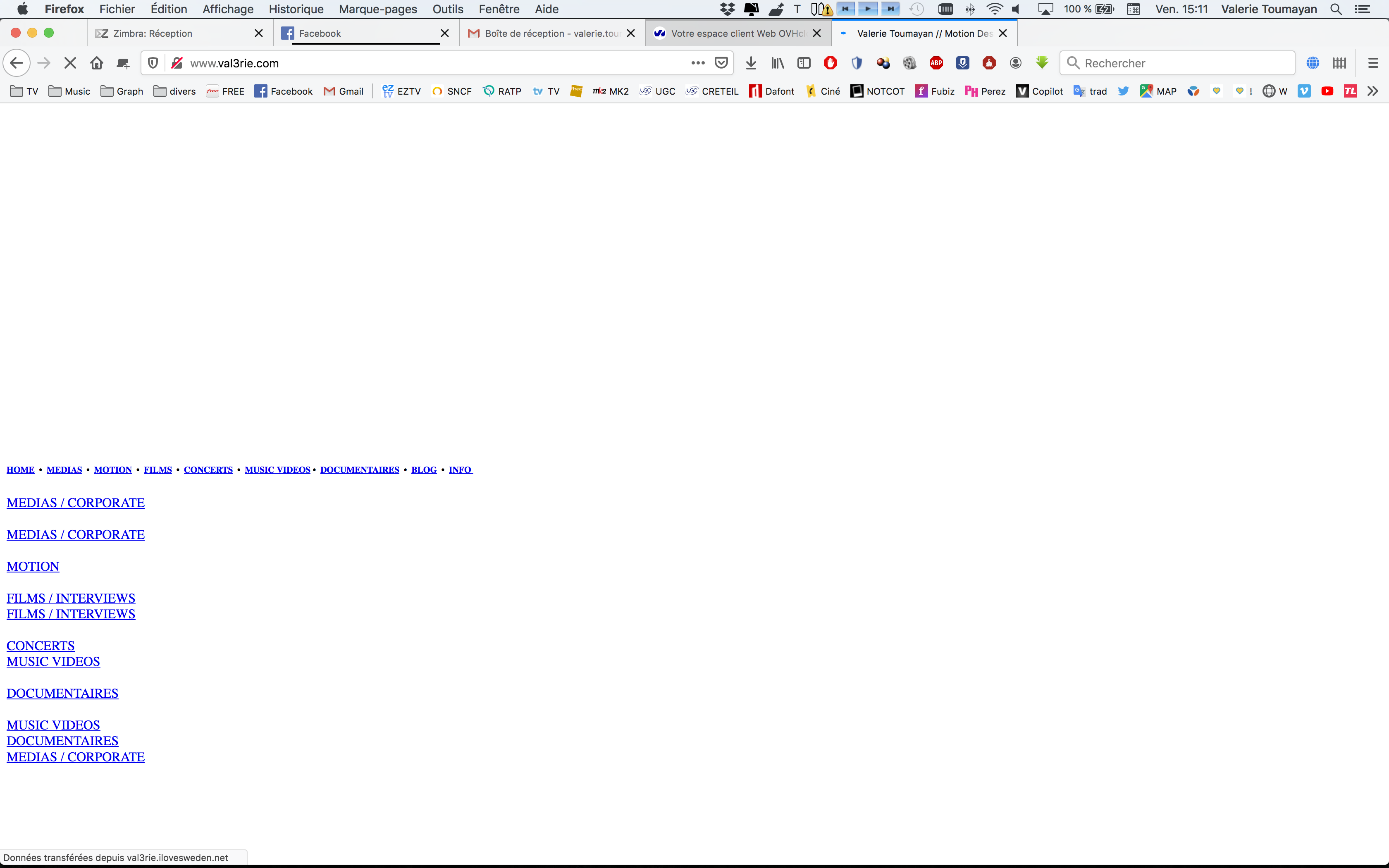
but I hid the square images, and they are still showing, that should happen?
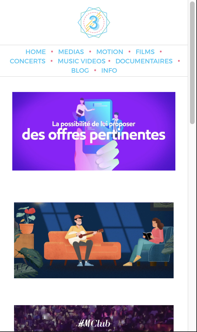
it was supposed to look like this
has for the glimpse, i have fast internet…maybe the pages should be stored in a folder so they don’t show up? but they, i don’t know how i’ll relink everything