I’m using 3.4.10. As you will see from my screenshots above, everything works fine in this version. Maybe someone else will run the file through their system and let us know what they see.
i have version 3.4.8
Maybe you should upgrade and then try again.
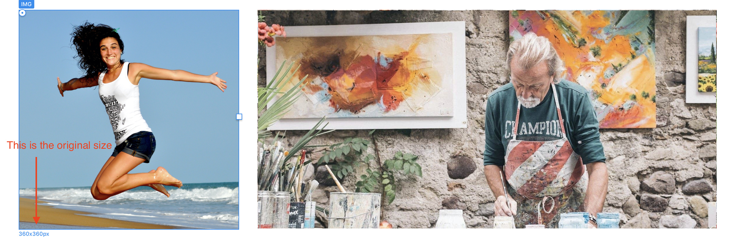
for one moment the big long image was aligned the other, but once i changed it as a button, it got small
i change the size of it like yours 2366 x 756 and then it fitted, but always the buttons create problems
do you have the overlay brics extension?
No, I don’t have that extension, but it may resolve your issue as I understand it uses images not buttons.
yes, i think the button thing is messing things up… now i managed to make the long image as a button and it alignes with your test grid. i have to see if can exchange you images with mine
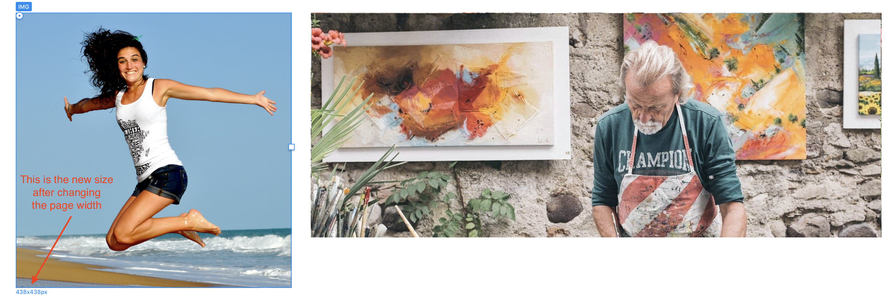
what size did you use for the square and medium? the image files? i can see it
Drag the images from the asset manager window to your desktop. Then, right click the images and select “get info” The dimensions will then be seen.
ok thanks, i’ll have a look at these
but earlier you said to put no-repeat on the button, but in the project it’s with repeat…?
It would be normal to select the no-repeat option as a belt and braces thing, but because my images were correctly sized, I simply omitted this option. It shouldn’t really matter if everything is sized correctly because the repeat option only kicks in if the button is larger than the image it contains. It certainly shouldn’t have any effect on the alignment unless your buttons are larger or smaller.
Ok thanks.
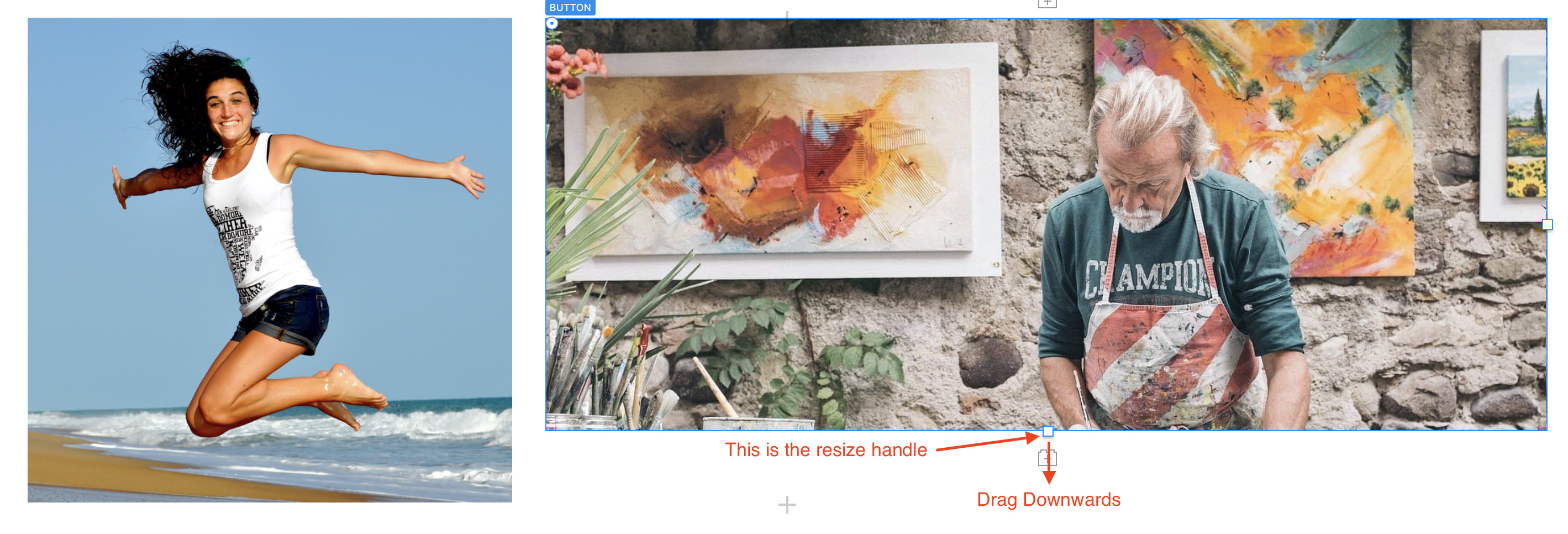
when you change the widht of the project to 1400, does everything stay aligned, same size ratio?
No, it goes out of alignment, but that is because the button height is dictated by a fixed padding measurement. So, when changing the page width, you just have to readjust the button size by dragging its bottom handle again. Then everything looks normal again.
i don’t see where that is? what is the bottom handle and how do i move it?
ok tanks, i think it works
is it possible to move the image inside the button? it would look best if it was higher in the framing…

That would indicate that the image isn’t sized in proportion to the button size. If it’s only a minor difference, you could change the image alignment on the button class. Instead of centre-centre, you could try centre-bottom.
it’s moving too much in the image…this issue is for the other mobile tablette resolution…it change the size of the thumbail, i try to keep the same height for everyone…
i’m having a lot of difficulties to create the small phone resolution…
is there a way to have one thumbnail per line? without messing the grid up on the other resolutions? i can’t change the positions of the blocs it guets stuck or mess up the rest off the thumbnails
this really doesn’t look nice
As I mentioned in a previous post, there is no point in creating rollover images on mobile versions of your site - touch screens cannot detect a finger hovering above the screen. Therefore, its best to make your grid of images non-visible on the mobile version of your site and simply create a separate block of images only that is better suited to mobile screen formats. You can then make that block non-visible on desktops and visible on other devices.