Hello! Any ideas how to do a zoom effect to a parallax background? Kinda like one of the zoom effects on the Card Design bric by @Whittfield
Trying to applying this
#content-holder [data-cover-effect=zoom] .cover-image {
But can’t make it work!
I’m just seeing this now, I’ve had my head down on a huge update for Tab Anything.
First, in your code you have an error.
[`data-cover-effect=zoom]`
should be with quotes…
`[data-cover-effect="zoom"]`
.
keyframes keyframes , There’s a lot you can do, here are two examples of keyframe css.
These are just code examples of keyframe syntax. Here you would make the image both scale and move. use any values you like really.
@keyframes example {
  0%   {background-color:red; left:0px; top:0px;}
  25%  {background-color:yellow; left:200px; top:0px;}
  50%  {background-color:blue; left:200px; top:200px;}
  75%  {background-color:green; left:0px; top:200px;}
  100% {background-color:red; left:0px; top:0px;}
}
Next, the element to apply the animation to
div {
  width: 100px;
  height: 100px;
  background-color: red;
  **animation-name: example;**
  animation-duration: 4s;
}
Hope this helps.
Stubbsy
November 11, 2020, 8:25pm
3
Hi, can you show me an example of what you want to do here, there is a nit of a zoom on this website https://neilholroyd.studio/ is this something like it? If so can you let me know how you did it. Thanks
1 Like
This is what I got haha
This one works but it has a loop! How to remove it?
div {
  height: 100vh;
  background-size: 110% 110%;
  background-position: center center;
  animation: shrink 5s infinite alternate;
}
@keyframes shrink {
  0% {
    background-size: 110% 110%;
  }
  100% {
    background-size: 100% 100%;
  }
}
pumpkin
November 23, 2020, 8:57pm
5
Change
animation: shrink 5s infinite alternate;
to
animation: shrink 5s initial;
the animation stops working once you change it for animation: shrink 5s initial;
pumpkin
November 24, 2020, 7:56am
7
Hm, I’m not a css expert, just looked at https://www.w3schools.com/cssref/css3_pr_animation.asp
I tried it myself. It works if you set it to 1 forwards
Better use a class for this instead of the div element, unless you want to have every div on your website use that animation.
.animate-div {
  height: 100vh;
  background-size: 110% 110%;
  background-position: center center;
  animation: shrink 5s 1 forwards;
}

@keyframes shrink {
  0% {
    background-size: 110% 110%;
  }
  100% {
    background-size: 100% 100%;
  }
}
1 Like
This one works! thanks a lot! The only problem is the background image changes the height on iPad and mobile versions
pumpkin
November 24, 2020, 10:22am
9
Right, that’s because your code uses percentages in the keyframe animation. Change it to this:
.animate-div {
  height: 100vh;
  background-position: center center;
  animation: shrink 5s 1 forwards;
}

@keyframes shrink {
    from {
        transform:scale(1.1);
    }
    to {
        transform:scale(1);
    }
}
Might want to play around with the background-position value though, to make it fit. Most likely something like right center or right top. Good luck
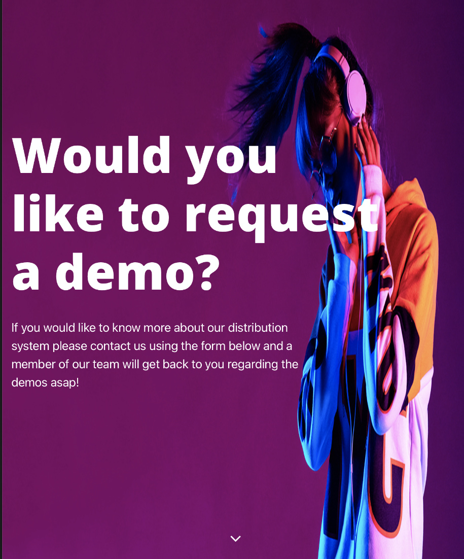
Just did it but its moving my nabber swell
pumpkin
November 24, 2020, 12:10pm
11
Where‘s your navbar located?
I‘m not at my Mac to try things before tonight, but I‘m curious.
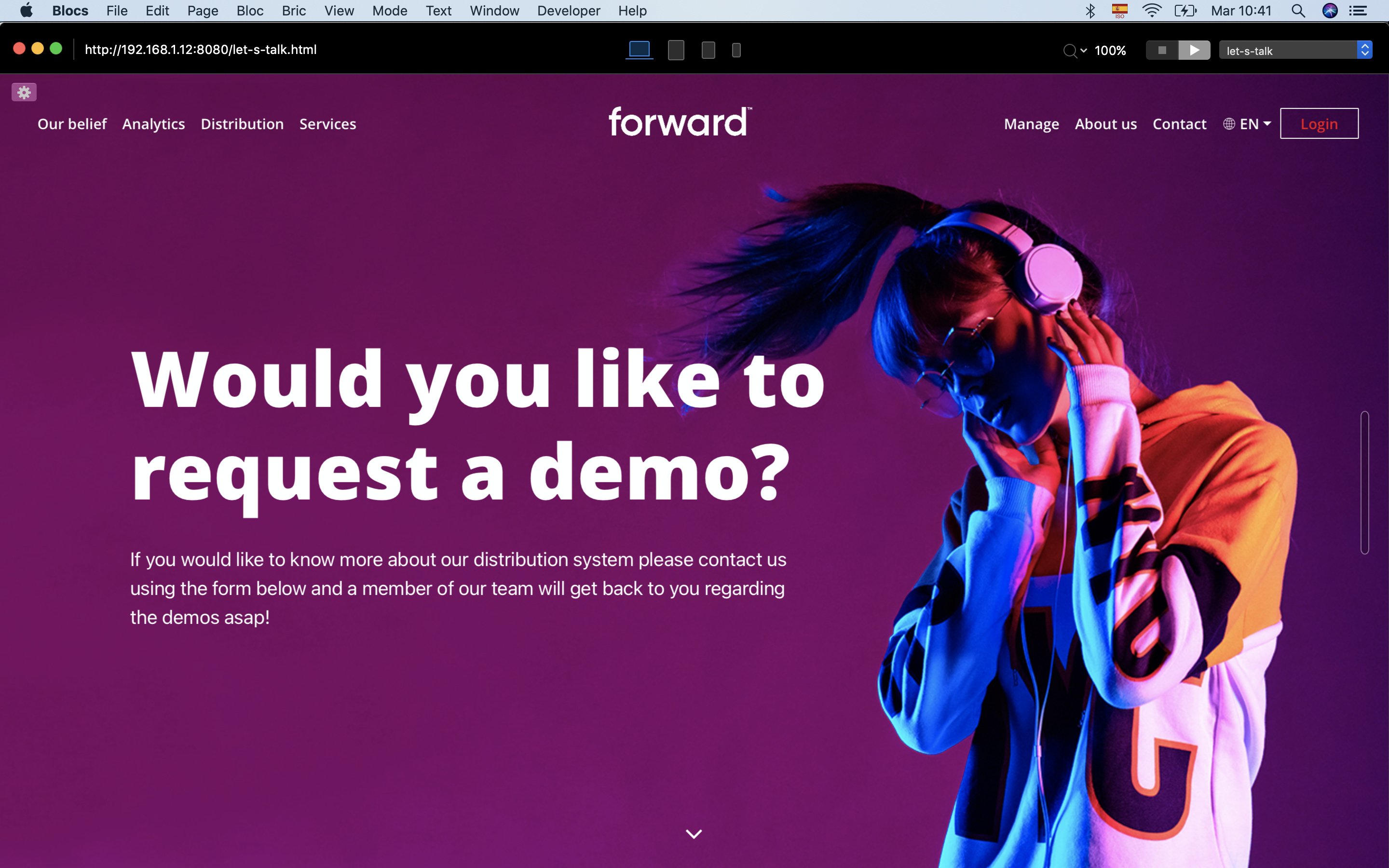
is not on the global area! I have a hero
pumpkin
November 24, 2020, 12:34pm
13
Ah, that’s the issue then. Navbar needs to be separate from the .animate-div
pumpkin
November 24, 2020, 12:44pm
15
Nothing that can’t be solved though. I won’t be able to try things and help before later tonight, I‘m at work … one that has nothing to do with Webdesign at all …
pumpkin
November 24, 2020, 1:16pm
17
I was thinking of using a navbar bloc in the Top global area, remove it from the Hero section and then use a negative margin-top to move the hero bloc up.
I can’t because the navbar is different on each page. Also it will be a multi language site.
pumpkin
November 24, 2020, 2:28pm
19
Hm, might even work if you just move the navbar out of the hero bloc and put it above it.
but with this one
.animate-div {
  height: 100vh;
  background-size: 110% 110%;
  background-position: center center;
  animation: shrink 5s 1 forwards;
}

@keyframes shrink {
  0% {
    background-size: 110% 110%;
  }
  100% {
    background-size: 100% 100%;
  }
}
the navbar stays