Graphic artist, but total noob to building websites. Working from the 2.3 beta.
I get the idea of building classes. I swapped in my logo for the default logo when starting a site. I assigned it a class, but it won’t resize no matter what I change the width or height to in the class menu. The blue bounding box resizes, but the logo won’t change.
So I tried a workaround. I deleted the bloc for the logo, and instead inserted an img. Now I can resize the img that is my logo. But when it comes to the tablet or mobile views and I make the header a smaller height using a class, it doesn’t matter what the padding or margin is, the logo menu is now knocked off center. I’ve given the header a class, and I’ve given the menu a class, and tried all kinds of padding/margins/height/width - nothing is getting me to where I need to be.
I’ve searched all over the web, but can’t find anything. Any help would be appreciated.
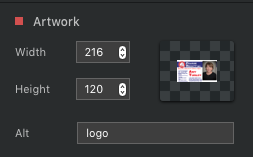
You can resize the logo by typing in the dimensions in the left hand pane. I use a @2 image and then type in the size you want it displayed. Example: I have a image that is 400x200 for the logo. I choose the image and then in the right hand pane I type 200x100.
I use a class for controlling the pad (blue box) around the image.
Thanks for the response, casey1823. The problem that solution leads to is that when I resize it in mobile version, it resizes in Desktop (and tablet too). Am I missing something?
If you use the size you want for the desktop and tablet size Blocs should automatically resize it for the mobile view.
Make sure when your adding the logo your in the desktop view. Look at the icons at the top of the page to tell.
The desktop icon should be selected. You can have different setting for all three. I’ve found that if you choose the size you want for the desktop Blocs will resize it smaller for the phone size.
After you add the main logo and size it the way you want just as a test click each of the view icons and watch the logo size in the left pane. When you click on the mobile view you should see the size will be smaller.
Everything you’re explaining is crystal clear, and I really appreciate the quick responses. But it’s just not happening for me. Even when I publish it to the browser, it’s showing the same as Blocs shows me in the app.
Just created a fresh, new global navigation bloc, followed your steps, and I’m getting the same results as always.
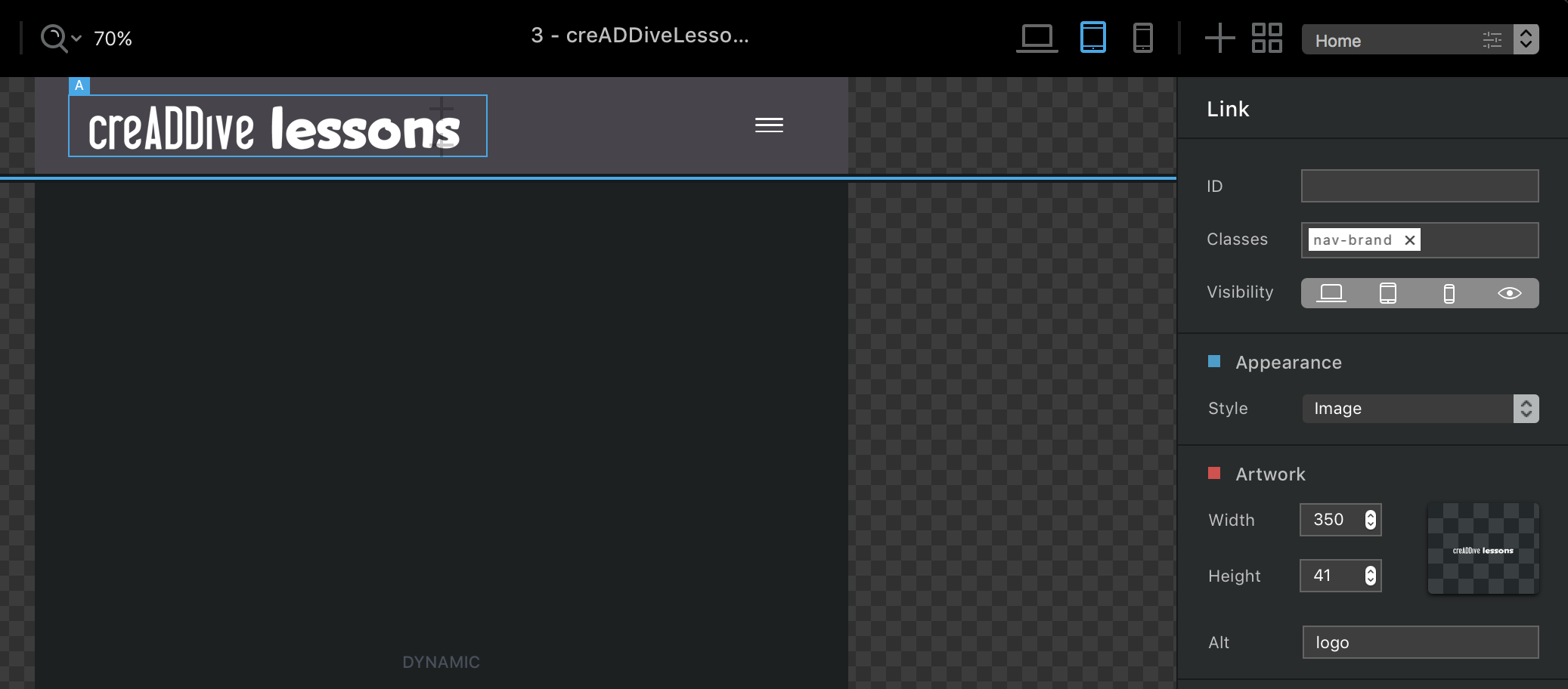
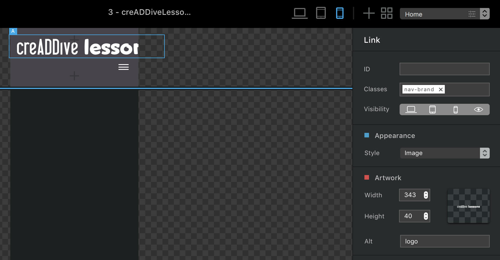
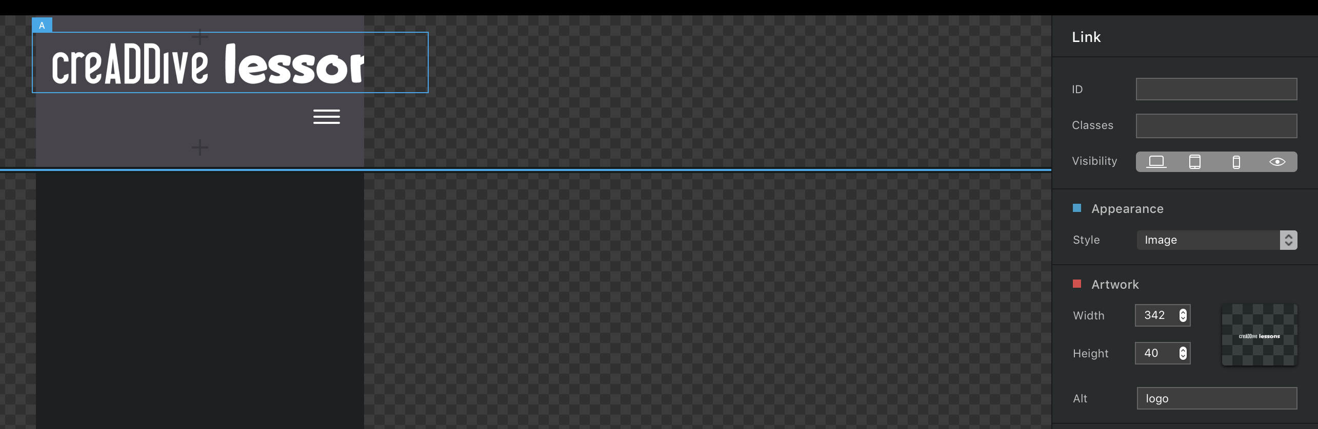
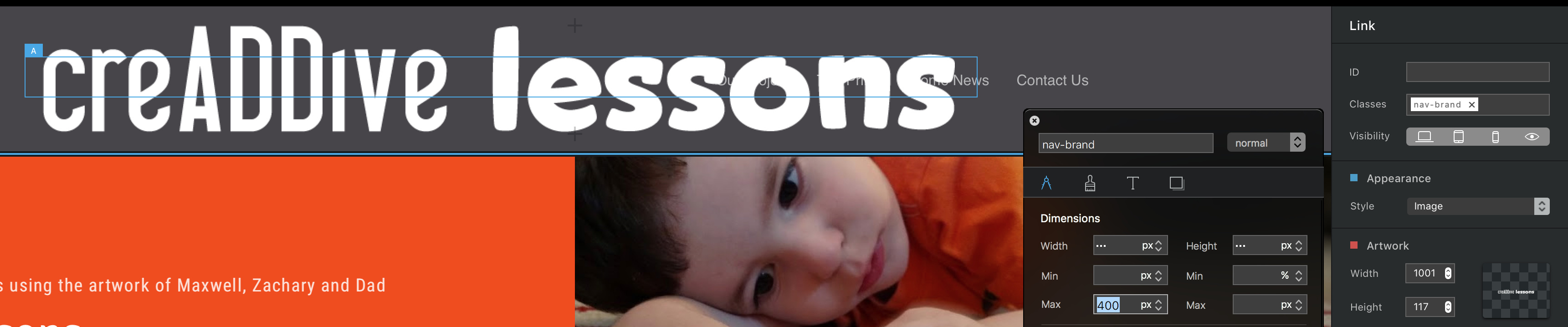
I see that you have a class (nav-brand) what have you added to the class? Try repeating the steps you just did but no not add any classes. Then see what Bloc does. If you want to resize the desktop version, then just do it in the artwork panel. My guess is something is going on with your class.
I tried this myself using a image the exact size of your graphic and it did the same thing for me. I even tried using this image on top and center aligned with the menu below and it still pushes outside of the mobile version.
Are you using the new 2.14 beta? I’m using that and I’m just wondering why it’s not making the image responsive.
I think there might be a bug in the new version. I’ll ask Norm to look at this.
@norm could you take a look at this? I logo image should be responsive and its not. I even made a 350x40 image and tried it without doing anything but inserting the logo. It does not resize the logo?
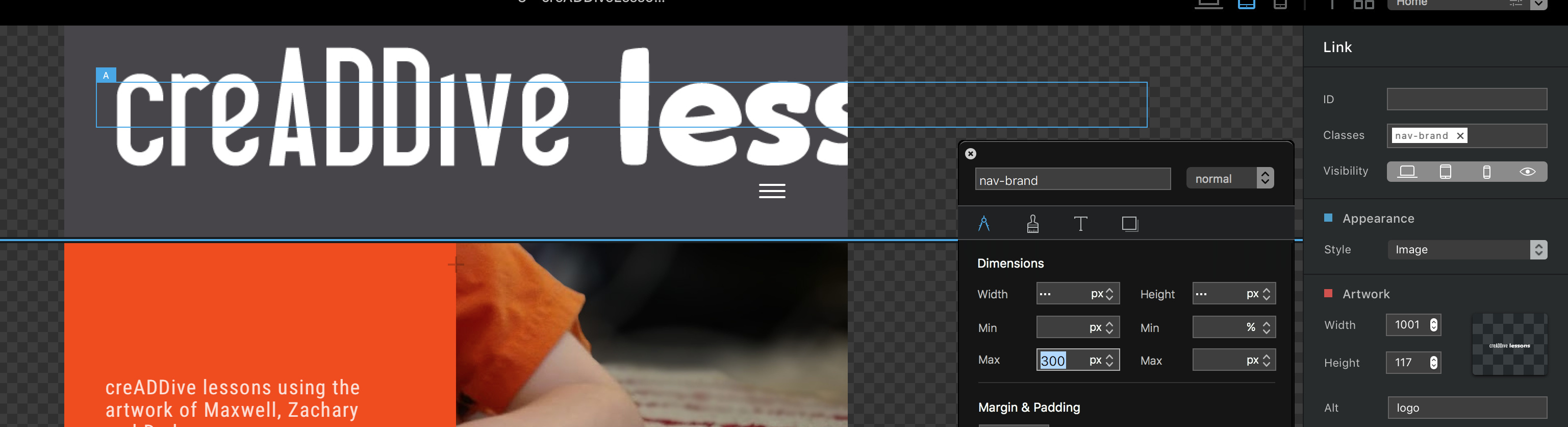
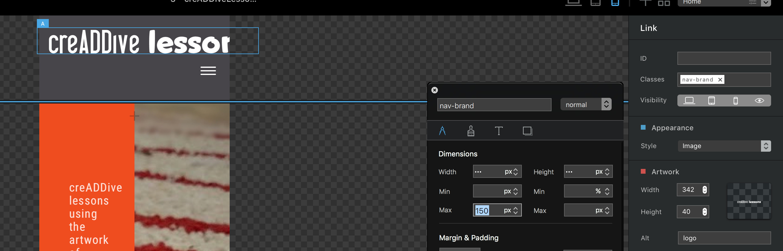
giving an image a size will stop it being responsive unless that size is 100%, so instead of being responsive it’s now fixed to that size, that’s not a bug. What you need to use and set is a max size. This will let the image get bigger upto a size but will retain its 100% responsive value.
So I was trying this technique from the start, but it doesn’t work. This is what I’m seeing when I set the max size. And yes @casey1823, I am using the new 2.14 beta.
When I test it in the browser, same sizing issues. Really appreciate all of your help. I feel like I’m missing something simple, but I’ve plugged in numbers (and then deleted them) in every field just to try to figure this out, but no luck.
Why is your logo artwork so big? I mean why do you have such a big image file? Try making the logo image 60px high, not via a class but when you export it from the graphic app you create artwork with.
The max size should be set to the largest you want the image to be displayed at.
It was that big out of design laziness. It was exported for another purpose at that height and I just dumped it into Blocs to get the project started. It’s now sized and exported to 399 x 47, but still the same issues.
FWIW, I was having the same issues with 2.2 and then downloaded the 2.3 beta.
Thanks, Norm! I’m loving Blocs. You’ve built one heck of a program.
Just been testing this and it works fine for me, I did notice that you have deleted the stock logo that comes with Blocs and just dragged another image into its place. This is whats causing the issues as the logo element is not just an image, it has other classes attached to it for positioning etc.
So try the following,
Create a new nav, select the stock logo image and use the sidebar options to replace it. This will keep the relevant logo code in tact.
Once you have the logo in place, use the class manager to add a new class called .navbar-brand img you will be asked if you want to keep the spaces in the class name, select yes keep spaces.
Now opening this class you can edit the size of the logo on different breakpoints.
I appreciated this could be more streamlined, Im hoping to add some new logo features coming in 2.4.
Hm… this is a vey annoying issue, it took me also many attempts to get it right and nothing seems logically. My mobile version still stays far too small and can’t resize it, what is possible in the other two versions When removing the basic stock logo and place an image in the nav field I got control over all three versions and they resize good.
But the standard option is too tough for an easy workflow in my opinion.
I would suggest you select the tablet view & then in the width setting, try a smaller width setting or assign a class & then in that class (when tablet view is active) assign a max width that looks good in tablet.
It’s tricky, I know, but you just have to keep at it.
Norm, first off, I just recently began using Blocs and am working on building my first website with it. Overall, it’s going OK, but I have had my share of head-scratching issues to research and solve. One is the same on “StateOfDesign” is asking about, where I feel the logo is too small on the mobile screen size and I simply wish to adjust the size larger for that breakpoint. But for the life of me I can’t get that to happen. I did read the entire string above and see where you eventually gave him advice that apparently worked, so I’m wanting to follow that same procedure. But I’m a bit confused at how to proceed… what are you referring to when you say “stock logo”? You mean those multi-colored vertical lines? I have a few questions about this issue:
I don’t see it anywhere in the Asset Mgr so how would I “select the stock logo image” as you suggest? I’ve even opened then exported the Fitness template and don’t see it in the “img” folder. Where is this “stock logo found” so that I can re-select it? I still don’t see why Blocs allows us to replace it in the project settings dialog if we’re not supposed to.
Should we check “Use the mobile layout helper classes”? (or should we leave this dialog alone altogether, being that you suggested not replacing the stock (default) logo?
As powerful and intuitive as Blocs is, I’m very surprised that it’s not easier to adjust the logo size for each device screen size. I feel we should be able to do that in the Class Inspector dialog. Short of that, I feel another option would be to be able to import different size logos which would be imported into the Inspector panel on the right for each different screen size.
Any help appreciated.
PS: I have a couple other issues I’m dealing with as well. Should I post them here or email you directly?