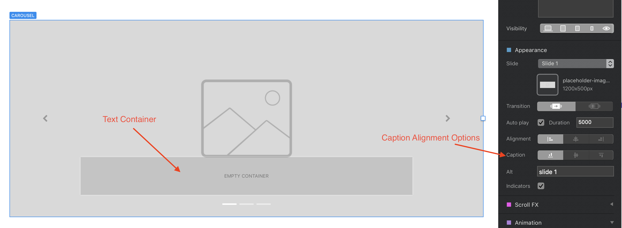
In answer to your question about carousels, one of the standard transition options in Blocs is fading from one image to the next. You can also turn off the left and right arrow indicators to create a carousel just like the one on your current page.
The issue you’re having with images is understandable seeing as you have been working in a Sparkle environment. In Blocs, your images will always be sized to fit the width of the column in which you place an image bric. This is for good reason as the the columns of your site will rearrange themselves to suit different device widths. In Sparkle, you’re probably more used to drawing out your image to any size you want, regardless of the underlying column structure. As such, you have other options that allow you to shrink or enlarge your images to fit and change the proportions of your image and have the underlying image placed at top, centre or bottom of the image placeholder. Blocs doesn’t do this. Therefore, before you place an image you should ensure that it’s sized and proportioned to how you want it to appear on the page (again, another good design practice).
If you attempt to resize the image on screen, you will distort it and you will lose the responsiveness of the image. So, the first rule in using images in Blocs is to make sure they are pre-cropped and optimised before placing them. They can be larger images than the placeholders, but when placed they will be scaled to fit the width of the containing column. So, if you want smaller images, use narrower columns, if you want larger images use wider columns. In any event, the height of your image when placed will be dependent upon the proportions of the image you’re using.
The above also relates to your other question about masonry galleries. The standard gallery Bric is quite nice, but it doesn’t provide a great deal of flexibility. However, you can create your own masonry gallery with a standard bloc. Just start with a two, three or four column bloc and add image placeholder brics into each column. Stack the brics as required to create the masonry bloc. At this point, all the placeholders will be the same size and won’t look much like a masonry gallery. Now start adding images to the placeholders, ensuring that each image is of the correct proportions. As I said before, all placed images will take on the width of the column, but the height of the image will be dependent upon the proportions. So, a portrait image in the first column will be perfectly sized to fit the column. A second landscape image placed in the second column will also fit the width of the column but will be shorter than the first image. You can keep adding images of differing proportions in subsequent rows and columns to create the masonry effect. You will probably find that the final row of images may be uneven (especially if you did’t proportion them accurately before importing them). However, you can use the class editor to add additional margin space to your images, thereby allowing you to align them all correctly.
The standard masonry gallery doesn’t provide a way to add text overlays, but the manual version does. Essentially you would place a text bric underneath each image and then create custom classes to apply a negative top margin to the text containers. This will have the effect of moving the text up and over the image.
The problem with Sparkle (which I actually do like) is the fact that it is an adaptive tool in which you have to manually layout and resize elements for each device variant. Whilst this does offer a less disciplined approach to design, it does entail extra work. In many respects, that extra work is of little importance to the user who is visiting your web page. They just want to see a clean, well laid out site that responds to different device sizes. They don’t really care if one of your images has been specifically laid out to create a 50 px margin to one side. Personally, I think Blocs imposes good web design disciplines. Custom classes can be deployed to add a great deal of flexibility in the visual look of the site, but in so doing, you’re taking a step back to adaptive website thinking which will involve you in extra, and largely, unnecessary work.
Finally, adding social media streams can be achieved by grabbing code from your social media provider and adding it to an HTML bric. This is no longer as popular as it once was because of the implications of GDPR compliance, however, it is still possible to achieve. As for styling, these options would be set up in the HTML code provided by the social media platforms. Many will give you a number of styling options before generating the code.
Give Blocs another run and try making a site that uses just the standard features it provides. The end result will look perfect and will be completed much faster than in apps like Sparkle. Whilst Blocs isn’t a graphic design tool, it does create great websites that simply work. However, it does require a little work on your part to ensure that website assets are correctly prepared before adding them to your project.


