Web design frameworks (like Bootstrap) provide responsive breakpoints in reasonable places to cover just about every device out there. Blocs UI for breakpoints is superb. It’s one of the strongest features of the software. But sometimes using a media query can be a valid or even the best solution to a build. Professionals use media queries to solve complex layout issues and push the UX standards forward through techniques like responsive design and progressive enhancement. And oh yeah, it also let’s you do things in bulk –make sweeping responsive design changes across a page or site. Media Query is the perfect companion to what Blocs/Bootstrap provides.
So much smarter
!! Media Query for Blocs is sneaky powerful. It doesn’t just define the media queries, it both adds and removes your custom defined classes from any target element as well.
!! With Media Query for Blocs you can add additional breakpoints where you need them, stack as many queries as you need!
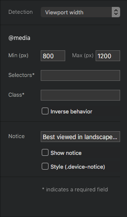
Media Query for Blocs does not add additional breakpoint icons to the Blocs UI. Your visual feedback for the media query looks like this.
What can I do with these additional “breakpoints”?
You assign a custom CLASS and a TARGET element. The class will be added and removed from the element as the query is in and out of range respectively.
Use the Class Manager to create this new class and style it anyway you like, including completely hiding the element. As your style gets both added and removed based on the query, you get powerful control and another responsive design aid in your toolbox.
Key Features
That said, there are 3 different methods of detection for your queries.
Detection Methods:
Parent container’s width
Device or viewport orientation
Image treatments at different breakpoints.
Device Notice: (optional)
Elegant little device notice that tells your visitors when the content is best viewed expanding browser or rotating device. The overlay and text can be completely customized and this notice fades away after a few seconds.
Inverse behavior
By default the class is added to the target element when the media query is within range. It’s removed when the query is out of range. The inverse checkbox will switch the behavior. Now the class you provide will be remove from the target element when the media query is within range. It’s added to the target when the query becomes out of range.
Some uses include
Showing/hiding content for specific breakpoints and custom ones.
Styling fonts for specific breakpoints.
Making project-wide tailorings based on break points.
Notify users when content is best viewed by rotating their device or expanding viewport/browser.
Do things in bulk. Make sweeping responsive design changes across a page or site.
I had the idea about 6 months ago and wrote it from scratch over the last couple months. I’ve been really using it for myself and decided it’s ready for you guys.
Thanks for sharing, I’m not super familiar with Interchange to be honest. I admit I’ve only supported Foundation sites and not really built with it I’m afraid.
After looking at the docs they do have some similarity in what they aim to accomplish. It’s a different approach but in the end I do think these relate to each other. In fact, if I were to build a UI for Interchange it would still look a lot like Media Query for Blocs
Of course with the bric you get a UI and you don’t have to predefine the breakpoints in your code and compile.
Video is coming along nicely, it should drop today at some point.
If you have ever needed or wanted to design for displays larger than Bootstrap (or any framework) provides out of the box). Media Query for Blocs has you covered!
Ha, I actually thought this might be a feature in Blocs by now as it was requested all the way back on the old original forum. I’ve been wondering if maybe Blocs 4 would have something in place although I remember the following comments.
So this will also help those still struggling with the XL breakpoint and beyond. With ever expansive screen diversification and design requirements across screen sizes this bric should prove useful for many users.
I’m glad to see you bridged the gap and reached that mile stone yourself with this bric. Really nice execution and delivery as always @Whittfield.
@Blocs_User, I do appreciate your comments about my bric. Thanks for tying this back around to the original conversation about the widest breakpoints!
But to be fair to Norm what he was saying goes way beyond what provide here. He means the ability to fully extend the Blocs UI to support bigger breakpoints than what the framework does. That’s hugely different and he’s very right in his assessment I’m afraid.
I’m just sayin’
These edges cases are really best served by media queries. This is how we handle it at every level of the industry. it’s incredibly standard. In my profession opinion media queries are the right answer.
Thanks for the response. I indeed understand the perspective as it pertains to the app, I’m not gonna disrupt your thread and respond in-depth further in that regard to the contrary. But for the record lets not try to confuse people given css breakpoints are still media queries, we should’t try to disassociate them as if they are not.
Honestly as a bit of an aside I’ve felt for sometime that you would be an excellent dev candidate to actually have directly on staff. To help bring forth and fulfill various Bloc & Bric features from a fronted standpoint within the app. I’m confident you are already busy and successful on your own. But if Norm ever wants to add such a person to enhance that side of things while he works on the underpinnings of the app I truly think you would be a excellent fit based on your various qualities and abilities.
…and I slept better last night than I have in 4 years.
First follow me where you can Gumroad and Twitter. Download a free product using your real email address so you get emails about discounts. I’ll do some reading about the topic, maybe there’s a clever way to help that I’m unaware of.
@Whittfield where are you now with Media Query supporting version 4.x of Blocs?
Have you got around to making the videos you mentioned earlier?
You were mentioned in this post: Pictures for Breakpoints
Do we still need to make various size images for the breakpoints using your Bric?
")